Trade Show TalesBlog

Posts Tagged ‘Exhibits Northwest’

2011 “State of the Company” Letter from Kevin Carty

January 11th, 2012 COMMENTS

Kevin Carty, VP of Sales

Happy New Year! Hope you had a great Holiday Season.

Classic Exhibits Inc. and its divisions continued to rebound in 2011, after showing solid increases in 2010. Across the board, volume grew from 22 to 33 percent, depending on the division. Most refreshing, we saw no single trends, meaning our sales came from kits and custom, rentals and extrusions, and trade shows and retail. Nearly every week we were surprised by interesting projects that challenged and stimulated us.

New Systems Released

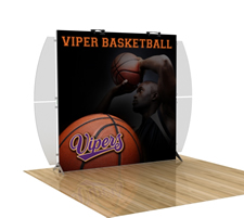
SEGUE Sunrise Trade Show Display

SEGUE Sunrise Portable Hybrid

Most new kits were based on MODUL TSP extrusions, which use silicone edge graphics. SEGUE Sunrise is a good example. Released in early January 2011, the Sunrise was one of those product releases you dream about. While it wasn’t the first SEG backwall on the market, it was the first to get it right from assembly to packaging. The Sunrise assembles without tools on both the single and double-sided versions and packs in die-cut foam packaging. Much like the Sacagawea and the Perfect 10, the Sunrise addresses a specific price point while not sacrificing design or value.

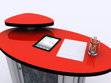
We introduced several iPad solutions as well. These have done well. If you haven’t seen them, I would encourage you to add them to your arsenal:  the MOD-211 iPad Counter Insert and the MOD-1276 Kiosk.

Design Monday Anniversary

In February 2011, we celebrated the 6th Anniversary of Design Monday. Kudos to Mel White, Mike Swartout, and the Classic Design Department for creating a marketing broadcast that transformed Classic and made a difference to our distributors. Other manufacturers shared their designs, but Classic made it a weekly feature. You can imagine the discipline it takes to create three new designs each week, but it’s that discipline that sets Classic apart. It forces us to never be complacent about innovation.

Exhibit Design Search/Website Changes

ClassicMODUL Aluminum Extrusions for Trade Shows

NEW ClassicMODUL Website

If you were watching closely, you saw lots of tweaks to Exhibit Design Search. We upgraded the UI, reorganized the galleries, finessed the Design Descriptions, and added 30 second audio clips. All that in addition to daily photos in P5D, new kits, articles, FAQ’s, and bi-monthly specials.

The ClassicMODUL website changed dramatically, www.classicmodul.com. If you haven’t been there recently, we encourage you to take a tour. The extrusion galleries are much easier to navigate. We’ve added a legend showing which depots have which extrusions, and (my favorite), the MODUL 6.0 Index can be viewed via Page Flip software. It’s pretty cool. As a reminder, we encourage you to contact ClassicMODUL when you need aluminum extrusion for designs you are constructing yourself.

Distributor Events

Historically, we have always been eager to participate in Distributor Events, such as open houses and training. There was a lull in those events during the recession, but 2011 saw a resurgence. We partnered with several Distributor Open Houses and Marketing Events. We applaud those distributors who took the time and effort to organize in-house activities. A special shout out to Atlantic Exhibits for their two ExhibiTrends events. Excellent turnout and they both ran like clockwork.

Alternate Markets
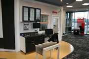
Like many display shops, retail and museum jobs have always been part of the mix. But this year we really pushed that envelope. Projects included studio set work for several television networks, a flagship store for Comcast Xfinity, retail fixtures for an athletic apparel company, and my favorite, building a museum onsite at a music festival celebrating the 20th anniversary of the band Pearl Jam.

These projects and many others were learning experiences that opened doors for Classic and our distributor network. We expect the trend to continue in 2012. In fact we started off the New Year with an in store display celebrating the Rose Bowl Victory for the Oregon Ducks. This display was designed to hang in a storefront of the flagship NikeTown store in Portland. Pretty cool.

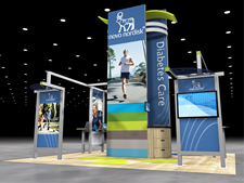
VK-5077 Trade Show Island

VK-5077 Island Exhibit

Islands are Back and Better than Ever

Islands are back and not just those with meager budgets. Well thought out, design-centric islands with realistic budgets are growing and a clear indicator of the “paced” economic recovery.

Internally at Classic, Exhibits NW and ClassicMODUL

Mel and I have always bragged about the great family atmosphere at Classic. In 2011, as we grew, we added employees to that family. And our employees did their job preparing for Classic’s employment needs in the future. At least five newborns were born.

Exhibits NW added folks to the Classic Rental Division. They have been wonderful additions who fit the culture and work ethic. I know I speak for Jim Shelman when I say how happy and thankful we are for the talents they bring to the company.

We expanded the Customer Service Department, adding two new FT positions to Set-up Instructions. We have consistently gotten high praise for our personalized set-up instructions, and Jeff and Pavel made them even better. Great job guys!

The Classic Production Department has grown as well, as business grew through out the year. They have all proven to be very talented additions who we hope will remain in the Classic Family for many years to come.

Thanks to the Staff

MOD-211 iPad Counter Insert for Trade Shows

MOD-211 iPad Counter Insert

I wanted to say a special thank you to the Classic Exhibits, Exhibits NW, and ClassicMODUL staff. As always you make Classic . . . well, Classic. I appreciate all that you do to keep our customers and their customers happy. This past year, like many before, we celebrated many double-digit anniversaries at Classic. It always chokes me up when we celebrate anniversaries once a month. Usually there are several folks who are celebrating 8, 9, 10, or even 12 years at the company. Thank you for your dedication and your hard work.

On a personal note many of have asked about my travel schedule. I have stopped traveling for the most part with the exception of industry events like EXHIBITOR, EDPA, and The Randy Smith Memorial Golf Classic. Except for a rare trip here and there, I have chosen to stick closer to home. And to be honest I am really enjoying it on a personal and professional level. I like being in the office every day and having more time to run the business with Mel and our management team. And I love being able to come home to my beautiful wife and two five year olds each day.

Having said that, I know this leaves a void in visits to you. For that I apologize. We expect to add to our outside team this year, sooner rather than later, to complement the great work that Mel and Reid have been doing. I look forward to updating you on this in the coming months. And certainly look forward to seeing you all in Las Vegas at EXHIBITOR 2012.

Speaking of additions, I want to welcome to the Classic Family a new Designer. Katina Rigall starts on January 16. She is a talented and much needed addition to the Classic Exhibits Design Department. I know I speak for Mike when I say, “We can’t wait for your arrival Katina.” 🙂

I hope you have a very successful 2012 and that we continue to be a part of it. Thanks for all your support and business over the past year. We really, really appreciate it.

Thanks,

–Kevin Carty

http://twitter.com/kevin_carty
http://www.linkedin.com/pub/kevin-carty/3/800/32a

*********************************

Based in Portland, Oregon, Classic Exhibits Inc. designs and manufacturers portable, modular, and custom-hybrid exhibit solutions. Classic Exhibits products are represented by an extensive distributor network in North America and in select International markets. For more information, contact us at 866-652-2100 or www.classicexhibits.com.

When Imitation IS NOT the Sincerest Form of Flattery

July 13th, 2011 3 COMMENTS

Magellan MOR VK-1078

Under the Heading of “Are You Friggin’ Kidding Me?!”

This week, we received a booth for storage, which is a service we offer through our Exhibits Northwest division. Like normal, we assembled it to determine if there were any issues. Now, here’s where it gets really interesting.

The display was built by ‘Blue” (and you know who I mean). Frankly, we have a great deal of respect for “Blue.” They have been market leaders for over 20 years in design, marketing, and product innovation. They know trade show marketing, and they know how to sell design. As a leader, you expect them to be trendsetters, not imitators. Certainly, you don’t expect them to copy iconic designs from other manufacturers. That wouldn’t make sense. They are “Blue,” and “Blue” doesn’t even acknowledge that there are other system manufacturers. But I digress.

Over three years ago, Classic Exhibits introduced two distinctive display designs, both in response to the recession. The designs were the Magellan Miracle and Magellan MOR. These designs were intended to offer customers a sexy hybrid look, but at a more affordable price than upscale hybrids like Visionary Designs. There were fewer bells and whistles, but the Magellan kits included large format tension fabric graphics, curved metal, monitor, and counter options. These designs have been successful because they are engineered well, they assemble quickly, and they pack in portable roto-molded cases with die-cut foam packaging.

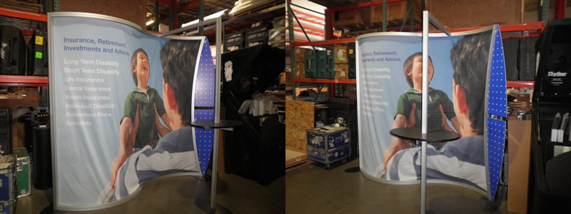
Too often, success breeds envy (or so we’re told) and the itch to imitate that success is often overpowering. Well, the display we assembled, as you can tell by the photo, bears an uncanny resemblance to the Magellan MOR VK-1078 and VK-2099.

Our first response was to be angry at “Blue” for copying our design. But, then we examined the display more closely and got really, really pissed off. It’s one thing to copy a design. It’s another to copy a design and butcher it. We felt sorry for their customer who went to “Blue” with a Classic rendering and the hope of a lightweight, easy-to-assemble, and attractive display . . . but got this.

At the risk of giving our competition a leg up, we’ll share with them what they got wrong.

  1. The Magellan MOR’s design is based on a smooth lightweight aluminum profile with a horizontal S-curve. We use the MODUL Z 45 extrusion. The metal should frame the graphic, not compete with it. The “Blue” design uses a large 50 mm grooved square profile, which is both physically and visually heavy. We hesitate to use the term unattractive. It’s not. Instead, think of it as an awkward teenager — no longer a cute child and not quite a confident adult.
  2. When you bend metal, the bending can create roller marks or cracks in the clear anodizing. Since you don’t want a customer who’s spending $8K or $16K to receive a less than perfect display, you have to re-anodize or powder-coat the metal. Yes, it’s more expensive, but it’s the right thing to do. Guess what didn’t happened to this display? Yep!
  3. Portable displays are supposed to be easy-to-assemble, which is why we designed the Magellan (and the Sacagawea and Perfect 10) with knobs. While a few components may still require the hex key tool, such as counters or base plates, the goal is to make it easy and intuitive. We do. Our doppelganger twin did not.
  4. Here’s an easy one. Graphics should fit. There’s a reason they’re call “tension fabric graphics” not “shower curtain graphics.”
  5. Finally, make it easy for show labor to assemble and disassemble it. When they don’t understand how something should assemble, they use a sledgehammer when a screwdriver would be appropriate. Or in this case, they used a drill and a hammer again and again and again.

Next time, just ask us for assistance. While we won’t deny that we’re proud of our designs and our engineering, we’d much rather know that a customer got a display they’ll love for years and years, even if it’s not built by Classic Exhibits.

Happy Exhibiting!

–Mel White
http://www.linkedin.com/in/melmwhite
mel@classicexhibits.com

*********************************

Based in Portland, Oregon, Classic Exhibits Inc. designs and manufacturers portable, modular, and custom-hybrid exhibit solutions. Classic Exhibits products are represented by an extensive distributor network in North America and in select International markets. For more information, contact us at 866-652-2100.

Five Months into a Great Year: Word on the Street — May 31st thru June 3rd

June 5th, 2011 COMMENTS
Five Months into a Great Year!

Word on the Street by Kevin Carty

Five Months into a Great Year!

So how have the first  months been for you and your company?

At the Classic Exhibits family of companies, I am delighted to report that 2011 has been different . . . and good . . . and surprising. And not just in terms of sales, but also in terms of product development and overall economic recovery.

In Q1, we posted our second largest quarter in the company’s history. A BIG thanks to our dedicated distributors for your sales efforts. You made it possible.

We had several real standout projects in the first five months that deserve a mention.

  • Comcast/Xfinity demonstrated our ability to design, build, and install a large retail interior project. For photos and a project history, see last week’s WOTS blog.
  • Boston Scientific was a great example of showing an old dog new tricks. 🙂 You would have been amazed to see the final project. We took an Intro Fabric Panel System and dressed it up with accessories normally seen on Visionary Designs Hybrid Systems.
  • Display Supply and Lighting’s EXHIBITOR 2011 exhibit. It’s probably my favorite display of the year to be honest. It really highlighted the use of TSP Profiles from ClassicMODUL, SEG fabric from Optima Graphics, and custom programmed LED lighting from Display Supply and Lighting. Take a look at the video we posted on our website. It is worth seeing (even if you’ve seen it before).
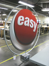
The Easy Button

Staple's Easy Button

And many, many more. In addition to the customized kits, there was a steady stream of standard and non-standard hybrids, an intriguing mix of modified counters and workstations, and then a rather bizarre mix of Aero Overhead and Freestanding projects. And, Aero Table Tops came back with a vengeance (you gotta love those high tech and medical companies).

I would be remiss if I did not acknowledge the amazing growth of Eco-systems Sustainable as well. Kudos to their whole team of course, but I would especially like to acknowledge the great design and marketing  by Michael McCord and Eric Albery. They really have helped to set Eco-systems apart from any of their competitors. Take a look at just one terrific example:  a very custom 10 x 10 for Google.

Exhibits Northwest Portland and Seattle have both seen a tremendous growth in 2011 as well. They started strong with CES in January by working with local companies and Classic distributors on new builds and rentals. But even beyond January, they have embraced new channels within their existing markets. The Comcast order by Tyler Poage and the Malarky order by Laura Magdalen are great examples.

Last but not least, ClassicMODUL. They started the year with the addition of a new Southeast Extrusion Depot (in Birmingham, AL).  Tom Jones, our CM guru, has really pushed hard to increase business in the retail and architectural markets. Not that ClassicMODUL is new to those markets by any means, but corporately we have been pushing to increase aluminum extrusion volume outside trade shows in 2011. Well done Tom!

As we head into June and July, traditionally slower sales months, all of the Classic companies plan to focus on the development of new products, services, and market opportunities. Often, it is the “unique” opportunities you bring us that guide us to develop those new products, service, and markets. So please don’t hesitate to bring new or unique ideas our way.

Thanks again for your support. On behalf of the entire Classic team, I hope you have a safe, enjoyable, and rewarding summer.

Be well!

–Kevin Carty

http://twitter.com/kevin_carty
http://www.linkedin.com/pub/kevin-carty/3/800/32a

Comcast Retail Interior Project: Word on the Street — May 23rd thru May 27th

May 29th, 2011 COMMENTS
It's Comcastic!

Word on the Street by Kevin Carty

It’s Comcastic!

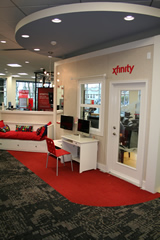
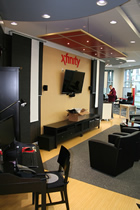
If you glanced at Past 5 Days on the Classic site recently, you noticed some pretty cool pictures of an interior project we completed this spring for Comcast Xfinity.

P5D (5/26/11)
P5D (5/27/11)

Tyler Poage from Exhibits Northwest brought the project to us last summer. The scope was to create a new flagship store in Portland showcasing Comcast’s Xfinity services in a series of vignettes. In addition, the design included workspaces for employees where they could work with customers to setup new service, make changes to existing service, or even assist them with billing issues.

Classic and Exhibits Northwest were not the only folks working on the project. We designed and built the vignettes and the workstations while a local architectural firm and general contractor worked on the building space.

At the start and throughout the project, Exhibits Northwest employed Michael Silva from MSILVA Design to design the retail interior. We’ve worked with Michael before, and he never disappoints. He had a pretty clear set of client goals, one of which was to use similar materials from Comcast’s corporate headquarters.

Classic was brought in to build it as modular sections. It proved to be challenging, but not insurmountable as you can see from the pictures of the final product. The basic goals were to create vignettes that allowed ease of access for wiring and potential redesign of walls in the future.

Vignette Wall

Vignette Walls

The main structural walls were ClassicMODUL aluminum extrusion, using the same Q 914 you’ve seen in Classic island and inline hybrid kits for years. These allowed for a wall structure where we could clad each vignette in laminated Sintra panels to individualize each setting. The aluminum profiles also provided a strong enough internal structure to hang multiple monitors, cabinets, ceilings, etc., while leaving enough space internally for wiring. In addition, using ClassicMODUL permitted us to minimize the ceiling drops. The entire double-sided wall structure consists of only two drops.

Each vignette is unique. They included a kitchen, bus stop, dorm room, and home theater. You can really see where the subcontractors, the contractor, Exhibits NW and the client worked together to create attractive and realistic spaces. These settings demonstrated how Xfinity products are used for PCs or Macs, iPhones or iPads, or various sizes of LCD’s or plasma televisions.

One great design element of the main wall structure was its ability to be scaled down for smaller retail locations. The setting shows off all the vignettes available, but for smaller retail locations, Comcast could choose to build a smaller wall that shows just four vignettes.

Workstations

The workstations are a more familiar, or at least more typical of trade show design. The difference was that these needed to be constructed for employees who would be working with customers seven days a week. These were permanent builds. They had to withstand daily use and continue to look new for years.

The bases are a great example. The base cabinets are one of my favorite elements of the project. They are some of the nicest pieces I have seen come out of our shop. Nothing like the makeshift furniture found at the mass market office product store.

Home Theater Vignette

Installation

This was tricky and a learning process for us. I have to tip my hat to the general contractor. They came with a detail task list and followed it. Did it change a lot . . . yes! 🙂 . But they kept track of every change and held to the dates as best as they could.

The retail installation world is something that Classic Exhibits and ClassicMODUL have been involved in before but usually as a part or a component, not necessarily as the whole project. This was an interesting view into what contractors and architects deal with every day. We gained tremendous insight on how to manage future projects, including some that we are currently working on.

I hope you enjoy the pictures of the project and let me know what you think. I look forward to sharing photos of other interior/retail projects we are currently working on.

Have a great Memorial Day Weekend. Please take time to honor our veterans for the freedom they provide us all.

Be well!

–Kevin Carty

http://twitter.com/kevin_carty
http://www.linkedin.com/pub/kevin-carty/3/800/32a

*********************************

Based in Portland, Oregon, Classic Exhibits Inc. designs and manufacturers portable, modular, and custom-hybrid exhibit solutions. Classic Exhibits products are represented by an extensive distributor network in North America and in select International markets. For more information, contact us at 866-652-2100.

Word on the Street — March 28th thru April 1st

April 3rd, 2011 3 COMMENTS
EXHIBITOR 2011 Follow-up

Word on the Street by Kevin Carty

EXHIBITOR Show Follow-up

To those who attended EXHIBITOR in Las Vegas, I hope you had an enjoyable time.

This past month was a very exciting one at Classic. I am delighted to announce that March will be the second largest sales month in Classic Exhibits’ history! Thanks to you, our distributors and friends, for your support, your orders, and for believing in our “Shared Success” philosophy.

Since I did not attend EXHIBITOR this year, I hope you will share your feedback and reactions via the blog. The Classic Team had only positive comments about the show: great traffic, quality leads, and an overall upbeat tone.

As you may have noticed if you were at the show, Classic Exhibits, ClassicMODUL, and Exhibits NW were fortunate to have built not just our own booth but also several others on the show floor.

Here are just a few. Let us know what you thought of these designs:

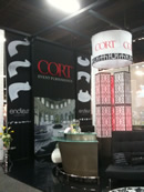
Cort Furnishings. The island display included ClassicMODUL black anodized extrusion, Aero Overhead Hanging Structures, and tension fabric graphics from Optima Graphics . . . and of course all the beautiful trade show furnishings from Cort.

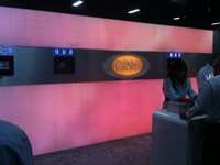
Display Supply and Lighting @ Exhibitor 2011Display Supply and Lighting (DS&L). This inline included Silicone Edge Graphic profiles from ClassicMODUL, SEG fabric graphics from Optima, and some truly amazing LED lighting from Display Supply. Check out the picture, but don’t miss the video. Great work to Rob Cohen and his team. And additional kudos to Steve Pinette for a stunning design.

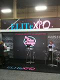
EliteXPO at Exhibitor 2011EliteXPO. This inline had a very cool lounge theme. It included several ClassicMODUL profiles, large format Duratrans and tension fabric graphics from Optima Graphics as well as LED backlighting panels from Display Supply and Lighting. Kudos to Dave, Lara, and Chuck. I heard a lot of great feedback from attendees on your booth design and theme. Nicely done!

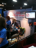
New Leads 10 x 10. A great example of a Classic Exhibits 10 x 10 Sacagawea hybrid! Take a look. Turned out very beautiful and highlighted a very functional design. New Leads at Exhibitor 2011And special thanks to New Leads for allowing us to use their lead retrieval technology which runs off iPads. Very easy to use.

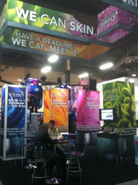
Optima Exhibitor 2011Optima Graphics Island. Not only was there a nice ClassicMODUL Tower in the booth, but did you see that Aero Hanging Sign structure?  Well done Jim, Dave, and the whole team at Optima.

EXHIBITOR Magazine. EXHIBITOR’s inline booth was a custom rental exhibit from Classic Rentals with a dynamic A/V presentation. The display demonstrated our flexible rental inventory and design capabilities. This was no kit. It was built using their design requirements for the show. Exhibitor2011_Booth

Classic Exhibits / Eco-systems Sustainable. And last but not least. I hope you enjoyed OUR booth: Your Home for Exhibits. Take a look at the pictures. What you might not know is that the structure is a Rental Exhibit! It highlights the true custom nature and capability of Jim Shelman and his whole crew at Classic Rentals / Exhibits NW. Thanks to Flying High Design for all the beautiful graphic work, to Optima for the printing, to Brumark for the carpeting, to Cort Furnishings for the comfy chairs and stools, to Nature Wall for the cool “real” grass wall in the ECO-Systems portion of the display. At the end of the day, that was probably the best overall design and display we have ever shown.

That being said, I want to say a personal thanks to Mel, Jim, James, Laura, Erik, Eric, Michael, Tim and of course Reid for their hard work last week. Not being there myself, I want you all to know how proud I am of our team and the job you did. Thanks!

Lastly, a huge thank you to our strategic partners:  Eco-systems Sustainable, Momentum Management, Cort, Optima Graphics, EliteXPO, and Display Supply and Lighting. Your guidance, generosity, and support made this year’s show particularly special.

Please share your comments about the show.

Have a great and restful weekend.

–Kevin Carty

http://twitter.com/kevin_carty
http://www.linkedin.com/pub/kevin-carty/3/800/32a