Trade Show TalesBlog

Posts Tagged ‘trade show displays’

We Don’t Care. We Really Don’t Care!

October 28th, 2017 COMMENTS

ClassicRentals

Thank you for a CRAZY FALL SEASON. We’ve had strong sales, including a record number of AMAZING custom projects. You kept us busy and inspired in Q3, which the Classic Exhibits Family appreciates.

The rental division, Classic Rental Solutions (CRS), saw the largest surge. And that’s not surprising. Exhibit rentals are growing at Classic and throughout the industry. More and more exhibitors are attracted to the smaller upfront investment and the luxury of changing their design from show to show or year to year. The exhibitor’s desire to “mix things up” challenges many builder’s design flexibility and capacity. Not every company has the capability (or willingness) to stretch their rental program.

But We Do. And Here’s Why.

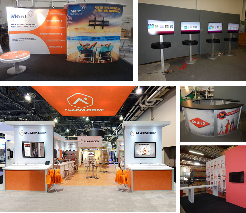
#1. Classic Exhibits and CRS support over 200 distributors. Not every distributor taps into our rental division, but the vast majority send us multiple projects every year. That volume means we have an unmatched inventory when your client needs five LED lightboxes, a double-deck display, a 40 x 40 island, or 37 monitor stands for an event. There are few requests we can’t handle.

#2. We are the manufacturer. We’re not ordering modular frames, cut aluminum extrusion, or custom wood counters. We’re building them. If the rental division needs a custom counter or curved Gravitee One-Step frames, it’s done in days, not weeks. It also means we control the quality. We have no hesitation about throwing away damaged aluminum, chipped laminate, or rebuilding or replacing crates. What we ship has to be perfect because we’re answerable not only to you but also to your client. Happy customers mean more rental orders. And that makes us happy.

#3. We are the designer (in most cases). That gives us enormous flexibility to create customized rental designs. We can choose to build a custom component for a specific design. So many rental designs on the show floor are cut-and-paste, carbon copies of modular panel templates. Be honest. How often have you seen the same rectangular tower with four arches and stock counters? Rentals are growing but some of the designs on the show floor are getting pretty stale.

RentalImages

#4. We are Classic Exhibits. Over the years, we’ve built our reputation on design, quality, flexibility, and nimble engineering. And especially predictability. When you open a rental crate there should be no surprises. It will include detailed instructions, immaculate packaging, and graphics that fit, since the display was staged and photos taken in our facility.

#5. Lightboxes, Charging Stations, Monitor Stands, Tablet Solutions, LED Accent Lighting, etc. Trade show industry trends change FAST. Those trends should apply equally to rentals as they do to purchases. Sadly, that’s not true for all suppliers. At Classic Exhibits, we have no reason not to cross-pollinate purchase trends with rentals. We benefit. You benefit. Your client benefits.

So…. you may be wondering about the title of this blog post — “We Don’t Care. We Really Don’t Care.” On occasion, a distributor will apologize for a rental order. Their client considered both a rental or a purchase but eventually decided to rent. Yes, the initial order is is smaller but that’s fine. Rental orders, over time, tend to be larger than purchases. And frankly, the margins are better. There’s no need to apologize. We don’t care whether you purchase or rent from Classic Exhibits. We only care that you do one or the other.

Thanks again for a remarkable fall. Be sure to visit the Rental Display Gallery. We’ve added over 120 designs in the past two months, all with rental and purchase prices.

–Mel White
mel@classicexhibits.com
http://www.linkedin.com/in/melmwhite

**********************************************

Classic Exhibits Inc. designs and manufacturers portable, modular, hybrid, and custom exhibit solutions. Classic Exhibits products are represented by an extensive distributor network in North America and in select International markets. For more information, contact us at 866-652-2100 or www.classicexhibits.com.

The Gift of Knowledge | EDS Tutorial Videos

December 23rd, 2016 COMMENTS

exhibit design search video tutorial

In the movie, Only the Lonely with John Candy (as Danny Muldoon), Danny’s signature line is “Sometimes it’s good to be a cop.” I often feel the same way except, “Sometimes it’s good to be the Marketing VP.”

Recently, a tech savvy Classic Distributor created four Exhibit Design Search tutorials. These 2-3 minute tutorials cover:  Exhibit Specials, Advanced Search, My Gallery, and Photo Galleries. You can find them in our Video Library and on YouTube, but I’ll make it even easier by posting them below. Enjoy and let us know your thoughts.

Exhibit Design Search — Search Options

Exhibit Design Search — Retail, Rental, and Custom Displays Photos

Exhibit Design Search — My Gallery

Exhibit Design Search — Lightning Deal and Exhibit Specials

–Mel White
mel@classicexhibits.com
http://www.linkedin.com/in/melmwhite
https://twitter.com/melmwhite

[subscribe2]

5 Classic Tips x 5 Days = 25 Delights | Day #2

November 8th, 2016 COMMENTS

tipsday2

Welcome Back!

Today, we stroll through the colorful history of our product names. We’ll even touch on the funky Classic Exhibits logo. Don’t scoff. It’s more interesting than you think.

Insight #6 — SEGUE

Six years ago, all SEG-type displays were in Visionary Designs. We got tired of searching for them in VD whenever you requested an SEG design so we created SEGUE. Obviously, the SEG in SEGUE stands for silicone edge graphics, but did you know that segue, like in a movie, means the transition from one scene to another? Or in our case, from one product line to another. Seamlessly.

Insight #7 — Sacagawea

I know it’s hard to pronounce, and I’m sorry. When we developed Sacagawea during the Great Recession, we wanted to continue an “explorer” naming system, like Magellan. It seemed clever at the time. Unfortunately, we soon realized that most explorers have “issues” (think Balboa, Pizarro, Cortes, etc.).

My wife suggested Sacagawea, a resourceful and invaluable guide who accompanied Lewis and Clark. Since the new line was lightweight, durable, practical, and adaptable, it made sense. Honestly, I still think it makes sense, and it’s the only product line in our industry named after a woman.

Insight #8 — Gravitee

Gravitee was born from multiple intense R&D sessions in 2015 where we mined our past product successes to create a new modular panel system. The elegant clips from Euro LT, the 180° hinge from Intro, the MODUL locking system, and our familiarity with custom wood construction. We realized that connecting the panels was as easy as letting gravity do the work. The Newton and apple tree concept came along for the ride. As for the spelling… blame marketing.

Insight #9 — Aero, Intro, Quadro, and Euro LT

No idea since the lines predate me. That said… they are most self-explanatory, except for the weird fixation with ending in “O.” FYI — There was a Euro before there was a Euro LT.

Insight #10 — Classic Exhibits Logo

cesymbolonlyI am told it was created by a design agency on the East Coast. Kevin loves the Classic logo. I’ve grown to (mostly) love it over the years as we’ve made subtle changes. If nothing else, it’s iconic.

Eleven years ago and about seven months after accepting the job at Classic, I mentioned the logo to a distributor who said they liked how the “C” crested the “E.” To be honest, I had never noticed the “C” before in the logo. Now suddenly it made sense! Before that, I just thought it resembled Marvin the Martian.

OK, maybe it wasn’t quite as interesting as I promised, but it’s not like you’ve never been disappointed in a story.

Hump day tomorrow with #11 thru #15.

–Mel White
mel@classicexhibits.com
http://www.linkedin.com/in/melmwhite
https://twitter.com/melmwhite

[subscribe2]

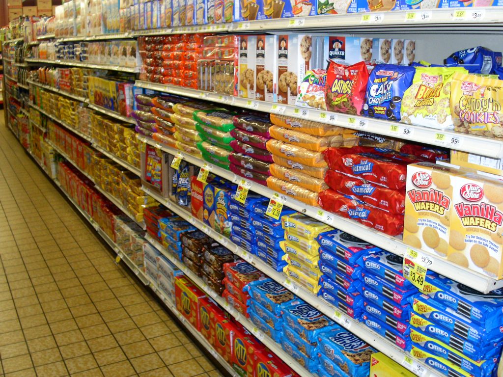
Is Your Exhibit an Oreo, a Fig Newton, or a Nilla Wafer?

September 12th, 2016 COMMENTS

Trade Show Displays as Cookies

Sugar and More Sugar

As someone who grew up in the 60s and 70s, I consumed a lot of sugar. I mean A LOT. Kool-Aid, Popsicles, Shasta pop, ice cream, breakfast cereal, and every Hostess snack from Twinkies to Ding Dongs (perhaps the best product name ever!). Sugar and salt balanced endless dinners of casseroles and salads with mayonnaise. It was a great childhood.

The sugar feeding frenzy wouldn’t have been complete without packaged cookies. My mother called the shots when it came to cookies, which meant she bought store or off-brand cookies most of the time. But occasionally, she would splurge for the name brand. And, like every kid, I loved Oreos best.

Trade Show ExhibitsMy parents would gladly eat sugar wafers or ginger snaps. Not us kids. We fought for Oreos. Would settle for Fig Newtons. And cried and pouted if given a Nilla Wafer (unless drenched in banana pudding).

This experience gave me a solid foundation for judging things. As an adult I can rate just about everything on a cookie scale. For brevity, I’ll limit myself to Oreos, Fig Newtons, and Nilla Wafers, but be assured that the “science” behind my methodology includes Frosted Animal Cookies, Pepperidge Farms (as a collective group), Girl Scout Thin Mints, and Chips Ahoy. And, while I love peanut butter cookies, no prepackaged cookies can ever compare to homemade ones. That’s just a fact.

Now, when it comes to trade show exhibits, specifically 10 and 20 ft. inline displays, categorizing them has never been an issue. There are pop-ups, hybrids, modular laminate, custom, and basic tube and pillowcase graphic displays. But those labels are just labels, and not practical, oh-so satisfying cookie evaluations.

Nilla Wafers.

Trade Show Exhibits as Nilla WafersIf you notice these inlines, it’s usually for all wrong reasons — fuzzy graphics, broken hardware, or a general “vanilla” appearance. In addition, they’re bland in design and accessories. No monitor, shelves, pedestals, storage. No tablet stand, computer, or lightbox. It’s a tradeshow display in the same way a Nilla Vanilla is a cookie. Basic, unassuming, aesthetically similar to every other opening price point display. It got you there, but no one’s going to assume you’re a Fortune 1000 company.

Fig Newtons.

You either love Fig Newtons or you don’t. There’s no in-between. The equivalent inline has the same characteristics. Attendees are drawn to it because it takes design risks. There may be curves, headers, accessories, and a creative counter with storage. The graphics are layered with a mix of fabric and direct prints. Fig Newton displays often come in a variety of “visual flavors,” each with slightly different creative variation. You’ll never mistake a Fig Newton display for a Nilla Wafer one. And while you may not always like everything about it, attendees notice it on the show floor. Which is what exhibitors want.

Oreos.

Trade Show Exhibits as OreosOreos are the cookie equivalent of royalty. The traditional Oreo is the king; there are also Oreo queens, dukes, counts, princesses, and barons. They rule in a 20th century sort of way. No real power, just a commanding presence that demands respect. You’ve seen these 10 and 20 ft. inlines on the show floor. The booth is beautiful. The graphics are spectacular. The design, the aesthetics, and the function are seamless.

You approach it, mesmerized by its allure. You find yourself lingering. Need water. It’s there. A freshly baked treat? They have a tray of brownies. The product video is captivating. The lead retrieval questions never seem threatening or intrusive. You understand what they do, and yet, you still want to know more. It’s not that the exhibit is expensive. It’s that the design is flawless, and the booth staff is attentive, knowledgeable, and professional. It’s that perfect display “cookie” which always satisfies and can be tailored to your trade show tastes.

You have a choice in inline displays just as you do with cookies. But unlike cookies, when it comes to a trade show display, you are not choosing what you want but what others want. How do you want to attract attendees? How do you want to be perceived? And lest you think it’s all about price, it’s not. Well-designed inline displays come in all price points. And well-trained booth staffers are priceless.

If that seems intimidating or overwhelming, then never fear. Find an exhibit house with an established history of success and grab securely on their coattails. They understand trade show displays. And possibly cookies.

–Mel White
mel@classicexhibits.com
http://www.linkedin.com/in/melmwhite
https://twitter.com/melmwhite

**********************************************

Based in Portland, Oregon, Classic Exhibits Inc. designs and manufacturers portable, modular, and custom-hybrid exhibit solutions. Classic Exhibits products are represented by an extensive distributor network in North America and in select International markets. For more information, contact us at 866-652-2100 or www.classicexhibits.com.

[subscribe2]

The Life Cycle of a Portable Hybrid Display

August 16th, 2016 2 COMMENTS

quality2

I need to gripe… so I can move on.

Quality Cycles

As you know, all products have cycles. No surprise there. However, one cycle that’s rare discussed is the quality cycle.

In general, first generation (new) products are introduced with mid-level quality. Meaning, while the materials may be of a higher quality, there are always bugs, features, etc. that lessen the “perceived” value. Those are remedied quickly, and the quality improves. Think first generation smartphones, cars, or footwear.

If the product is successful, then others rapidly enter the market. Some add features at the same quality level, but others look for ways to cut costs and the selling price. That may include improving production, increasing volume (and lowing their margins), or the tried-and-true method of making a cheaper version with less optimal or alternative materials. These products may look the same, but rarely perform as well as the higher-quality versions.

What Do We Do?

As customers, we experiment with the look-a-like cheaper versions, ex. shoes, lawnmowers, jewelry, or BBQ grills. We discover that price is usually a good indicator of quality. That doesn’t mean we won’t buy a less expensive suit or dress, for example, but we understand that it won’t perform at same level as the more expensive one.

You know this, intuitively. In our business, exhibitors are often confused by a product that appears to be the same but is less expensive. Pop Ups and Banner Stands fit this pattern. You know that and are able to describe the differences to your customers based on your experiences with those products.

Can you do the same with Portable Hybrid Displays? That’s much harder.

1202_render_1bEarlier this week, I saw a 10 ft. hybrid backwall for $1,759. It included plex wings, a fabric graphic, lights, and a case. Great price on a kit that looks similar to a Sacagawea Portable Hybrid at around $4000.

I often see the bargain imported hybrids on the trade show floor, so I thought I’d share what I see as the major differences. These are not obvious, especially if your only point of reference is an online rendering.

1. Much lower quality aluminum (softer) with thinner walls, less internal ribbing, and minimal anodizing. Meaning it will dent, scratch, distort, and discolor after two or three shows. Do you recall when pop ups displays always featured “aircraft grade” aluminum? It matters.

2. Hinky hardware connections (yes, I said hinky!). I can’t tell you how many I’ve seen leaning like the Tower of Pisa. Most of the time, the connections are not repairable on the budget hybrids.

3. First or second generation dye-sublimation printing on low thread-count fabric. The images are muted, and the fabric is more prone to ripping and distorting. It’s clearly not HD quality. It’s like buying a shirt at H&M. You don’t expect it to last.

4. Minimal packaging. Basic foam and tape for one-time use. This increases the chances of damage and lost pieces — significantly.

5. 100% tool assembly and caricature-like instructions. Makes me appreciate IKEA instructions.
Plus limited upgrades and accessories.

6. Low quality roto-molded cases. The plastic walls crack, buckles break, or handles snap after several shipments. You know you’re in trouble when the case is held together with duct tape.

7. Lastly, the warranty is laughable. Not happy? Want to return it? Now you are just making my sides hurt.
lawnmower

Let’s Not Kid Ourselves

There is a market for these basic hybrids. And there should be. But as exhibit professionals, we shouldn’t present them as comparable to higher-quality portable hybrids, especially to our corporate clients who want a durable, attractive, and easy-to-assemble display.

Allow me to put this in perspective with a personal example. Quite a few years ago, I purchased a $169 lawnmower. It lasted four years and did an OK job, except for the wheels always falling off. Then I bought a Toro for $325. It has lasted 10 years and does an AMAZING job, and I expect it will last another 5 years. My all-to-friendly neighbor agrees.

Your customer will always buy based on their budget. And you are going to sell them what they can afford. No complaints here. However, as the “tactful professional” is important for them to understand what they are getting (and not getting) on any display purchase.

I’m better now. And I’ll move on. Comments? Please share.

–Mel White
mel@classicexhibits.com
http://www.linkedin.com/in/melmwhite
https://twitter.com/melmwhite

**********************************************

Based in Portland, Oregon, Classic Exhibits Inc. designs and manufacturers portable, modular, and custom-hybrid exhibit solutions. Classic Exhibits products are represented by an extensive distributor network in North America and in select International markets. For more information, contact us at 866-652-2100 or www.classicexhibits.com.

[subscribe2]