Trade Show TalesBlog

Archive for 2013

What Do You Do With Your Time?: Word on the Street — July 1st thru July 5th

July 7th, 2013 COMMENTS
What Do You Do With Your Time?: Word on the Street -- July 1st thru July 5th

Word on the Street by Kevin Carty

Happy 4th of July

This past week was and probably will go down as the slowest sales week of the year. Having the holiday land on a Thursday can do that. Add to that it’s in July, and you get a whole lot of nothing.

Now that is the sales side of me speaking, but the productivity side of me loves weeks like this past week. You can get so much done on your “To Do” list. I am not talking about the normal day-to-day stuff. I am talking about that list you have in your head or on a notepad somewhere buried in your desk. You know the list of things you swear you will get to when you have the time. You know the one.

For me, it included a lot of database projects, organizing (at least starting to organize) my office, and cleaning out some files. And starting a pricing analysis project on Wednesday, the beginning of a much larger pricing project for late summer.

I know many people take vacation this time of year. I will the latter part of next week. But I am curious. To those in the office this time of year, what do you do with your time?  What are the “long term” projects you tackle in June and July?

Based on our crystal ball, you better tackle them soon. We’re seeing an earlier start to the fall season based on design activity. So enjoy the down time while it lasts. Which the sales side of me hopes ends this week.  🙂

Hope you had a terrific Independence Day Holiday.

Kevin
http://twitter.com/kevin_carty
http://www.linkedin.com/pub/kevin-carty/3/800/32a

[subscribe2]

SIGNIFICANT CHANGES to Brumark’s Flooring Galleries in EDS — WOW!

July 2nd, 2013 COMMENTS

Brumark Flooring Galleries

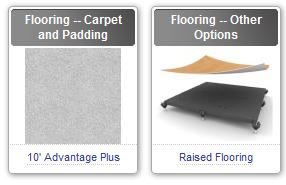
Brumark has made significant changes and additions to the Flooring — Carpet and Padding and Flooring – Other Options galleries of Exhibit Design Search!

In addition to enhanced product descriptions and updated images, they’ve added a variety of flooring products to meet just about any application and budget requirement. Here’s Brumark’s description of the changes:

New Exhibit Carpet – The very popular 10′ Advantage Carpet line has been expanded. In addition to 10′ wide Advantage Carpet in 16 oz., 30 oz. and 50 oz. weights and a variety of stylish colors, we’ve added the new NexGen 10′. This quality 10′ wide carpet comes in nine vibrant, fade-resistant colors and is offered at a significant value. NexGen 10′ is available in 16 oz. and 28 oz. weights.

Additional Styles of FlexFloor Rollable Vinyl Flooring – FlexFloor is extremely convenient and easy to use — it rolls out and then back up for fast, simple installation. We added the Stone Works Collection, which provides the look of natural stone, as well two Designer collections. The Designer I collection is designed for single-use only, providing an economical option for clients who need a one-time flooring solution. The Designer II collection has four styles, including white, that can be used multiple times.

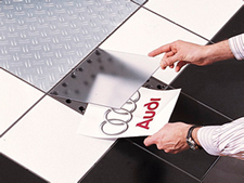
Printable Flooring – We’re also excited to add a printed flooring option that gives your clients a convenient and attention-grabbing way to extend their branding or theme to the floor. With FlexFloor Clear Choice, the image is custom-printed on the back side of the clear, rollable vinyl flooring for maximum image life. And of course FlexFloor Clear Choice has all the benefits of the FlexFloor line, including fast roll-out installation.

Elevate Raised Flooring

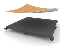
Raised Flooring – We added four raised flooring options that give your clients a way to create a distinctive look and easily manage their utilities. The Elevate Raised Flooring System consists of strong polycarbonate tiles and is designed to be easy to set up, level and dismantle. Clients can easily use carpet, FlexFloor or other options on the surface.

The cutting-edge A&P Flooring System is designed to easily adapt to your clients’ changing exhibit needs. The super-strong anodized aluminum frame installs to almost any size with no tools needed, and then custom infill panels just set into place. This allows users to create almost any size floor and then easily customize it. A&P holds up to 3.5 tons per square meter – including vehicles – and can be used indoors or out.

The Altitude R&R Raised Flooring System is unique in that it has an interchangeable top surface and a durable subfloor that can be reused many times. This gives clients a very convenient and cost-effective way to update the look of their flooring without having to invest in an entirely new floor.

And the TraxFlex Hardwood Flooring System provides a simple and cost-effective way to use real hardwood flooring for exhibits and events. This innovative raised floor quickly and easily installs on spring-mounted tracks — no tools required. It’s extremely durable and reusable. And because the spring-mounted tracks allow for the natural expansion and contraction of the hardwood, TraxFlex can be used indoors or in covered outdoor areas.

PromoDek Flooring

Modular Flooring – The PromoDek Modular Display Flooring System is another ultra-convenient way you clients can get multiple flooring options from their investment. It features standard components that easily click together to create a platform in almost any size or shape. The surface can be updated in minutes with new materials or printed graphics, and the floor is easy to resize, reposition and reconfigure. Plus, PromoDek is strong enough to hold cars! In addition to trade shows, this is also a great option for product demonstration, sales meetings and more.

Chilewich Tiles – We’re also pleased to add Chilewich Tiles with BioFelt™ to Exhibit Design Search. This is another very convenient option. The comfortable, 18″ x 18″ woven vinyl tiles provide a modern, upscale look. They can be installed with adhesives, but the new BioFelt backing also allows you to install the tiles with Velcro®. This makes it very easy to install, reposition, remove and reuse the tiles. Not to mention, they are an eco-friendly flooring choice made from 82% recycled content. Chilewich Tiles are available in Bamboo, Basketweave, Frost, Rib Weave and Lounge styles, in a variety of modern colors.

With all these new flooring options, there’s something for everyone. We encourage you to take some time to check out the expanded flooring galleries and contact us if you have any questions or would like more information.

[subscribe2]

Polishing Perfection: Word on the Street — June 24th thru June 28th

June 30th, 2013 COMMENTS
Who are We Trying to Impress?: Word on the Street -- June 24th thru June 28th

Word on the Street by Kevin Carty

This has been on my mind for some time so I am going to share a little more “Seth-Wisdom” with you. Seth Godin that is. Only because he nails this conundrum.

First, the issue. We design, manufacture and sell tradeshow exhibits. We depend on you to find new clients or to work with your existing clients to develop their tradeshow program. But there is, at times, a fly in the ointment or a pink elephant in the room. It’s YOU!

Whether it’s in design, build, or even in the final review, we sometimes find ourselves tweaking and revising the salesperson’s wishes rather than what the customer wants. Especially in design. I am amazed at how many times a designer has participated in a design meeting(s) with the end-user, then comes up with a great design for the client only to have it incessantly revised based upon what the salesperson wants — not what the client wants. And, of course, we make the changes, but 100 percent of the time once the design lands on the client’s desk, we end up changing it back to the original design.

This is not a complaint . . .  but it kinda is. No one questions your wisdom or your knowledge of exhibit marketing gleaned from years and years of working with exhibitors. It’s invaluable. It’s indispensable. Your guidance ensures that your client makes smart decisions about trade show marketing.

Ours is a specialized business, a knowledge that comes primarily from working with hundreds of clients.  However, and far too often, the account executive makes decisions based on their preferences, not their client’s preferences. You hear statements like, “I’m doing this for the client’s best interests.” Which is fine . . . kinda . . . but not when there’s a laundry list of “best interests” that the client never hears about and then discovers at the preview or the show site.

What really impacts the project is when we are in the final staging of an exhibit and then have to make last minute production changes based on what the account executive wanted only to find out later that the client was not expecting the changes. But I digress.

This came from my daily Seth email.

Polishing Perfect

Perfect doesn’t mean flawless. Perfect means it does exactly what I need it to do. A vacation can be perfect even if the nuts on the plane weren’t warmed before serving.

Any project that’s held up in revisions and meetings and general fear-based polishing is the victim of a crime. It’s a crime because you’re stealing that perfect work from a customer who will benefit from it. You’re holding back the good stuff from the people who need it, afraid of what the people who don’t will say.

Stop polishing and ship instead. Polished perfect isn’t better than perfect, it’s merely shinier. And late.

Now I am not saying that we don’t strive to be perfect. We most certainly do! But in the end, our goal is perfection per the end-user’s expectations. Not my expectations. Not the account executives.

If you take exception to my comments, please share your thoughts.

Hope you have big plans this coming week for the 4th of July holiday. Have a great time with your family and friends.

Kevin (not yet perfect) Carty
http://twitter.com/kevin_carty
http://www.linkedin.com/pub/kevin-carty/3/800/32a

[subscribe2]

Magellan Portable Hybrid Displays

June 28th, 2013 COMMENTS

Whenever we conduct an Exhibit Design Search (EDS) webinar, we reserve 5 -10 minutes to review the Classic Hybrid product lines. We have five hybrid lines . . . well kinda. In reality, we have six or seven or even eight if you toss in the rentals, table tops, several Euro LT designs, and even Eco-systems Sustainable (which is a separate company but represented in EDS). It can be confusing.

The Classic distributors who attend Shared Knowledge University (SKU), our comprehensive training program, hear the history and the explanation of our hybrid lines. They always tell us that what was confusing, now makes sense. So, over the next few weeks, I’ll do my best to encapsulate the SKU review into a series of blogs about the Classic Hybrid lines. We’ll begin with Magellan.

What Makes a Magellan a Magellan?
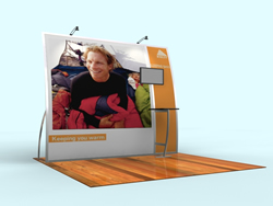
Magellan Miracle Hybrid

Magellan Hybrid Displays was Classic’s third hybrid line, launched (if I remember correctly) in late 2008 or early 2009. I  remember very, very clearly why we created the Magellan line, and in particular, the Magellan Miracle. Several months into The Great Recession, sales of our existing hybrid lines, Visionary Designs and Perfect 10, had stalled. We were hearing from distributors that price, while always a factor, was now paramount. We knew we needed to react quickly, but we didn’t want to create a basic aluminum box with a graphic. It had to have “presence,” but be less expensive than a Perfect 10.

Many of you have heard me say the price of a hybrid is not complicated. There are three major elements:  the metal (size and shape of the profile, straight, or curved), the graphics (size and quantity), and the accessories and components. You can add a four element if you collectively include design, assembly, and packaging, which also contributes to the price. To reduce the cost of a hybrid, you use less expensive profiles, have fewer bends, smaller or fewer graphics, and limited accessories.
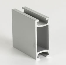
Z 45 Aluminum Extrusion

The Magellan line is (almost exclusively) built with the Z 45 profile. Why the Z 45? It’s relatively inexpensive, extremely versatile, and very attractive. In addition, our metal bending expertise allows us to bend it in both directions (what we call the hard and soft edges). That means the Z 45 can be used as both a horizontal and a vertical, and bent to create a variety of interesting shapes.

Miracle

The Miracle was the first Magellan. Like the Perfect 10, it has two large fabric graphics, each 96 in. tall. And, like the Perfect 10, the verticals are curved. However, the Miracle has less extreme curves, fewer accessories, and a limited set of options. The Miracle, as with all Magellan Displays, is a “Knob-assisted Assembly” system, meaning that about 85% of the assembly uses attached knobs. Where a knob would be visible or impractical, a hex key tool is required. These changes allowed us to price it about $1300 less than a comparable Perfect 10.

Fortunately, the Miracle was an instant success. One distributor was so sold on the concept (and hungry for sales) that she based her entire quarterly marketing campaign on the Miracle. It saved her quarter and jumped started her year. The positive feedback encouraged us to create other Magellan designs, some with similar price points such as the MOR and the Magic. But we didn’t stop there. The versatility of the Z 45 meant we could design more intricate, more upscale, and more expensive designs such as the VK-1043 and VK-2056.

So, when should your client consider a Magellan Hybrid? There are two directions:

1. Limited Budget/Attractive Design

  • 10 ft. and 20 ft. Inlines
  • A budget that won’t stretch for a Visionary Design or a Perfect 10
  • Your client requests a portable system that they can assemble at the show
  • They want something more than a basic curve, box, or pop-up
  • They want large vibrant fabric graphics
  • They need a workstation for a monitor
  • Die-cut reusable foam packaging and numbered components
  • Examples:   Miracle, MOR, Magic

2. Larger Budget/Distinctive Design

  • 10 ft and 20 ft. Inlines
  • Larger, more flexible budget
  • Loves curves. Wants the booth structure to be unique
  • Likes the idea of portability, whether they need it portable or not
  • Needs counters, workstations, headers, multiple large fabric graphics
  • Die-cut reusable foam packaging and numbered components
  • Examples:  VK-1083, VK-1085, VK-2049, and VK-2045

Next time, we’ll review Perfect 10 Portable Hybrid Displays. That’s an interesting tale of what happens when you discover a major, untapped segment of the market that EVERYONE has ignored.

–Mel White
http://www.linkedin.com/in/melmwhite
mel@classicexhibits.com

**********************************************

Based in Portland, Oregon, Classic Exhibits Inc. designs and manufacturers portable, modular, and custom-hybrid exhibit solutions. Classic Exhibits products are represented by an extensive distributor network in North America and in select International markets. For more information, contact us at 866-652-2100 or www.classicexhibits.com.

[subscribe2]

Meet Katrina Broten, Our Design Intern: Word on the Street — June 17th thru June 21st

June 23rd, 2013 1 COMMENT
Katrina Broten, Our Summer Designer Intern: Word on the Street — June 17th thru June 21st

Word on the Street by Kevin Carty

The Classic Family is very happy to welcome Katrina Broten to our Design Department as a Summer Design Intern. Many of you might remember Katrina from earlier postings. She and I met through the EDPA Mentorship Program with Bemidji State University last fall. During her final year, she collaborated with Mike and Katina from the Classic Exhibits Design Department as she worked on her senior projects. She also made a visit to the Classic facility for several days and attended EXHIBITOR2013 where she met many of you at the Classic Exhibits Distributor Appreciation Suite.

We look forward to spending the summer with her and hope that we can assist her career as an exhibit designer.

Here is a brief introduction she wrote.

Katrina Broten (not to be confused with Katina)

I’m on the right. 😉

Hi. I’m Katrina, a graduate from “Burrmidji” State University (a university in northern Minnesota known for bitter cold weather and lots of snow) with a B.A. in Design Technology with an emphasis in Exhibit Design. My mentor, Kevin Carty and the team at Classic Exhibits, has granted me the privilege of starting my career here as an intern. I’ll be learning the ropes and gaining real world skills of the exhibit industry.

In an ironic/destiny sense, it’s funny how this amazing opportunity presented itself. First of all, I have always had a love for Portland Oregon. My aunt lives here, and I have visited many times. Portland is a beautiful city where I have a strong connection. Knowing this will help explain where the irony of my story.

I was introduced to Kevin through the mentor/mentee program that, as a student, I applied for while attending my final year at Bemidji State University. Well to tell you the truth, I kind of spaced out the deadline for this application, what with homework, projects, and multiple jobs. Eeeek!  BUT, using my quick-witted communication skills, I managed to get squeezed into the system and was lucky a few pairings were left. Shortly thereafter, I was sent an email informing me that Kevin Carty was my mentor.

Katrina Broten

Since I started the program late, I thought, “Oh great! I’m going to get stuck with the opposite of what I’m looking for. This is going to be a mess. Will he even have any advice to share with me or want to share with me? Why did I do this? I’m going to be punished for being late! Cripes, I’m screwed!” I emailed Kevin with the hope that I would not be wasting my or his time. About a week went by and I figured I was right . . . but then to my surprised he emailed me back.

This email gave me some reassurance that I would actually have contact with my “mentor.” I was relieved, but still didn’t know what to expect. A few more days went by, and I was contacted again and after some small talk, Kevin invited me to Portland to visit Classic and tour the company. I was shocked! In January, we planned a time that would work and after a nervous plane ride, I arrived and had the most amazing experience meeting everyone and learning the “Classic Way.”

After the trip to Oregon, I kept in touch with Classic and Kevin. At EXHIBITOR2013, we met again and Classic invited me to their hospitality suite, their booth, and we had some amazing adventures in Las Vegas. Now I am back in Portland with the entire team whom I have come to enjoy! I look forward to this internship. I’m already immersed in Design working with Katina and Mike and understanding their world. Pretty eventful to say the least. Honestly, I couldn’t have asked for a better mentor or company.

I look forward to working with you, the Classic Distributors, over the next three months.

Katrina Broten
kbroten@classicexhibits.com

[subscribe2]