Trade Show TalesBlog

Posts Tagged ‘trade show graphics’

Trade Show Graphics 101: How to Make Your Mark

April 4th, 2025 COMMENTS
trade show graphics

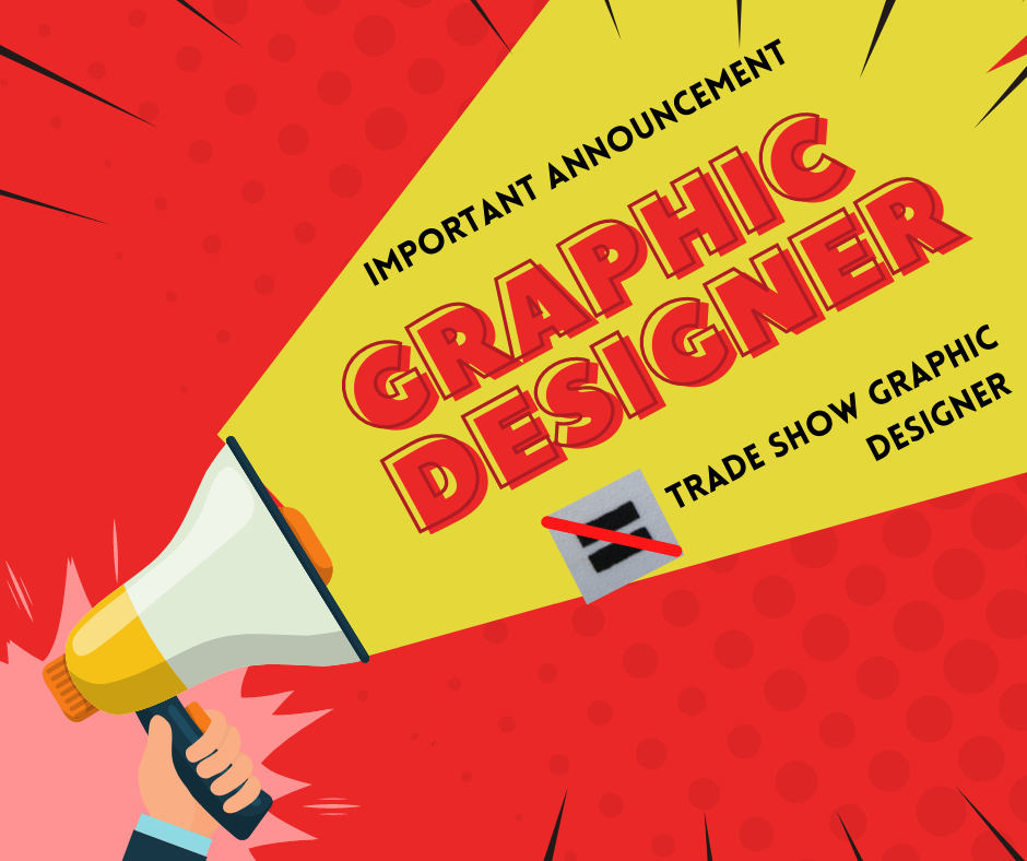
Three Secrets about Trade Show Graphics:

1. The graphics on a trade show exhibit, regardless of the size of the display, are just as important as the exhibit structure,

2. Designing graphics for a trade show display is different from designing graphics for anything else,

3. Hire a graphic designer with trade show design experience. Why? They’ve already made all the mistakes… that a novice at trade show design would make. 

Trade show graphics are critical for making a strong first impression, acting as a visual magnet that attracts attendees to your booth. In a crowded exhibition hall, compelling graphics effectively communicate your brand’s message, highlight key products or services, and create a memorable experience. They contribute significantly to brand recognition, helping to solidify your company’s presence and fostering engagement with potential customers, ultimately driving leads and sales.

Trade Show Graphics: The Foundation of a Successful Exhibit

Trade show display graphics are the first thing attendees notice and are undeniably crucial for any business aiming to make a significant impact at an exhibition. In a bustling environment filled with competitors vying for attention, compelling visuals serve as the initial point of contact, drawing attendees to your booth and sparking their interest. 

Investing in high-quality, thoughtfully designed trade show graphics is not just an aesthetic choice, but also a fundamental element of a successful trade show strategy.

Trade show graphics offer multiple marketing benefits.  

Enhanced Visibility and Brand Recognition:

  • Eye-catching graphics are the first point of contact, drawing attendees to your booth amidst a crowded environment.
  • Consistent use of logos, colors, and branding elements across your graphics strengthens brand recognition and recall.
  • Unique and well-designed visuals help your booth stand out and leave a lasting impression on visitors.

Effective Communication and Messaging:

  • Graphics can communicate your company’s identity, key offerings, and unique value proposition quickly and concisely.
  • Visuals can help tell your brand story and connect with attendees on an emotional level.
  • Graphics provide an opportunity to visually display products and their benefits, attracting interested prospects.

Increased Engagement and Lead Generation:

  • Compelling graphics entice attendees to enter your booth, increasing foot traffic.
  • Incorporating interactive displays and graphics can engage visitors and encourage them to spend more time at your booth.
  • Strategically placed calls-to-action and contact information on graphics facilitate lead generation.

Professionalism and Credibility:

  • High-quality graphics convey a sense of professionalism and attention to detail, enhancing your company’s credibility.
  • A well-designed booth with strong visuals can build trust and confidence with potential clients and partners.

Competitive Advantage:

  • Unique and creative graphics help you stand out from competitors and make a memorable impact.
  • Targeted messaging and visuals can attract attendees who are genuinely interested in your offerings. 

Investing in well-designed trade show graphics is a strategic decision that will ultimately contribute to a positive return on investment. Want to explore more about large-format graphics? Read our insights on large format trade show graphics.

trade show display graphics

Exploring Your Options: Types of Trade Show Booth Graphics

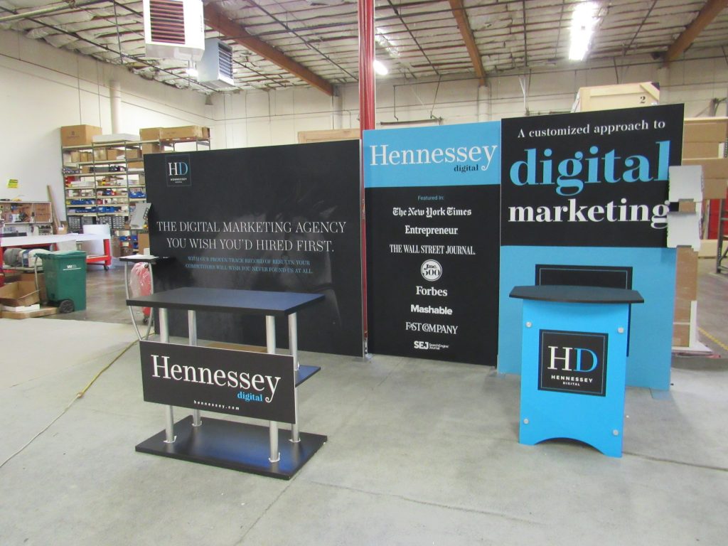
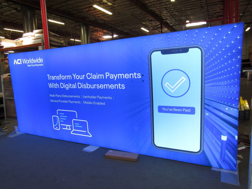
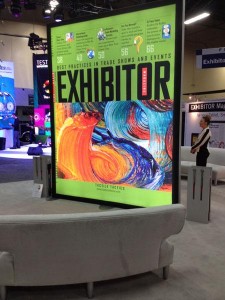
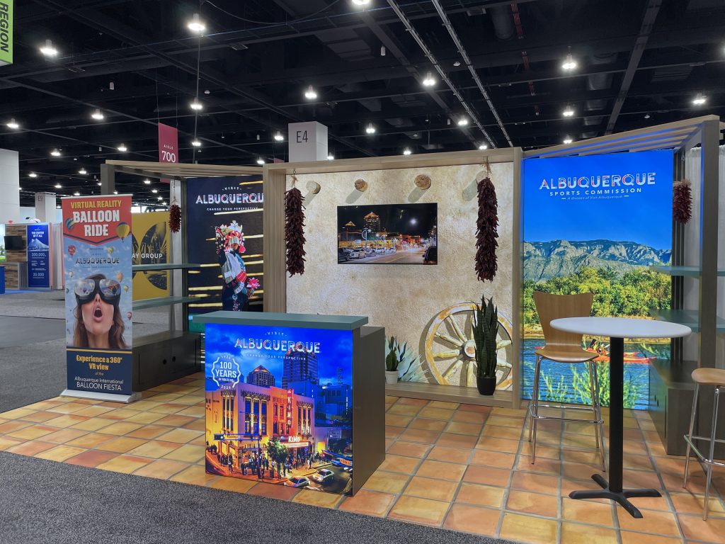
If your first mental image of trade show graphics is large fabric images on backwalls and towers, you wouldn’t be wrong. Vibrant dye-sublimated fabric graphics, either front lit or backlit, are ubiquitous at trade shows and events. These graphics have transformed most exhibits into big, bright, and colorful billboards on the show floor, all at a cost that would have been unimaginable 10 years ago. 

But if you look beyond those fabric graphics, you’ll see other graphics mediums which add to the overall branding and messaging. 

Beyond Backwall and Tower Fabric Graphics: 

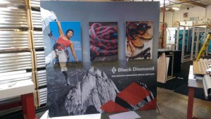
  1. Direct Print Graphics. Direct prints on Sintra or foam board are still common on rentals with modular wall panels, smaller floating graphics, and for targeted branding in a display. Generally, they’re cost-effective, easy to install, and the colors true. If there’s a downside, it’s durability, especially during shipping.
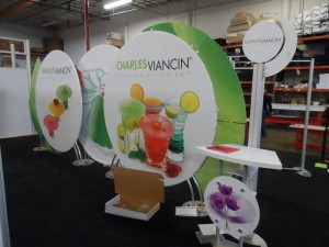
  2. Hanging Signs. Every exhibitor with an island display either has a hanging sign or has considered one. They’re brand markers on the show floor, visible to attendees the moment they enter the show hall. In most cases, these are lightweight tube structures, like circles, squares, or ovals, with a tension fabric pillowcase graphic. Unfortunately, while the cost of hanging signs is still affordable, the expense to hang them at an event has become exorbitant. 
  3. Vinyl Graphics. This is more common than you might think. Vinyl graphics are practical branding additions to counters, tabletops, workstations. Basically, anything with a hard surface like laminates. You’ll also see graphics on larger surfaces when a specific color match is required or the design requires a visual background texture. They require expertise to install, but are generally simple and quick to remove.  
  4. Floor Graphics. More and more exhibitors are expanding their graphic presence by extending their graphics to the flooring.  That includes carpet inlays or printed flooring or even forgoing traditional flooring altogether and using vinyl to create distinctive patterns or themes. 
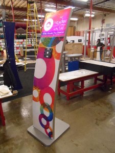
  5. Banner Stands, Tabletops, and Backdrops. At smaller shows, simple portable displays are ideal for exhibitors who still want a graphic presence but don’t have the budget, time, or the need for a larger display. 
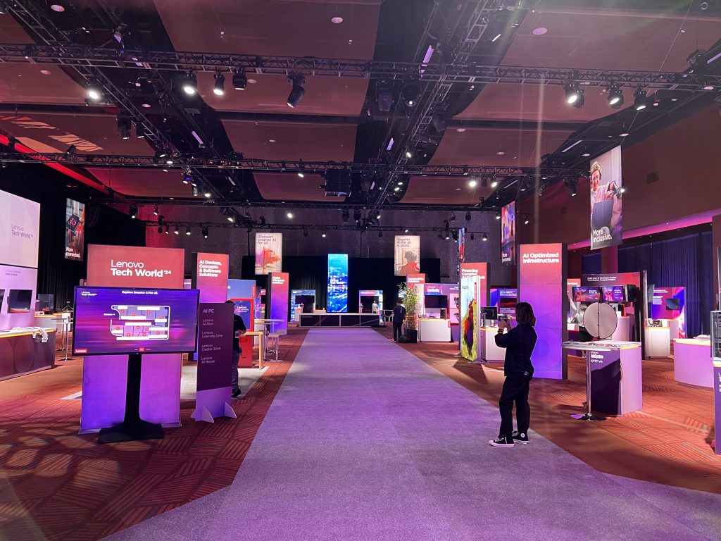
  6. LED Video Walls. It’s time to think of video walls as graphics and not merely the addition of video to a booth. The increasing popularity of larger LED video walls now augment or in some cases replace traditional graphics. 

Well-designed graphics effectively communicate your brand identity, key messages, and product offerings at a glance, ensuring that your presence is both memorable and impactful. From eye-catching banners and backdrops to informative signage and interactive displays, strategic use of graphics can differentiate you from the crowd, facilitate engagement, and ultimately contribute to lead generation and business growth.

Trade Show Graphic Design: Principles for High-Impact Visuals

Designing graphics on trade show displays can be overwhelming for many graphic designers. Most designers are comfortable with print or online projects, but when they shift to large format projects, it can be unfamiliar, both in the scale and content. 

Trade show graphics are like billboards. They must attract attention quickly to be successful. But unlike billboards, they’re competing with hundreds of other designs in varying heights in a chaotic environment with loud noises, unpredictable movement, and bright colors. 

Long Distance Relationship

Trade show graphics are meant to be viewed from a distance. Think about what elements you want to be seen either 6 ft. away or across the show floor. Avoid putting important elements at floor level. Higher elements will draw your customer’s attention. Those should be the ones you emphasize. Don’t use strange fonts or fancy fonts.

A Higher Power

Put important messages or images, like your logo, up high for visibility. There’s a reason companies put their logo on hanging signs.

White Space 

Use white or empty space. Don’t be afraid of white space, especially with backlit graphics. Backlighting colors, like blue or yellow for example, will make your canvas pop. 
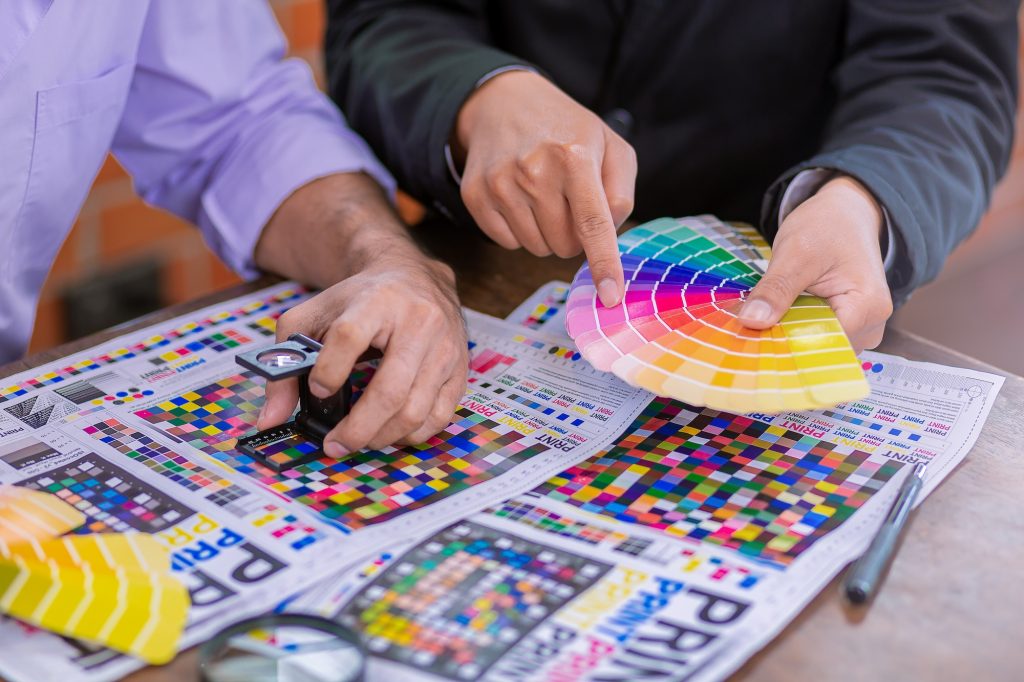
Pantone Color Match 

Use PMS colors to be sure to stay true to your brand. Reference specific Pantone swatches when color matching is critical. This goes back to working with a professional when possible. No one wants to have graphics shipped directly to the show only to find out that the nice mustard yellow they were expecting printed peach or pea green.

Multiple Fonts

One or two fonts is enough. Any more and you’ve got an identity crisis on your hands. Legibility is key with any graphic design but especially graphics that are being viewed from a distance. Look for a clean, easy-to-read type, and then if you want a little flare, add an accent font that is more unique, but don’t overuse it. And please, don’t use a cursive or handwriting font in all caps. Just don’t. As a side note, avoid any fonts with names like Giddy-up…

Have a Plan and a Purpose 

If this is for a large exhibit, make sure your graphics have a plan and/or coherency, don’t just place random product images on a wall because the wall is there. Be purposeful with your graphics. You have the opportunity to create graphics of a larger-than-life magnitude. Seize the day! 

trade show exhibit graphics

More Tips to Designing Trade Show Graphics That Maximize Engagement

There’s an often-cited rule regarding trade show design and graphics. You have 2.5 seconds to catch someone’s eye at a trade show or event. Here are some high-level things to consider.

  1. People are NOT going to read every bullet or every line of your copy. Your trade show exhibit is not a white paper or an instruction manual. It’s a 3D billboard meant to quickly communicate a problem and a solution. This rule doesn’t apply to pharmaceutical or scientific research companies.  
  2. Did you put graphics behind a counter, a table, or a monitor? It’s a common but avoidable mistake. 
  3. Aligning images across structural seams is VERY difficult for fabric graphics. Consider how you can create visual continuity without a line or image spanning separate panels. 
  4. Is your tagline, URL, or contact information at the bottom of your display? No one will see it…
  5. Graphics with lots of images, color, and text can be tricky. Sometimes they’re amazing but more often they’re cluttered and busy.  
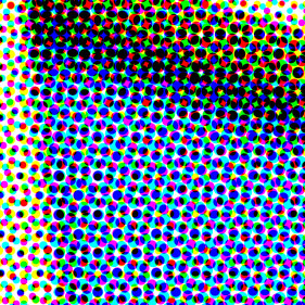
  6. Know your DPI. What works for a website or print media may not scale up for large print graphics. If you’ve ever seen a fuzzy or blurry graphic on a booth, that’s why. Here’s an excellent Image Resolution Calculator for determining size and DPI. 

Don’t forget the floor. Done well it can extend the graphic canvas available in a display. Often doubling it.

Printing & Resolution Tips for Trade Show Display Graphics

Explaining graphic file requirements to a client with limited graphic experience can be like explaining the earth’s curvature to a flat earther. The more you explain why an image from their website won’t work, the more defensive they become. To them, a graphic is a graphic — just make it bigger. 

Is Bigger Better?

To be fair, the concept of vector vs. raster files isn’t always intuitive. Then there’s the discussion of the graphic file types. Bottomline… You’ve told them their file isn’t a high-resolution image. But they still don’t understand.

trade show graphic design

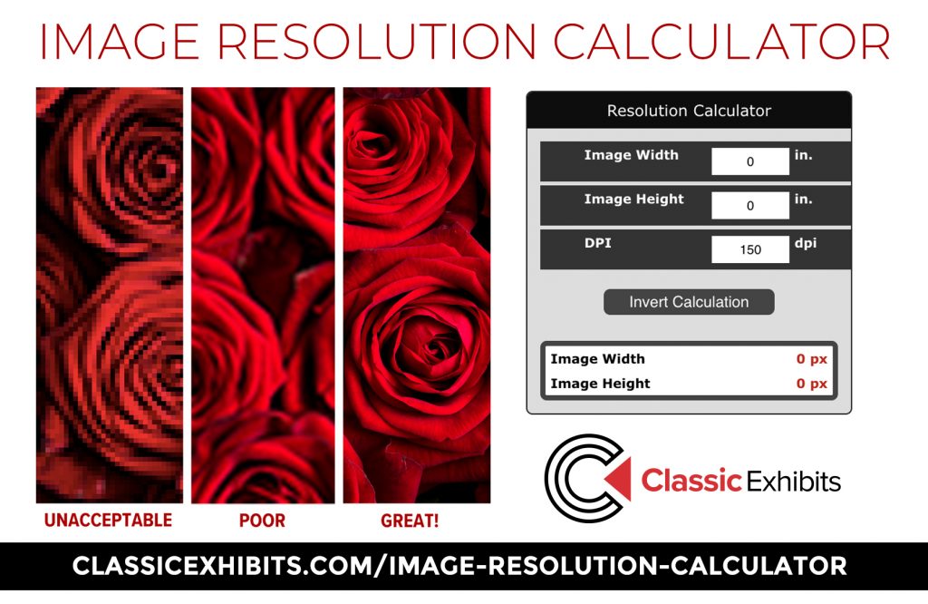
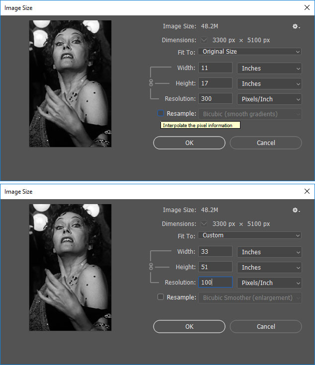
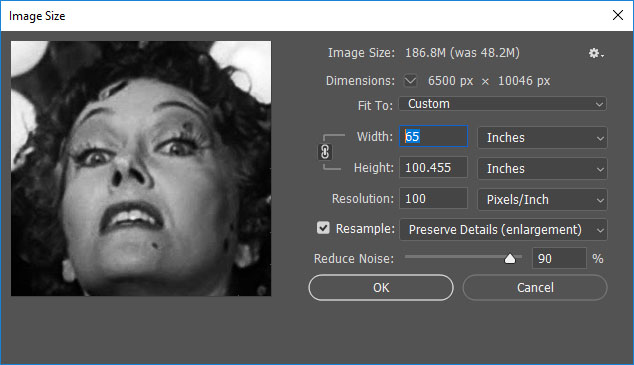
Years ago, we created an Image Resolution Calculator to make this concept more understandable.  It relies on three variables: Size, Pixels, and Dpi. Size is obvious since it’s measured in inches. Pixels and DPI less so to a non-graphic savvy client.

Fortunately, you have graphic design software ranging from basic photo apps to professional programs like Photoshop or Illustrator. Opening their low-resolution file on those, and then comparing it to what’s required in the Image Resolution Calculator is an easy way to demonstrate what they have vs. what they need.  

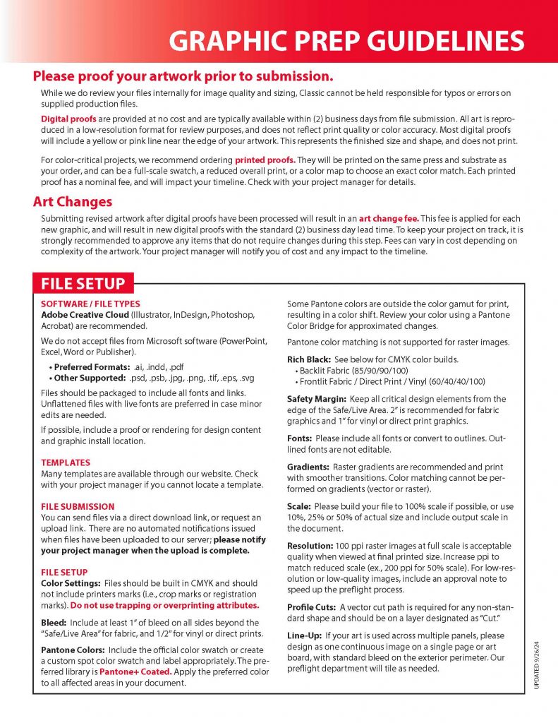
If you’re an expert, then all you need are the design prep guidelines. If you’re not, then pass these along to your graphic designer. 

trade show booth graphics

Professional Trade Show Graphics & Printing Support

Think of designing a trade show exhibit like working with an architect on a new house. It’s easy to get lost in the layout, but it’s the materials, details, and colors that make it distinctive. Trade show graphics turn a “house” into a “home” on the show floor. Attendees don’t remember that your booth had two towers, three counters, and a locking closet. They remember the colors, the theme, and the message, which is why your graphics must be both functional and visually striking. 

At Classic Exhibits, our Nationwide Distributor Network of Exhibit Professionals are experts in exhibit and graphic design. They’ll assist you with refining your marketing message and branding at a trade show and ensure your graphics are exceptional. Don’t guess about graphics. Not when there are experts who can maximize your trade show ROI. 

For over 30 years, Classic Exhibits has been designing and building creative custom solutions for our Distributor Partners and their clients. As North America’s largest private-label exhibit manufacturer, we have the unmatched capability, capacity, and creativity to create 3D projects ranging from 10 x 10 inline displays to 60 x 80 double-deck islands. Find success on the trade show floor with an exhibit that reflects your marketing message. For more information, see www.classicexhibits.com and explore Exhibit Design Search or request a meeting with a Classic Distributor Partner.

Designing Large Format Graphics for Trade Shows

April 3rd, 2025 1 COMMENT

large format graphics

Designing Large Format Graphics for Trade Shows

“Oh my god Becky, look at those large format graphics!”

Forgive the Sir Mix-a-Lot reference. But then again, most graphic designers have a good sense of humor, both artistic as well as musical. A good song can inspire and change your design mood, just as seeing work from other designers can give you great ideas.

What we are going to review today is the terribly easy world of large format graphics for trade show exhibits and other large structures. Now of course, as a graphic designer, you noticed I put the words “terribly easy” into that previous sentence and you instantly think I’m crazy. Most designers rarely design a layout larger than a corporate booklet or perhaps a 20″ x 30″ poster. Therefore, when it comes to knowing the secrets to making a perfect graphic print at 30 ft. wide by 10 ft. tall, designers get cold sweats and think of calling in sick that day.

But fear not. Designing for large format is actually quite simple once you know the basic steps. And, if you do large format designs on a regular basis, you might find that it is more enjoyable than most jobs. All it takes is a leap of faith… and trust in my advice.

Please note this is only a breakdown of the most important elements. Should you have more questions about large format graphics or need help with trade show graphic design, we’re here to help!

Viewing Graphics from a DistanceTip #1 – Large Format Graphics are Viewed from a Distance

When you look at a billboard along the freeway, you probably wonder how a large graphic can appear so crisp. The beauty of billboard graphics is that, if viewed from 1 ft. away, it would appear like a blotchy and dotted mess. It’s the perceptive ability in our eyes to complete images that makes such items work.

The concept for trade show graphics isn’t that much different. But, luckily, trade show printing is MUCH higher quality than billboards. However, the concept is the same. At a trade show, it is rare for a booth visitor to stand 1 ft. away from a printed graphic that is 30 ft. wide by 10 ft. tall. Though it does happen. A large format trade show graphic must be stunning from the aisle as potential customers pass by. You want to create something unique and eye-catching without worrying about print quality. Should someone stand next to the display, and really want to analyze the quality, they may notice a slight difference from perfect. But that isn’t common.

Tip #2 – Patience and Computer Power

You need to have a powerful computer before you design something in large format. Many of the files you will be processing can be beasts on your RAM and processing speed, not to mention your video card. Therefore, if you feel your system isn’t up to the task, but you have still been given the job of designing something very large, I recommend you be patient. Most modern systems that run graphic design software without crashing on opening will eventually process your requests if you wait. You just have to allow the system to get through all of the math.

One change you should make to your Adobe software (I’m assuming that is what you are using because hardly anyone uses other graphic design software today) is to alter the scratch disc settings. In Illustrator you will find that under “Preferences” then “Plug-ins & Scratch Disks.” When you find it, be sure to change the “Primary” to STARTUP and the “Secondary” to the largest hard drive on your computer. Usually that is the main drive, but if you have larger drives on your system used for storage, change it to that. In Photoshop, you will find these settings under the “Edit” menu followed by “Preferences” and then the “Scratch Disks” section. Here you may only have one option depending on your system. Specify the main drive as primary start-up disk and then, if you have a secondary, larger drive, used for storage, use that as another. This will actually set the drives to use hard drive space for extra processing during your layout.

Power systems today can use up to 32 GB of RAM and have processing speeds that are out of this world. 64 bit systems are always desired but not always affordable. The more RAM and processing power you have, and the faster video card you have with as much internal RAM as possible, the smoother your experience will be.

But, for many years I have worked on systems well below the standard recommended system for large format design and still accomplished my goals. The word is always patience. You need to allow the system to process.

Tip #3 – Resolution is Different in Large Format Design

Most standard corporate designs, such as business cards, brochures, booklets, and magazines, require you to work at 300 ppi (pixels per inch) or higher. However, for large format design, you do not need that level of resolution. Instead, most large format printers work at anywhere from 100 to 120 ppi maximum. The main rule is to always read the company’s graphic submission requirements so you know what resolution they are looking for. If they state that 100 ppi is the requirement, that means your “raster images” should be 100 ppi at final print size or 100% scale. Knowing this resolution requirement ahead of time will save you many hours of waiting for your computer to process and save a file. Imagine creating a display graphic that is 10 ft. wide by 8 ft tall in Illustrator or Photoshop with a resolution of 300 ppi or higher on raster effects and images! The time it would take (if your computer would even manage it) would be large indeed. And the file size would just be too big.

Large format printing is different from standard offset printing. Dye sublimation, UV wide format inkjet/direct print, and Lambda outputs print excellent quality at lower file resolutions. The brochure image you printed at 300 ppi can print the same quality at 100 ppi on fabric using a dye-sublimation press. It just works.

Scaling GraphicsTip #4 – Scaling Items and Viewing at 100% Zoom

At some point in your large format graphic design adventure, you will need to use raster/bitmap photo images in your layouts. Hopefully you have very large, high-resolution images, but how do you really know what will work?

When working with raster images, you should always pre-scale them in Photoshop so you know the “natural size” for all resolutions. For example, if you have a photo that opens in Photoshop and is naturally 11″ wide by 17″ tall at 300 ppi and looks perfect, you should then find out how that image will scale to larger sizes. To do this, go to the “Image” menu in Photoshop when the file is open and select “Image Size.” At that point, look at the dimensions of the file and then “uncheck” the “re-sample” box.

Once that is done, change the width of the image to something higher, like what you actually want it to print at. You will see the resolution drop. Or, alternatively, just change the resolution at that point to the required resolution your printer has asked for. In this case, the 11″ x 17″ image that is 300 ppi, when reduced to 100 ppi, becomes an image that will print to 33″ wide by 51″ tall. Not a bad increase. You can then re-sample the image to larger sizes, but we’ll get into that later.

Getting back to the original 11″ x 17″ image. Before you scale it up, be sure to view the image at 100% zoom on your computer screen (working on desktop systems is recommended as most laptops do not clearly show full quality). Large format printing is exceptionally accurate when it comes to the print quality in real life compared to what you see on your computer screen. Should you see an imperfection on the screen, it will print that way on the final output. It’s always good practice to view all raster images and full layouts at 100% and go through every inch of the design before you send it to a printer. That way, you will know if there is a quality problem.

So that 11″ x 17″ 300 ppi image, when dropped to 100 ppi, will now print at 33″ x 51″. That is an excellent enlargement without altering the file size in any way! But what if you need to make the image larger beyond that?

Tip #5 – How to Force Raster Images to Sizes Larger Than They Support

The latest version of Photoshop has excellent tools for making raster/bitmap images bigger than they naturally are. Older versions of Photoshop can also perform these tasks, but it requires multiple manual steps to accomplish the goal. The latest CC version has most steps built-in to the “Image Size” options.

Forcing Raster Images to Sizes Larger Than They SupportTo make our 11″ x 17″ 300 ppi file that has now become 33″ x 51″ when dropped to 100 ppi even bigger, we must force it up. The steps are simple but still require you to view the file at 100% scale afterwards. Begin by turning on the “re-sample” check box again when viewing the file with the “Image Size” window open. Then, look for the “Preserve Details (enlargement)” or “Bi-cubic Smoother (enlargement)” items in the drop-down menu beside the re-sample check box. Here you can play with the options presented in the enlargement as there are various settings to control. But, the basic idea is to choose one and then force the image up to the final print size.

For our example, let’s say we want to go to 65″ wide. With the re-sample check box active, the image will instantly convert to the correct height when you change the “width” to 65. And the print resolution will be maintained. Give it a try to see what happens. When the file has finally processed, you will see a larger image with some slight loss in quality. But, since we are printing in large format, which is usually viewed from several feet away, you shouldn’t have too much of an issue.

On a side note, it is not recommended you increase images beyond 200% in scale, especially if they are already lower quality images. Since you will be viewing the file at 100% scale on your screen and will know what each inch of the image will print at, the decision is up to you. Many raster images behave differently depending on the original quality of the image. I’ve seen some stock images scale up to 400% larger while others only support around 150 to 200%. It comes down to how the image was originally created.

Photoshop Noise and Manual Touch UpsTip #6 – Photoshop Noise and Manual Touch Ups

Beyond the scaling up of images we just discussed, you may find the need for further touch ups. I’ve found that using the “add noise,” “dust and scratches,” and the “reduce noise” filters after the enlargement can improve your finished image greatly. Experiment with these filters after going through the previous steps with an image of your choice to learn what works best.

Afterwards, I always recommend getting back to the 100% zoom setting and then manually fixing any blotchy areas or imperfections using cloning tools or the content aware fill features in Photoshop.

Tip #7 – Software Choice is Key

Most large format printers will accept files from Photoshop and Illustrator. Some will accept InDesign but more rarely. Very few will accept Corel products or third-party free apps like GIMP. And, I do not know of any respectable large format printers that will accept standard files from MS office software such as Word, PowerPoint, and so on. Therefore, it is important to have the right design software.

My first choice for large format design is always Adobe Illustrator. Although most designers feel more comfortable in Photoshop, Illustrator is really the most powerful tool for final assembly of your large format design.

You will of course use Photoshop for all preparations of raster images before placement into the Illustrator design, which makes Photoshop very important. But as an assembly tool with superior control of color, measurement, tone, and scale, no software compares to Illustrator, especially with the vector capabilities for shapes, illustrations, text, logos, and so on.

Sometimes you may need to only work in Photoshop if the entire job is raster based, and you must work at extreme dimensions and settings. That is OK too. The key is to know the graphic requirements of the printer and adapt accordingly. Which brings us to the next step.

Tip #8 – Read the Graphic Requirements

Each large format job will have a specific list of graphic requirements for how the job should be prepared. Some printers will actually ask you to send “only PDF” files while others want original source files. But the key beyond the file format is the steps you need to take for proper file prep.

– Should the file be 100% scale (or can it)?
– Should the file be in RGB or CMYK mode?
– Will Pantones be an option and, if so, should you use coated or uncoated?

All large format presses are run in CMYK and do not conform to the usual offset printing rules. They can’t put in, say, Pantone 200C ink, and give you a match. Rather, prints are calibrated on a job-by-job basis in CMYK (or, on rare occasions, sometimes RGB) to try to get the color you indicated. Therefore, knowing how a printer wants the job is very important. So read the manual!

Tip #9 – Choosing a High-Quality Large Format Printer

There are several hundred large format printing companies in North America. Most are good. A few are amazing! Who you select for your large format printing may be as simple as geography (they’re close) or industry specialty (trade show, retail, or outdoor) or past relationship (we trust them) or equipment (they have the latest dye-sublimation printer). 

Let’s put all that aside for just a moment and pretend you’re researching your options. What should be on your list of requirements? Quality, obviously. Price, of course. Capability, naturally. Customer Service, yes. Here are some factors to consider:

  1. Your Needs. Every business has unique large format printing needs. Some have the luxury of time and clients with flexible budgets so quality is #1. Others are driven by speed and quick turnarounds. Still others need a printer with extensive technical and graphic design support. Defining your needs will narrow your choices on potential large format graphic vendors.
  2. Volume. Some printers will only accept multiple quantity orders, which is common for retail applications. Others target single prints, like for trade show exhibits. As a result, their equipment and materials may be specific to those applications.
  3. Equipment. This isn’t just about what printing equipment they have – inkjet, laser, dye-sublimation, Gerber cutting equipment, vinyl, sewing, etc – but also the quantity and age. Some printers have multiple dye-sublimation printers for example, capable of printing in 10 ft. or 16 ft. widths. Others may only have one but upgrade it every 2-3 years as the technology improves. 
  4. Services. Does your printer provide pre-flight, creative design, fulfillment, or staging services? Are they necessary for every customer? No. But if your business model relies on any of these, then choosing the right printer makes a difference. 
  5. Sustainability.Sustainability may be your #1 requirement when choosing a printer.. Large format printers with a sustainable mission devote considerable time and resources to minimizing their environmental impact, including using recycled printing paper and fabric, vegetable-based inks, energy-efficient equipment, and implementing comprehensive recycling programs. 
  6. Customer Service. You’ve narrowed your choices down to large format printers with the most modern equipment, fastest turnaround times, and lowest prices. However, all those “pluses” will become “minuses” if their customer service is unresponsive, inflexible, or even hostile. Most often than not, your team will choose the vendor with the best customer service, not necessarily the best prices. It’s hard to fault them, since a reliable, supportive printing partner makes their job easier and the final product more predictable. 

By carefully considering these factors, you are more likely to select a large format printer that delivers the quality and performance you require.

Tip #10 – Leverage Large Format Wall Graphics to Elevate Your Trade Show Presence

Large format graphics play a pivotal role in the success of trade show exhibits. In the competitive environment of a trade show, where numerous businesses vie for attention, these graphics serve as powerful tools for attracting and engaging potential clients. For an excellent summary on the Do’s and Don’ts of Trade Show Graphics, see this article

Key Benefits to Large Format Wall Graphics for Trade Show Exhibits:

Enhanced Visual Impact: Large format graphics create eye-catching displays that stand out from the crowd. Their size and vibrant colors draw attention, making it easier to capture the interest of attendees.

– One of the best ways to create seamless, high-impact trade show displays is by using silicone edge graphics (SEG). These graphics provide a clean, frameless look, making them a favorite for modern trade show booths. SEGs also offer easy installation and fabric tensioning for a professional, wrinkle-free appearance.

Stronger Brand Recognition: These graphics provide a large canvas for displaying logos, slogans, and brand messaging, reinforcing brand identity and increasing brand visibility. Consistent use of brand elements across the exhibit creates a cohesive and memorable impression.

Effective Information Delivery: Large format prints allow for the clear and concise presentation of key information, product features, and benefits. They enable businesses to communicate their value proposition effectively, even from a distance.

Increased Visitor Engagement: Visually appealing graphics create a more engaging and interactive booth environment. They encourage attendees to stop, explore, and interact with the exhibit.

Maximized Booth Space: Strategically placed large format graphics can optimize the use of booth space, creating a visually appealing and organized display. They can be used to create backdrops, banners, and signage that enhance the overall look and feel of the exhibit.

Professionalism: High quality large format graphics convey a sense of professionalism, and attention to detail. This helps to build trust with potential clients.

Large format graphics are essential for creating impactful trade show exhibits that attract attention, reinforce brand identity, and drive engagement. They help businesses make a strong first impression and stand out in a crowded environment.

More Large Format Graphic Design Tips

  • Less is more in large format design. Keep your designs simple. Something that is 20 ft wide, if very complex, will seem even more so. Simple images create stunning results.
  • Keep a buffer of white/blank space in the design. Often you will find that display structures in large format have very odd constructions and shapes. Therefore, try not to span too many elements close to edges or over onto other elements of the design that have breaks. Rather, the more you keep “focus” elements of your design on the side/base they are intended, the better visual result you will have for marketing.
  • One item in large format graphic design that makes all designers shudder is file size. If you are trying to create something so very large in the real world, you of course expect your file size on the computer to equal that frightening number. But there are tips to solve this, especially if working in Illustrator. 
  • Finally, you should never feel embarrassed as a designer to contact another designer for help. If any of the information you read here today, or any information you see on the graphic requirements pages/sheets for your current large format job don’t make sense, be sure to contact the company and ask questions! That is why these people are working in this industry. They WANT to make your graphic the most beautiful output possible. Designers that work in large format really care about results and always want to make the highest quality prints anyone has ever seen. So, if you just are not sure what to do, just contact the company you are working with. All professional large format design teams are eager to assist any level of designer as they enjoy the work and conversation. If you encounter someone who “doesn’t” treat you that way, you are not working with a professional team.

Get Professional Large Format Graphics for Your Next Trade Show!

Large format graphics, whether direct prints or fabric, have changed trade shows marketing over the past decade. Modern exhibit graphics are much more vibrant, detailed, colorful, and larger. Add the impact of backlighting and LED accent lights and the color, impact, and shape possibilities are nearly unlimited. The key to successful large format graphics is three-fold:  1. A strategic plan for your branding, 2. Putting that plan in the hands of an experienced trade show (or 3D) graphic designer, and 3. Identifying the right large format printer. 

Based in Portland, Oregon, Classic Exhibits Inc. designs and manufacturers portable, modular, and custom-hybrid exhibit solutions and prints large format graphics.. Classic Exhibits products are represented by an extensive distributor network in North America and in select International markets. For more information, contact us at www.classicexhibits.com or www.summitgraphicspdx.com.

Graphic Designers for Trade Shows and Events

September 16th, 2021 2 COMMENTS
Graphic Designers

Guest Post by Lori Hanken, Total Displays

So you bought or are renting a new trade show exhibit. It is exciting the possibilities in front of you. When you are on the trade show floor you have one chance to capture someone’s attention. The structure is just part of it. The bigger thing?  

Trade Show Graphics!

Let’s talk graphic design. What do you think of when you hear someone is a graphic designer? Do you think about logos? Websites? Flyers? Social Media? Here is what I think (I really should say know, but I don’t want to sound arrogant). 

Graphic Design is TOO broad of a category. Let’s run a little scenario. You have a “marketing firm”. That marketing firm helps you with campaigns, print campaigns, email campaigns, social media campaigns, maybe some logo design and other fun things like that. Then you decide it is time to update your trade show exhibit. Who do you turn to? Your marketing agency?

Alternatively, it seems like many recent marketing graduates or unemployed graphic designer has created a home based business to offer graphic design services to companies. Be very careful hiring these people without vetting them first. I am all about entrepreneurship, but your trade show graphics will have a HUGE impact on your success at a trade show. 

Let me tell you a little secret. DESIGNING FOR TRADE SHOW DISPLAYS IS COMPLETELY DIFFERENT THAN ANYTHING ELSE! We have seen trade show graphics that read like a marketing flyer. We have seen backwall graphics that are so busy with lifestyle or action shots and color that your brain goes, ‘WHHHOOOOOAAAA”, just looking at it.

Graphic Design for Trade Show Exhibits

Graphic Design Tips and Advice

You have 2.5 seconds to catch someone’s eye at a trade show or event. Here are some high level things to consider.

  1. People are NOT going to read all your copy. Your trade show exhibit is not a marketing flyer. Yes, I will say this multiple times.
  2. Putting graphics behind a counter or a table? The graphics are lost.
  3. Trying to align images (depending on the system) across structural seams is VERY difficult for fabric graphics.
  4. Putting messaging on the bottom of your display? No one will see them.
  5. Busy, busy, busy graphics with lots of images, color and text will be ignored (unless that is part of your brand).
  6. Images from a website or print media do not generally enlarge well for trade show exhibits.
  7. A jpeg of your logo may not enlarge well.  

We have had numerous interactions with “trade show exhibit graphic designers” over the years. Based on the questions they ask and the designs they create, it’s often pretty clear they do not specialize in trade show graphic design. It is a completely different animal from digital marketing, website, or even print marketing.

Trade  Show Graphic Design

If you are designing new graphics for a trade show exhibit, here are a couple of suggestions.

  • Ask for references from your agency of choice for large format, trade show exhibit design clients.
  • Check their website. A bullet item that says they do trade show booths or graphics, doesn’t mean they excel at trade show graphics.
  • Check their website or ask them for examples of  previous trade show work. 
  • If most of their work is digital marketing, web design and social media marketing? Find another designer. Your bank account will thank you. Your patience will thank you.
  • Make sure you have a library of your marketing assets, logo source files, high resolution images etc. 

Tried and True Suggestions

Here are some simple, tried and true suggestions for trade show graphic design.

  1. Trade show graphics are meant to be viewed from 6 ft. or more away.
  2. Don’t use strange fonts or fancy fonts.
  3. Put important messages or images, like your logo, up high for visibility.
  4. Use white or empty space. Don’t be afraid of white space.
  5. Reference/use PMS colors to be sure to stay true to your brand.
  6. Less is more. Don’t try to put an entire flyer on your trade show graphic.
  7. If this is for a large exhibit, make sure your graphics have a plan and/or coherency, don’t just place random product images on a wall because the wall is there. Have a plan. Be purposeful with your graphics.

If you need help with trade show graphic design? I recommend starting with your trade show exhibit company. A good partner should have resources or recommendations that they know have experience in large format, trade show exhibit design.

Total Displays can help. Contact us a sales@totaldisplays.com or 952-941-4511 to set up a free design consultation call. Click HERE to see more blog posts from Lori Hanken

Vibrant Color and Stunning Contrast Gallery

August 6th, 2014 COMMENTS

Glenna Martin, Graphic Design Manager

Glenna Martin, Graphic Design Manager

Graphic Inspiration Galleries

Several months ago, Glenna Martin, our Graphic Design Manager, created the first Graphic Inspiration GalleryGraphics that Complement the Display. Glenna pulled 38 Past 5 Days photos to show effective examples of structure and graphics. If you haven’t read her notes, I urge you to review them. You may want to consider directing graphic designers to the galleries if they are unfamiliar with trade show graphics.

Glenna has created another gallery, Vibrant Color and Stunning Contrast. This gallery discusses color strategy and image placement. As you click-through the photos and read the text, Glenna identifies how colors serve to create a cohesive image and guide your eye to the important images and text. It makes so much sense to a non-graphic designer once you read her notes, but it takes a talented graphic designer to build it. See all 30 photos in the Graphic Inspiration Gallery in the Resource menu. Here are a few examples to entice you.

Gorgeous example of how wonderful backlighting can showcase rich color.

Great combination of white space and high color saturation in the photo. The white space allows the logo to stand out while the bright green wings frame the entire design nicely.

The wide gamut of bright colors give this iPad stand WOW factor in a small amount of space.

Black and white photo with color photos set forward really showcases the product in this display’s graphics.

We welcome your comments.

–Mel White
http://www.linkedin.com/in/melmwhite
mel@classicexhibits.com

**********************************************

Based in Portland, Oregon, Classic Exhibits Inc. designs and manufacturers portable, modular, and custom-hybrid exhibit solutions. Classic Exhibits products are represented by an extensive distributor network in North America and in select International markets. For more information, contact us at 866-652-2100 or www.classicexhibits.com.

[subscribe2]

The 10 Do’s and Don’ts of Trade Show Graphics

November 6th, 2013 5 COMMENTS

VisionaryBlogBanner

You decided on your new trade show display . . . but you’re not done yet. Now, it’s time to design the graphics. Every day we see completed graphics, many of which we feature in Past 5 Days. Some amaze us. Others not so much. You want AMAZING!. Below are 10 tips to consider when designing your next trade show graphics.

1. Look Up. Think about what elements you want seen either 6 ft. away or across the show floor. Avoid putting important elements at floor level. Higher elements will draw your customer’s attention. Those should be the ones you emphasize.

2. Hire a Graphic Designer Who Understands Trade Show Graphic Design. Most don’t. Don’t spend thousands of dollars on a new display only to use lackluster, unprofessional graphics. It’s the equivalent of working out to build a 6 pack and then wearing a muumuu. A professional graphic designer will know how to source quality files, format them, design your graphics, and hit your deadline.

If you don’t know what resolution, PMS color, vector art and bleed are, trust me, you don’t want to be responsible for file preparation. Hire someone who knows what they’re doing. The graphics are as important as your physical display, if not more important, and they can make or break your display presentation.

3. Your Display isn’t a Paper Brochure. This is the single biggest mistake most exhibitors make. You want your messaging to be clear, concise, and to the point. Leave the details for the printed or electronic collateral. No one is going to read text heavy graphics so keep it simple and impactful. Get the help of a copywriter if you can. Avoid clichés and tired expressions like “innovative” and “unique.” Get to the root of the problem and state your solution. Strong messaging that can be digested in 15 seconds or less will make your display MUCH MORE effective.

4. Image Quality Counts. Photos should be high resolution or vector, especially for your logo. Always have native, clean artwork for projects. This is critical! Spend the extra money to get good quality stock photography. It’s not that expensive and can make a HUGE difference in your booth. This isn’t a billboard — people will be walking up and even touching your graphics. Nothing makes a graphic designer cringe more than being handed a business card and asked to pull a logo from it. If you worked with a designer to create an identity for your company, ask them for the native files. You may not be able to open them, but that doesn’t mean your designer won’t be able to. This is why you hired a professional in the first place, remember?

5. The Devil is in the Details. View your graphics rendered on the display. Sometimes elements of the physical booth really have an affect on the flow of your graphics. You won’t know until you see them so make sure that you view them before you print them. Be sure that you know where accessories like shelves and monitors are placed. Exact measurements are critical. Too many times the graphics arrive and they look amazing, vibrant, and perfect . . .  until you realize that the monitor cuts off half of your logo. Seeing the graphics rendered will help prevent mistakes and be worth the added time.

6. Create a Flow. Sometimes clients have a million ideas in all different directions. Just because your display has four different graphic surfaces that doesn’t mean that you should treat them as such. Make sure your graphics tell a coherent story. If your client wants each of their four products featured, one on each panel, that’s fine. Find a way to tie them together. Make sure that the color scheme and design as well as your copy works together. Don’t re-invent the wheel with each panel. You want the overall design to work together — not confuse.

7. Color is Your Friend . . . or Your Enemy. Reference specific Pantone swatches when color matching is critical. This goes back to working with a professional when possible. Trade shows are notorious for being tight turn projects. No one wants to have graphics shipped directly to the show only to find out that the nice mustard yellow they were expecting printed peach or pea green.

8. Don’t Font It Up. One or two fonts is enough. I promise. Three fonts is pushing it. Any more than that and you’ve got an identity crisis on your hands. Legibility is key with any graphic design but especially graphics that are being viewed from a distance. Look for clean, easy-to-read type and then if you want a little flare, add an accent font that is more unique, but don’t over use it. And please, I beg of you, don’t use a cursive or handwriting font in all caps. Just don’t. As a side note, avoid any fonts with names like Giddy-up.

9. Scale is Everything. You have the opportunity to create graphics of a larger than life magnitude. Seize the day! Go big or go home. Don’t waste your time designing 20 foot graphics that are only meant to be viewed from two feet away. Again, let them use your collateral for details and smaller views of things. Think about what you want people to see from three aisles over. Show them something that makes them want to visit you.

10. Cut Your Losses. If your client wants to do something really dumb and you’ve tactfully advised them why they shouldn’t, then let them do it. They’ll learn. They can only smack their thumb so many times with a hammer before they eventually discover how to hit the nail. 😉

Need assistance with your trade show graphics? Let us know. Share your tips for AMAZING trade show graphics in the Comments section.

Glenna Martin
Graphic Design Manager

http://www.linkedin.com/in/glennamartin
glenna@classicexhibits.com

**********************************************

Based in Portland, Oregon, Classic Exhibits Inc. designs and manufacturers portable, modular, and custom-hybrid exhibit solutions. Classic Exhibits products are represented by an extensive distributor network in North America and in select International markets. For more information, contact us at 866-652-2100 or www.classicexhibits.com.

[subscribe2]