Trade Show TalesBlog

Posts Tagged ‘Hybrid Displays’

Sacagawea vs. Magellan vs. Perfect 10 vs. Visionary Designs

July 22nd, 2010 3 COMMENTS

Comparing Four Hybrid Display Systems from Classic Exhibits

Are you comfortable describing the differences between the Sacagawea, Magellan, Perfect 10, and Visionary Designs Hybrid Systems with your customers? If not, here’s an excellent summary of each product line.

It’s actually fairly straight-forward (and it makes a lot of sense). Please understand (which translates to me CMA) that these distinctions are broad-based, and there are always exceptions.

In order, from the lowest to the highest starting prices . . . .

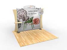
Sacagawea VK-1222

Sacagawea Portable Hybrid Displays

Starting Prices:  $3100 (10×10) | $6225 (10×20)

Sacagawea is the entry level portable hybrid line for Classic Exhibits. Introduced about a year ago, it is our most successful product launch ever. The reasons are obvious:  three attractive design series, compact and versatile displays, and terrific price points.

  • Sizes: Table Tops, 10 x 10, 10 x 20, Pedestals, and Workstations.
  • Kits: 65 standard kits.
  • Straight Extrusions:  Mostly straight extrusions with MODUL S40 uprights and Z45 horizontals.
  • Graphics:  Primarily one large tension fabric graphic @ 7.5 ft x 6.75 ft with a smaller tension fabric graphic and/or direct print graphics. Velcro tension fabric.
  • Assembly:  MOSTLY attached knobs with some hex key connections. Individual numbered parts with setup instructions.
  • Colors:  (9) Sintra/Plex Wing colors. (1) Standard extrusion color:  Silver (clear satin anodized).
  • Packaging:  LT-550 Portable roto-molded case(s) with die-cut foam inserts.

Bottom Line:  Least expensive, mostly straight extrusions, primarily knob assembly, medium-large graphics. Ideal for anyone considering a pop up display.

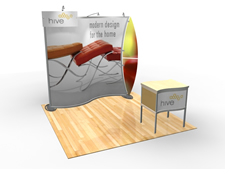
Magellan MOR VK-1077

Magellan Portable Hybrid Displays

Starting Prices:  $4500 (10×10) | $8745 (10×20)

Magellan Hybrid designs vary from straight-forward to complex. Anyone who loves curves, loves Magellan because the kits are all about curved metal and large tension fabric graphics. The most popular have been the Miracle and MOR, which not surprisingly are also the most affordable.

  • Sizes: 10 x 10, 10 x 20, Pedestals, and Workstations.
  • Kits: 62 standard kits.
  • Curved and Straight Extrusions:  Curved and straight extrusions using MODUL Z45 and S40 for horizontals and verticals.
  • Graphics:  One, two, or multiple large tension fabric graphics. Example: 7.4 ft x 7.8 ft and 2 ft x 7.8 ft (Magellan Miracle) with possible direct print graphics. Velcro tension fabric.
  • Assembly:  MOSTLY attached knobs with some hex key connections. Individual numbered parts with setup instructions.
  • Colors:  (9) Sintra/Plex wing colors. (1) Standard extrusion color:  Silver (clear satin anodized).
  • Packaging:  LT-550 Portable roto-molded case(s) with die-cut foam inserts.

Bottom Line:  Inexpensive, mostly curved extrusions, primarily knob assembly, large graphics. Ideal for anyone upgrading from a basic display system such as banner stands, pop ups, or curved pillowcase graphics.

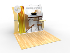
Perfect 10 VK-1507

Perfect 10 Portable Hybrid Displays

Starting Prices:  $5200 (10×10) | $12,840 (10×20)

There is nothing on the market remotely close to the Perfect 10 and Perfect 20. It defines sexy for a portable hybrid display. It assembles without tools and comes in a mind-boggling assortment of color and shape options, all included in the standard price. The P10 is protected by multiple design and utility patents.

  • Sizes: Table Tops, 10 x 10, 10 x 20, Banner Stands, Pedestals, and Workstations.
  • Kits: 38 standard kits.
  • Curved Extrusions:  Mostly curved extrusions using MODUL S40 for verticals and custom Z33 horizontals.
  • Graphics:  One or two large tension fabric graphics. Example: 8 ft x 5.8 ft and 8 ft x 2 ft (VK-1507) with possible direct print graphics. Velcro tension fabric.
  • Assembly:  ALL attached knob assembly and hinged components. Individual numbered parts with setup instructions.
  • Colors:  (9) Sintra/Plex wing colors. (7) Powder-coat extrusion colors.
  • Packaging:  LT-550 Portable roto-molded case(s) with die-cut foam inserts.

Bottom Line:  Competitively priced, mostly curved extrusions, all knob assembly, large graphics, more options. The Perfect 10 System epitomizes high design and offers the most standard options of any portable hybrid in the world.

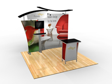
Visionary Designs VK-1900 SEGUE

Visionary Designs Hybrid Exhibits

Starting Prices:  $7788 (10×10) | $14,826 (10×20)

With Visionary Designs, anything is possible – portable, modular, custom, and custom-hybrid designs. As the saying goes, “form follows function,” and the amorphous design capabilities of Visionary Designs allows you to create simple, complex, large, or small displays.

  • Sizes: Table Tops, Inlines, Islands, Counters, Pedestals, and Workstations
  • Kits: Over 300 standard kits
  • Extrusions:  Hundreds: Depends on the design and the function.
  • Graphics:  From one to multiple tension fabric and direct print graphics.  Velcro and silicone edge tension fabric.
  • Assembly:  Hex key assembly. Individual numbered parts with setup instructions.
  • Colors:  Standard Sintra/Plex colors. (1) Standard extrusion color:  Silver (clear satin anodized). Powder coat and anodizing options available for an addition cost.
  • Packaging:  Roto-molded cases, tubs, and jigged wood crates.

Bottom Line:  Extensive extrusion options, hex key assembly, small, medium, and large graphics (including SEG), unlimited designs, inlines, islands, and table tops. Visionary Designs includes the new SEGUE line of Silicone Edge Graphic displays, which maximizes graphics and minimizes visible extrusion.

Let me know if you have any questions or would like an in depth review of these systems. I would ask that you forward this link to anyone in your organization who would benefit from this comparison.

Also, please let me know if you would like to participate in the webinar Exhibit Design Search:  Tips, Tricks, and Techniques in September, along with a webinar about the basics of blogging.

–Mel White

http://www.linkedin.com/in/melmwhite
mel@classicexhibits.com
Classic Exhibits Network (LinkedIn)

Word on the Street — November 9th thru November 13th

November 14th, 2009 3 COMMENTS
Word on the Street by Kevin Carty

Word on the Street by Kevin Carty

Love thy Neighbor (Unless They Own a ’79 Chevette on Cinder Blocks) 

Most neighborhood developments in America since the early ’90’s have covenants. These covenants specify what you can and can not do to your house, your lawn, and even whether you can park your land yacht in your  driveway or paint your house bright pink. Why do neighborhoods impose these covenants? Basically, so you do not end up living next to neighbor with 4 ft. tall grass, plastic pink flamingos, and a ’79 Chevette on cinder blocks.

I propose that we consider similar guidelines for the trade show floor.

This past week, I walked the Greenbuild Show in Phoenix. Let me start off by saying that the show was gorgeous — It was seriously one of the most beautiful and well-managed events I have attended in years. Kudos to Champion Exposition Services for putting on such a great event. Kudos to most of the exhibitors for their creative and stunning exhibits.

However, like all shows, there were still some black eyes. On Wednesday, Tim Morris,  the President of Eco-systems Sustainable Displays, and I walked the floor for most of the day. And we both had a few moments where we shuddered a bit. I’m not including photos to protect the exhibitors in question, but man-o-man were there some doozies!

We were walking down an aisle filled with beautiful 10 x 10 and 10 x 20 inlines, mainly hybrid display systems, when we came upon Mr. Blue Fabric Pop Up planted between two of the most spectacular 10 x 20 inline exhibits on the aisle. Well, this pop-up looked like a dress shirt that had been balled up in the closet for about 24 months! Panels were wrinkled to the point that I am pretty sure they were folded and not rolled. Detachable graphics were nothing more than printed pieces of paper that had been stapled into place . . . CROOKED! And the topper (pun intended) was the header graphic . . . or lack thereof. It was the black and white sign provided by show services, hung haphazardly and off-center.

Now, I realize that we are in a rough economy and that people are pinching pennies — but REALLY!?!?

As Tim and I walked past, we couldn’t help but comment to the other exhibitors. They were not amused by Mr. Blue Fabric Pop Up. Their exhibits were beautiful and their neighbor was a ’79 Chevette on cinder blocks.  It really did detract from their professional exhibits, and, it seriously made people walking past not want to engage the exhibitors surrounding Mr. Blue Fabric Pop Up. We watched it happen.

I know it’s a slippery slope, but I really think there should be some basic “aesthetic” guidelines that exhibitors must adhere to.

What do you think? And please share your examples of Mr. Blue Pop Up. Photos are optional.

Have a safe and restful weekend!

–Kevin Carty

http://twitter.com/kevin_carty
http://www.linkedin.com/pub/kevin-carty/3/800/32a

When 50% “Show” and 50% “Trade” is 100% “In Doubt”

September 29th, 2009 1 COMMENT
trade-show_portland

The Future of Trade Shows

After ten plus years in the exhibit industry, I tend to make assumptions about trade shows. To me, they are convention halls, pipe and drape, carpeting, hanging banners, and trade show displays. They are drayage, union labor, and confusing electrical forms. You expect the typical exhibit hall to be 50 percent “show” and 50 percent “trade” once the doors open.  

Admittedly, my perception is a bit skewed. I work for a portable, modular, and custom-hybrid exhibit manufacturer, and tend to see every show as a healthy dose of our designs with a smattering of custom exhibits and a sprinkling of banner stands. Those are trade shows, all set within a large exposition hall. That said . . .  I’m not naïve. I know a typical arts and crafts fair, Chamber of Commerce show, or local health fair doesn’t have all the pomp and circumstance of a traditional trade show. However, even those shows have professional table top displays, pop ups, and banner stands. I have always believed (and preached) that if you want your show to be successful, you should follow the advice of industry experts.

No Carpeting, No Pipe and Drape, No Drayage

Two weeks ago, I discovered otherwise. I learned, through personal experience, that you can hold a successful show without carpeting, without hanging banners, and largely without professional displays. People will come if the event speaks to their hobby or their lifestyle. And, in many situations, a more casual approach may give the event more credibility – especially in the beginning.

vegfes1About three months ago, I volunteered to assist with a local vegan/vegetarian festival, called the Portland VegFest 2009. This isn’t a new event. In fact, this year marks the 5th year, but this was the first year the VegFest was to be held in the Oregon Convention Center. The previous events were held in a local high school cafeteria. As the newbie on the planning committee, I quickly learned that the committee was well-organized, professional, and knowledgeable, but that the event had little money for the normal bells and whistles of a trade show. There would be no carpeting or hanging banners. Signage would be minimal, and even the printing of the black and white program was held to 1500 copies.

(more…)

Perfect 10 Portable Hybrid Display — Setup Animation for Trade Show Exhibit (Cool!)

July 4th, 2009 COMMENTS

Excellent animation by Mike Swartout, the Classic Design Director, for the Perfect 10 Portable Hybrid Display. The animation video shows the P10 Helio (VK-1507) with inline wings, hard rock maple laminate, and a rectangle header. The background jazz music is the perfect compliment to this video.

httpv://www.youtube.com/watch?v=GKM-ZtSGf48

(more…)

Classic Exhibits Gets Some Street Cred

April 15th, 2009 COMMENTS
Earning Our Street Cred

Earning Our Street Cred

I’m neither an old man, nor a young man . . . unless you ask Kevin who referred to me as a geezer at EXHIBITOR. Nor can I claim to have a long history in the exhibit business. My experience is limited to about 10 years with three exhibit manufacturers. Many of you know my background (and my former employers), so I won’t go into details. The details are not important, except to say that I’ve worked for two companies that were competent, resourceful, creative, aggressive, and second-tier players in the portable/modular market. There is nothing wrong with being a second-tier player, especially if the company is filling a niche, is profitable, and is clearly a first-tier player within that niche. And in both cases, my former employers were good companies with great products.

What about the third company? Classic Exhibits is the third, and if I was honest, I’d admit (reluctantly) that about five years ago Classic was perceived as a second-tier player. Was that perception fair and accurate? Probably not, but perception carries a lot of weight in our industry, especially in the portable, modular, and hybrid segment. In fact, we hadn’t been a second-tier player for many years, but Classic took a very low-key approach about marketing the Classic Exhibits’ brand. If you didn’t know us, and didn’t work with our designers, our project managers, and our production team, it was easy to image us as “Five Guys in a Garage.” Five VERY TALENTED guys in a garage who could do just about anything, but, sigh, . . . still just five guys.

(more…)