Trade Show TalesBlog

Posts Tagged ‘Graphic Design’

How to Speak Graphic Designer (Infographic)

August 25th, 2015 1 COMMENT

How-to-Speak-Designer-Infographic

28 Design Terms Marketers Should Know

Wow! Two sensational infographics within a week. This one should be printed, framed, and hung on the wall next to every graphic designer and marketing manager. No more misunderstandings about leading and kerning. No more wasted conversations about web-friendly fonts. No more confusion about UI and UX.

Our thanks to Sarah Matista at Pagemodo.

Pagemodo-How-to-Speak-Designer-Infographic

–Mel White
mel@classicexhibits.com
http://www.linkedin.com/in/melmwhite
https://twitter.com/melmwhite

**********************************************

Based in Portland, Oregon, Classic Exhibits Inc. designs and manufacturers portable, modular, and custom-hybrid exhibit solutions. Classic Exhibits products are represented by an extensive distributor network in North America and in select International markets. For more information, contact us at 866-652-2100 or www.classicexhibits.com.

[subscribe2]

How Your Eyes Move on a Website [Cool Inforgraphic]

August 13th, 2014 COMMENTS

Single Grain designed this excellent infographic that explains:

  1. How our eyes move on a website or blog,
  2. How web design influences eye movement and interaction, and
  3. Proposes tips for creating an effective website design.

I thought this might be helpful to Classic Distributors redesigning their website. It’s a topic I hear almost every day since so many distributors have branded versions of Exhibit Design Search.

Enjoy!

how-your-eyes-move-on-a-website-infographic-internet-marketing-with-blog-optimization

–Mel White
http://www.linkedin.com/in/melmwhite
mel@classicexhibits.com

**********************************************

Based in Portland, Oregon, Classic Exhibits Inc. designs and manufacturers portable, modular, and custom-hybrid exhibit solutions. Classic Exhibits products are represented by an extensive distributor network in North America and in select International markets. For more information, contact us at 866-652-2100 or www.classicexhibits.com.

[subscribe2]

Vibrant Color and Stunning Contrast Gallery

August 6th, 2014 COMMENTS
Glenna Martin, Graphic Design Manager

Glenna Martin, Graphic Design Manager

Graphic Inspiration Galleries

Several months ago, Glenna Martin, our Graphic Design Manager, created the first Graphic Inspiration GalleryGraphics that Complement the Display. Glenna pulled 38 Past 5 Days photos to show effective examples of structure and graphics. If you haven’t read her notes, I urge you to review them. You may want to consider directing graphic designers to the galleries if they are unfamiliar with trade show graphics.

Glenna has created another gallery, Vibrant Color and Stunning Contrast. This gallery discusses color strategy and image placement. As you click-through the photos and read the text, Glenna identifies how colors serve to create a cohesive image and guide your eye to the important images and text. It makes so much sense to a non-graphic designer once you read her notes, but it takes a talented graphic designer to build it. See all 30 photos in the Graphic Inspiration Gallery in the Resource menu. Here are a few examples to entice you.

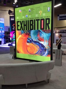
Gorgeous example of how wonderful backlighting can showcase rich color.

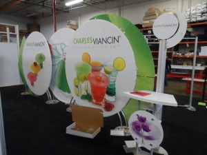
Great combination of white space and high color saturation in the photo. The white space allows the logo to stand out while the bright green wings frame the entire design nicely.

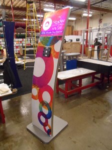
The wide gamut of bright colors give this iPad stand WOW factor in a small amount of space.

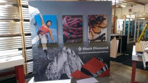
Black and white photo with color photos set forward really showcases the product in this display’s graphics.

We welcome your comments.

–Mel White
http://www.linkedin.com/in/melmwhite
mel@classicexhibits.com

**********************************************

Based in Portland, Oregon, Classic Exhibits Inc. designs and manufacturers portable, modular, and custom-hybrid exhibit solutions. Classic Exhibits products are represented by an extensive distributor network in North America and in select International markets. For more information, contact us at 866-652-2100 or www.classicexhibits.com.

[subscribe2]

Why the Big Picture MATTERS in Graphic Design

April 17th, 2014 6 COMMENTS

Glenna Martin, Graphic Design Manager

Graphic Inspiration Galleries

Many trade show clients and graphic designers are unfamiliar with how to design for 3D structures. If you have a client that fits that description, then our new Graphic Inspiration Galleries will be useful. We’ve dug through the Past Five Days (P5D) photo archives and identified outstanding examples of graphics. Each image has notes about why the graphics are successful (in our humble opinion). Our hope is that these notes will help you start an informed conversation with your client about their next project.

We love using P5D as inspiration space when designing graphics — there is tons of great stuff in there. Keep checking back as we add more images and create new categories.

In addition to the Inspiration Galleries, we’ll post a few of our favorites in the blog each month. Here are a few favorites from March:

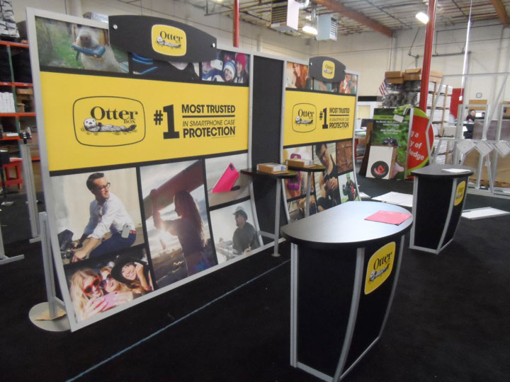
Otterbox:
Wonderful combination of lifestyle photos in these graphics and bright yellow band as the focal point for copy. This display also has a unique header shape that mimics of the logo shape.
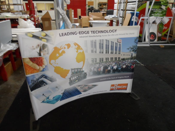
Busch:
It’s very unique how the images flow down the left side of this table top and land flat on the visual plane in the graphic. This does a great job of guiding your eye to their logo and copy points.
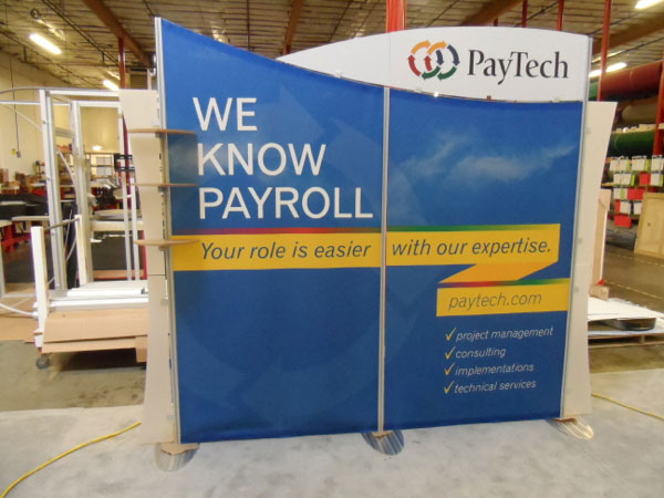
PayTech:
Excellent use of contrast between header and backwall graphic. The curves compliment the contrast and the ribbon’s “z” shape emphasizes their URL and copy points.
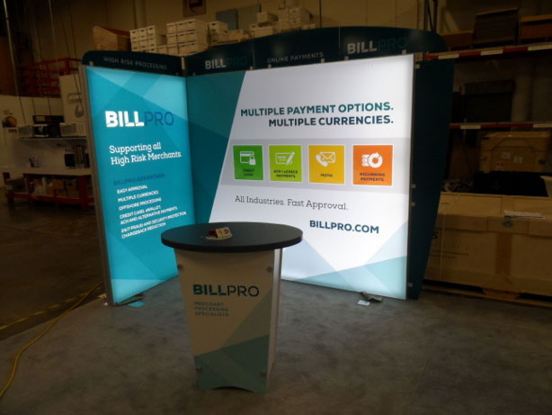
BillPro
Very vibrant shade of blue in these graphics. The backlighting makes all of the colors pop and look amazing. The angles in the graphics stretching around the corner creates a nice flow in a small space. This is a great example of what SuperNova lights can do for artwork.
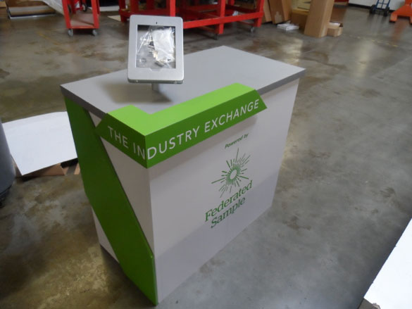
Federated Sample:
This counter is a spectacular example of a customized counter. The 3D graphic elements and contrasting colors are streamlined, but amazing.
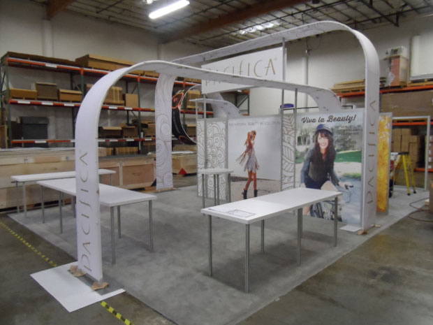
Pacifica:
These graphics are so simple and elegant, yet they work fantastically. The illustrated pattern and logo placement in combination with the lifestyle photos are perfect. Nice how the front curved piece extends into the space making the merchandise part of the display.

Stay tuned for next month when we highlight examples from April.

Glenna Martin
Graphic Design Manager

http://www.linkedin.com/in/glennamartin
glenna@classicexhibits.com

**********************************************

Based in Portland, Oregon, Classic Exhibits Inc. designs and manufacturers portable, modular, and custom-hybrid exhibit solutions. Classic Exhibits products are represented by an extensive distributor network in North America and in select International markets. For more information, contact us at 866-652-2100 or www.classicexhibits.com.

[subscribe2]

Classic Exhibits Welcomes Glenna Martin, FT Graphic Design Manager

August 13th, 2013 COMMENTS

Glenna Martin, Graphic Design Manager

Classic Exhibits announces the addition of Glenna Martin as a full-time Graphic Design Manager. Glenna is not new to the trade show industry, as her bio reveals. She’s been working with Classic and Classic Distributors for eight years as a contract designer and has been instrumental in the branding of Classic Exhibits since 2005. Now she’s at our beck and call, and we couldn’t be happier.

Should you need graphic design services for your client’s exhibits or for your company, such as website design, please give us a call. Our rates are very reasonable. And Glenna is a terrific designer.

Glenna Martin’s Bio

I grew up in Eastern Kentucky and started dabbling in web design at fourteen. My love of art combined with technology drove me to pursue graphic design. I was one of those annoying people who always knew what they wanted to be when they grew up. In 2004, I graduated with a Bachelor of Fine Arts with an emphasis in graphic design and almost immediately (I think two weeks after graduation) started working for an ad agency in Berea, Kentucky. It was the perfect position for me:  no project was too large or too small and I got to delve into the software head first. I quickly picked up the ins and outs of the full Adobe Creative Suite, and the on-the-job training was perfect for further developing the skills that I learned in school. As an added bonus, being the only designer on staff meant that I got experience in every facet of graphic design such as traditional identity design, hand illustrating signage, building websites, creating email blasts, and designing print pieces all while working with a wide range of businesses.
It wasn’t long before we broke into the trade show industry by designing identity materials and trade show graphics for Classic Exhibits Inc. This was back when tension fabric was still a cutting-edge new material and not yet the industry standard. Since then, I’ve worked in some capacity on nearly every piece of Classic branded material that has been created:  from hanging ivy on their EXHIBITOR booth in 2007 to the cheesy Aeroman and Kevio campaigns. My skills and creativity have grown with Classic’s success. As our agency built a name for itself in the exhibit industry, we also worked with several Classic Exhibits distributors on everything from identity and creative campaigns to large format graphics.

In 2010, I switched direction and started doing graphic design for a large newspaper, but maintained my relationship with Classic in a freelance capacity. While at the newspaper, I further developed my skills in Photoshop, InDesign, and Illustrator while learning a ton about color theory and optimizing files for offset print. Designing exclusively for print didn’t have the same creative appeal for me as trade shows so when the opportunity to join the Classic and Exhibits NW presented itself, I was thrilled to jump back in. In true Mel White fashion, there were lots of projects waiting for me. When I started in mid-July, he immediately asked me to complete the Classic website redesign (look for it to launch soon!). I’ve also worked on projects with Classic Distributors who wanted to WOW their clients with professional graphics but didn’t have a designer on staff. I’m excited to see what the future holds and even more excited be part of such an amazing team.

Contact Glenna

If you are planning to attend Shared Knowledge University (SKU) on Sept. 30 and October 1, I look forward to meeting you. If not, don’t be shy about contacting us about our graphic design services. We’re here to make you and your client look better.

Glenna Martin
Graphic Design Manager
glenna@classicexhibits.com

**********************************************

Based in Portland, Oregon, Classic Exhibits Inc. designs and manufacturers portable, modular, and custom-hybrid exhibit solutions. Classic Exhibits products are represented by an extensive distributor network in North America and in select International markets. For more information, contact us at 866-652-2100 or www.classicexhibits.com.

[subscribe2]