Guest Post: Lori Hanken, Total Displays
In the past, elegance and structure have not really been associated with portable trade show displays. Convenience yes. Upscale no. So what do I mean when I say that some portable displays have not been like the others?
One Of These Is Not Like The Others
Pop-ups and Panel Systems
First a little portable display history lesson. Over the years, portable exhibits have come in many shapes and sizes. The most common had Velcro-compatible fabric panels, like pop-ups and folding panel systems. You could print graphics and Velcro them to the exhibit. They were revolutionary at the time, and there have been a lot of product advancements with these systems, like the introduction of photo mural panels which elevated them to another level. Many exhibitors continue to use them.
Tube Systems
There have been other portable displays systems over the years.
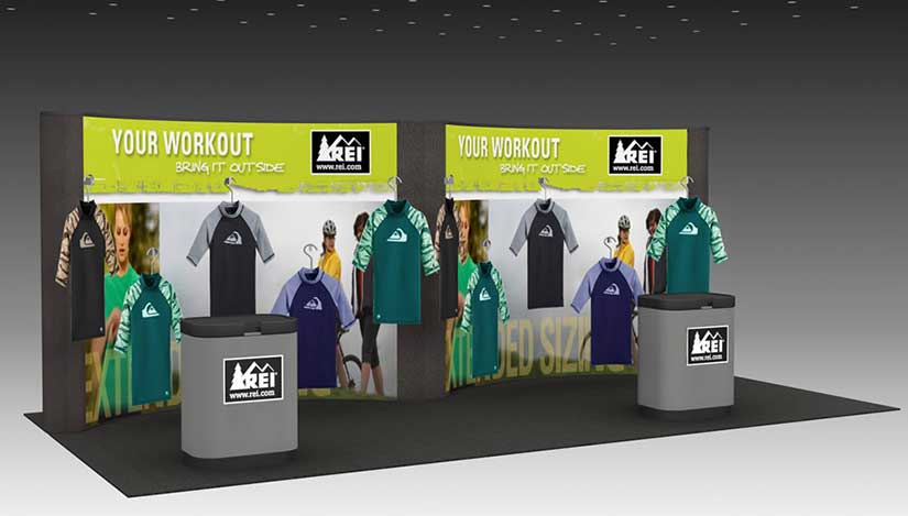
One of the most popular is tube stands, an aluminum tube system with a pillowcase graphic that slides over the frame. There have been advancements in this system such as adding different frame sizes, accessories and more. Different frame sizes are used together to make modular displays.
Tube stands with pillowcase graphics are lightweight and easy to set-up. And the pillow case allows for two-sided graphics.
Some Downsides
- They are beginning to look dated
- Graphics, unless done well can be saggy
- The cheap versions are unstable (usually sold by promotional product companies or others with no business selling trade show exhibits)
- Most carry limited warranties (you break it, you replace it)
- They really have become a commodity item
- Everyone seems to have them now
Now, why would I tell you the downsides of a system that we sell a lot? Total Displays has always provided good quality products. We do sell a lot of tube systems. Typically the people who are buying them are upgrading from an old school pop-up display, or they are often replacing retractable banner stands with simple tube stands.
- If you love the look of a tube stand, be sure to buy from a reputable trade show exhibit company. If you want to see the difference in quality, let me know and we can do a Zoom meeting where I can show you one of ours vs. one that was produced by a promotional products company. Trust me when I say they should stick to pens and hand sanitizers. They really know nothing about trade show exhibits.
- Next time you walk the show floor, take notice of them. How many look good, how many do you see?
Banner Stands
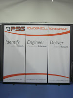
Another popular portable option has been retractable banner stands. Again, really a commodity item. Seriously, everyone has them. I have seen 10 x 30 and 10 x 40 exhibits filled with retractable banner stands. They may be easy, but do they really represent your brand in the best light possible? When used in the right situation and environment, retractables banner stands can be a great solution. But if you really want major impact? Look for something else.

Why do you exhibit at a trade show? What is the purpose of your exhibit materials? One of the whole points of a trade show exhibit is to make you stand out in a crowd!
So what we would recommend?
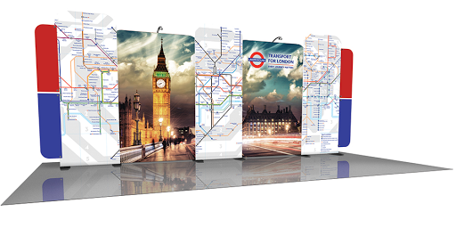
We have a new line of products, called Symphony PORTABLE DISPLAY ELEGANCE. In the past, portable exhibits have generally looked portable. The tube systems were a step in the right direction. But now we have the next step.
Do These Look Portable to You?
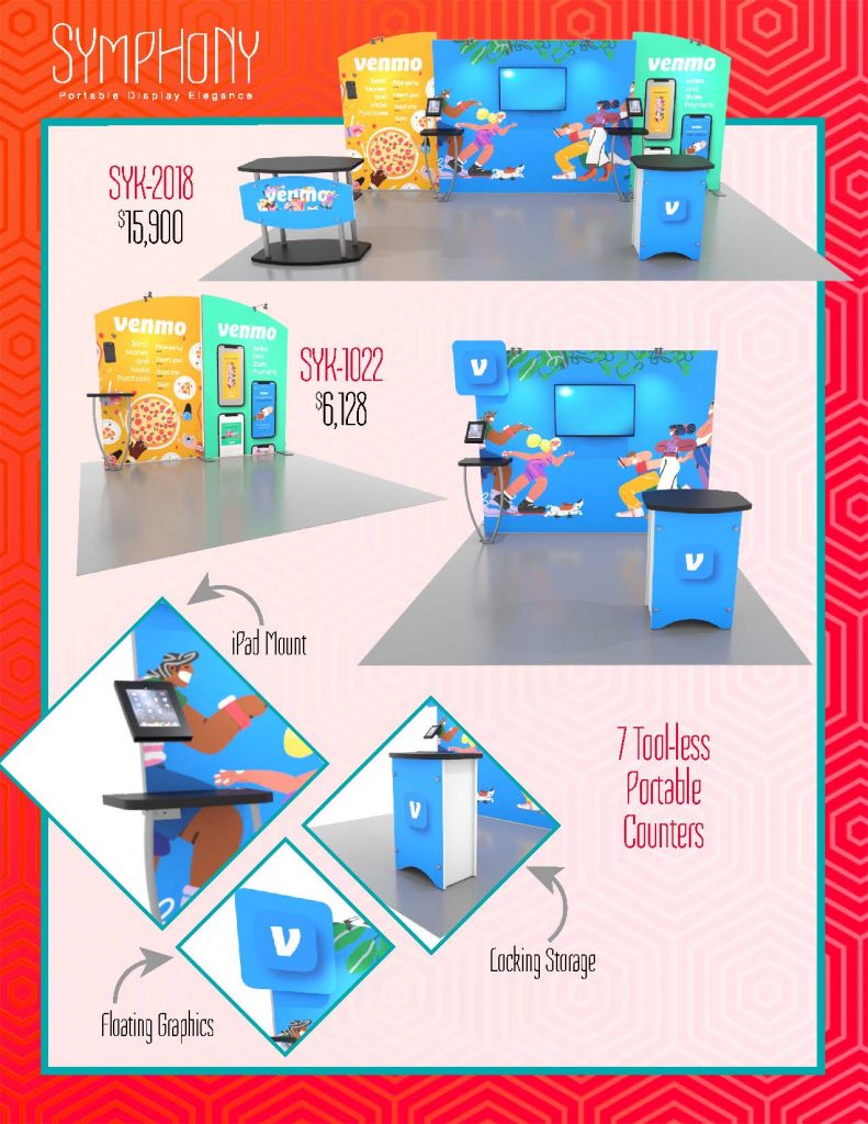
- Multiple frame shapes/sizes to build customs looks
- Large monitor support.
- Cell phone charging ports on backwall counters.
- Curves.
- Sturdy, aluminum extrusion frames.
- Professional tight fit, silicone edge graphics.
- LOCKING storage in counters.
- COMPLETELY Tool-less assembly
Elegant Portable Exhibit Ideas
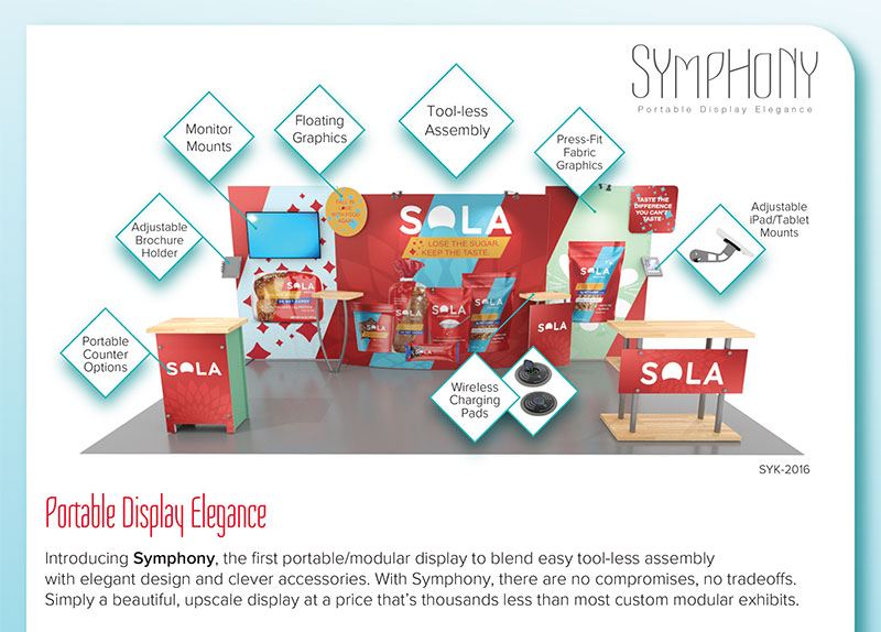
Call or email us at 952-941-4511 or sales@totaldisplays.com to review components and build your own custom look with this amazing new system. P.S. They are on sale right now. BONUS

Lori (and David) Hanken own Total Displays in Edina, MN. Since 1984, Total Displays has been the leading one-stop shop for exhibit marketing needs in the Upper Midwest. For more information, see www.totaldisplays.com or call 952-941-4511.


