EXHIBITOR Show Follow-up
To those who attended EXHIBITOR in Las Vegas, I hope you had an enjoyable time.
This past month was a very exciting one at Classic. I am delighted to announce that March will be the second largest sales month in Classic Exhibits’ history! Thanks to you, our distributors and friends, for your support, your orders, and for believing in our “Shared Success” philosophy.
Since I did not attend EXHIBITOR this year, I hope you will share your feedback and reactions via the blog. The Classic Team had only positive comments about the show: great traffic, quality leads, and an overall upbeat tone.
As you may have noticed if you were at the show, Classic Exhibits, ClassicMODUL, and Exhibits NW were fortunate to have built not just our own booth but also several others on the show floor.
Here are just a few. Let us know what you thought of these designs:
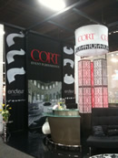 Cort Furnishings. The island display included ClassicMODUL black anodized extrusion, Aero Overhead Hanging Structures, and tension fabric graphics from Optima Graphics . . . and of course all the beautiful trade show furnishings from Cort.
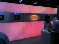 Display Supply and Lighting (DS&L). This inline included Silicone Edge Graphic profiles from ClassicMODUL, SEG fabric graphics from Optima, and some truly amazing LED lighting from Display Supply. Check out the picture, but don’t miss the video. Great work to Rob Cohen and his team. And additional kudos to Steve Pinette for a stunning design.
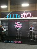 EliteXPO. This inline had a very cool lounge theme. It included several ClassicMODUL profiles, large format Duratrans and tension fabric graphics from Optima Graphics as well as LED backlighting panels from Display Supply and Lighting. Kudos to Dave, Lara, and Chuck. I heard a lot of great feedback from attendees on your booth design and theme. Nicely done!
New Leads 10 x 10. A great example of a Classic Exhibits 10 x 10 Sacagawea hybrid! Take a look. Turned out very beautiful and highlighted a very functional design. 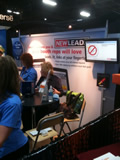 And special thanks to New Leads for allowing us to use their lead retrieval technology which runs off iPads. Very easy to use.
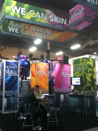 Optima Graphics Island. Not only was there a nice ClassicMODUL Tower in the booth, but did you see that Aero Hanging Sign structure? Well done Jim, Dave, and the whole team at Optima.
EXHIBITOR Magazine. EXHIBITOR’s inline booth was a custom rental exhibit from Classic Rentals with a dynamic A/V presentation. The display demonstrated our flexible rental inventory and design capabilities. This was no kit. It was built using their design requirements for the show. 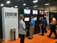
Classic Exhibits / Eco-systems Sustainable. And last but not least. I hope you enjoyed OUR booth: Your Home for Exhibits. Take a look at the pictures. What you might not know is that the structure is a Rental Exhibit! It highlights the true custom nature and capability of Jim Shelman and his whole crew at Classic Rentals / Exhibits NW. Thanks to Flying High Design for all the beautiful graphic work, to Optima for the printing, to Brumark for the carpeting, to Cort Furnishings for the comfy chairs and stools, to Nature Wall for the cool “real” grass wall in the ECO-Systems portion of the display. At the end of the day, that was probably the best overall design and display we have ever shown.
That being said, I want to say a personal thanks to Mel, Jim, James, Laura, Erik, Eric, Michael, Tim and of course Reid for their hard work last week. Not being there myself, I want you all to know how proud I am of our team and the job you did. Thanks!
Lastly, a huge thank you to our strategic partners: Eco-systems Sustainable, Momentum Management, Cort, Optima Graphics, EliteXPO, and Display Supply and Lighting. Your guidance, generosity, and support made this year’s show particularly special.
Please share your comments about the show.
Have a great and restful weekend.
–Kevin Carty
http://twitter.com/kevin_carty
http://www.linkedin.com/pub/kevin-carty/3/800/32a


