You decided on your new trade show display . . . but you’re not done yet. Now, it’s time to design the graphics. Every day we see completed graphics, many of which we feature in Past 5 Days. Some amaze us. Others not so much. You want AMAZING!. Below are 10 tips to consider when designing your next trade show graphics.
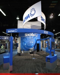
 1. Look Up. Think about what elements you want seen either 6 ft. away or across the show floor. Avoid putting important elements at floor level. Higher elements will draw your customer’s attention. Those should be the ones you emphasize.
2. Hire a Graphic Designer Who Understands Trade Show Graphic Design. Most don’t. Don’t spend thousands of dollars on a new display only to use lackluster, unprofessional graphics. It’s the equivalent of working out to build a 6 pack and then wearing a muumuu. A professional graphic designer will know how to source quality files, format them, design your graphics, and hit your deadline.
If you don’t know what resolution, PMS color, vector art and bleed are, trust me, you don’t want to be responsible for file preparation. Hire someone who knows what they’re doing. The graphics are as important as your physical display, if not more important, and they can make or break your display presentation.
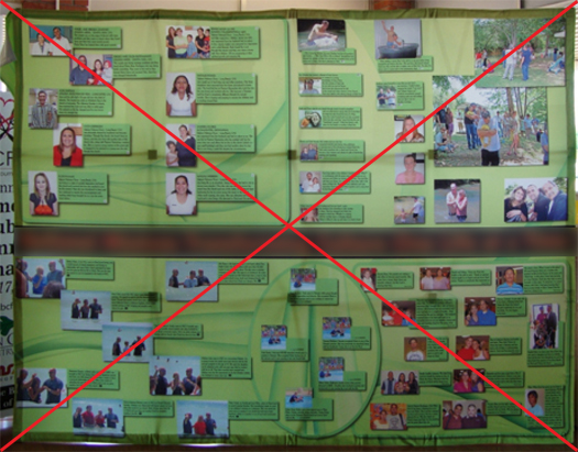
3. Your Display isn’t a Paper Brochure. This is the single biggest mistake most exhibitors make. You want your messaging to be clear, concise, and to the point. Leave the details for the printed or electronic collateral. No one is going to read text heavy graphics so keep it simple and impactful. Get the help of a copywriter if you can. Avoid clichés and tired expressions like “innovative” and “unique.” Get to the root of the problem and state your solution. Strong messaging that can be digested in 15 seconds or less will make your display MUCH MORE effective.
 4. Image Quality Counts. Photos should be high resolution or vector, especially for your logo. Always have native, clean artwork for projects. This is critical! Spend the extra money to get good quality stock photography. It’s not that expensive and can make a HUGE difference in your booth. This isn’t a billboard — people will be walking up and even touching your graphics. Nothing makes a graphic designer cringe more than being handed a business card and asked to pull a logo from it. If you worked with a designer to create an identity for your company, ask them for the native files. You may not be able to open them, but that doesn’t mean your designer won’t be able to. This is why you hired a professional in the first place, remember?
5. The Devil is in the Details. View your graphics rendered on the display. Sometimes elements of the physical booth really have an affect on the flow of your graphics. You won’t know until you see them so make sure that you view them before you print them. Be sure that you know where accessories like shelves and monitors are placed. Exact measurements are critical. Too many times the graphics arrive and they look amazing, vibrant, and perfect . . . until you realize that the monitor cuts off half of your logo. Seeing the graphics rendered will help prevent mistakes and be worth the added time.
6. Create a Flow. Sometimes clients have a million ideas in all different directions. Just because your display has four different graphic surfaces that doesn’t mean that you should treat them as such. Make sure your graphics tell a coherent story. If your client wants each of their four products featured, one on each panel, that’s fine. Find a way to tie them together. Make sure that the color scheme and design as well as your copy works together. Don’t re-invent the wheel with each panel. You want the overall design to work together — not confuse.
 7. Color is Your Friend . . . or Your Enemy. Reference specific Pantone swatches when color matching is critical. This goes back to working with a professional when possible. Trade shows are notorious for being tight turn projects. No one wants to have graphics shipped directly to the show only to find out that the nice mustard yellow they were expecting printed peach or pea green.
8. Don’t Font It Up. One or two fonts is enough. I promise. Three fonts is pushing it. Any more than that and you’ve got an identity crisis on your hands. Legibility is key with any  graphic design but especially graphics that are being viewed from a distance. Look for clean, easy-to-read type and then if you want a little flare, add an accent font that is more unique, but don’t over use it. And please, I beg of you, don’t use a cursive or handwriting font in all caps. Just don’t. As a side note, avoid any fonts with names like Giddy-up.
9. Scale is Everything. You have the opportunity to create graphics of a larger than life magnitude. Seize the day! Go big or go home. Don’t waste your time designing 20 foot graphics that are only meant to be viewed from two feet away. Again, let them use your collateral for details and smaller views of things. Think about what you want people to see from three aisles over. Show them something that makes them want to visit you.
10. Cut Your Losses. If your client wants to do something really dumb and you’ve tactfully advised them why they shouldn’t, then let them do it. They’ll learn. They can only smack their thumb so many times with a hammer before they eventually discover how to hit the nail. 😉
Need assistance with your trade show graphics? Let us know. Share your tips for AMAZING trade show graphics in the Comments section.
Glenna Martin
Graphic Design Manager
http://www.linkedin.com/in/glennamartin
glenna@classicexhibits.com
**********************************************
Based in Portland, Oregon, Classic Exhibits Inc. designs and manufacturers portable, modular, and custom-hybrid exhibit solutions. Classic Exhibits products are represented by an extensive distributor network in North America and in select International markets. For more information, contact us at 866-652-2100 or www.classicexhibits.com.
[subscribe2]


