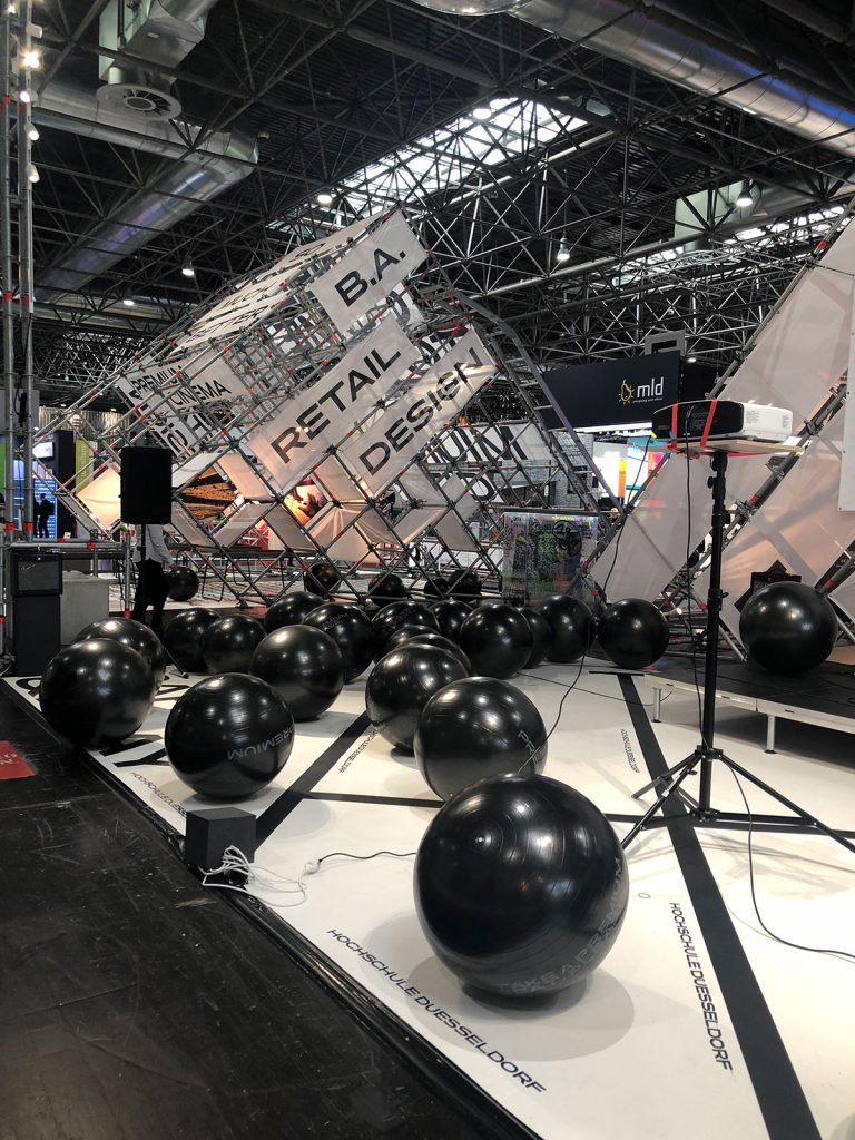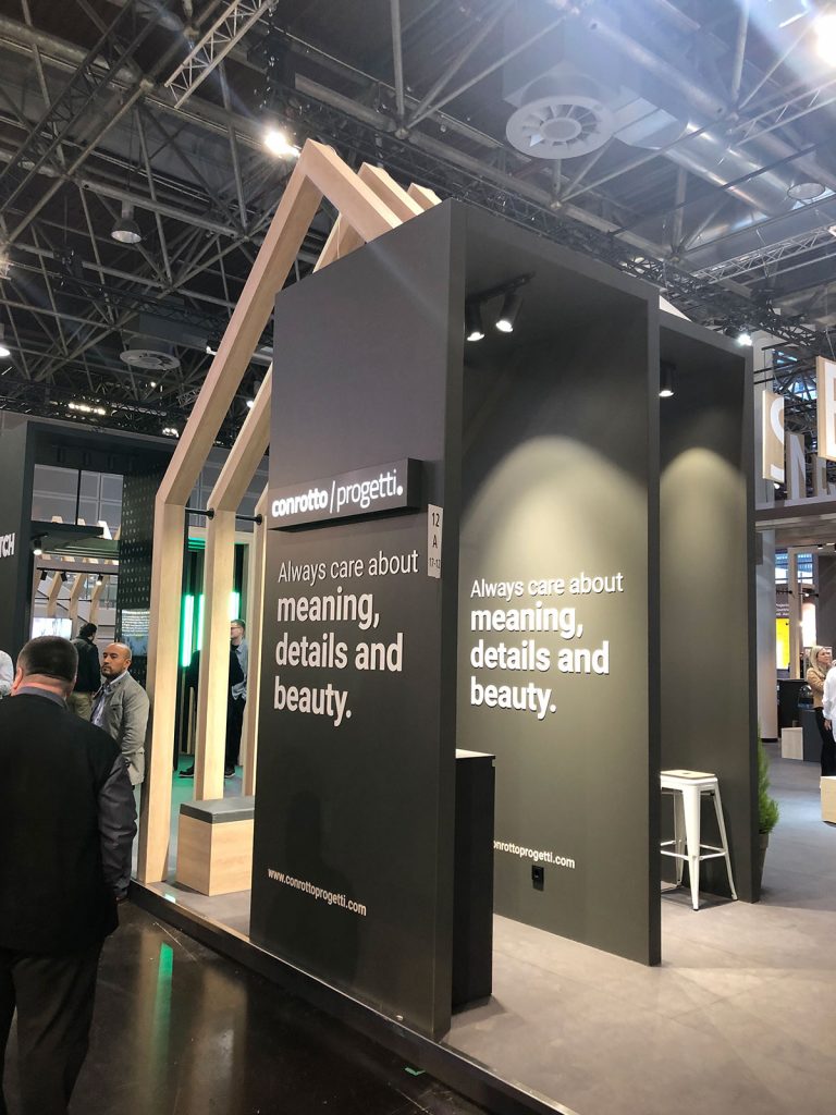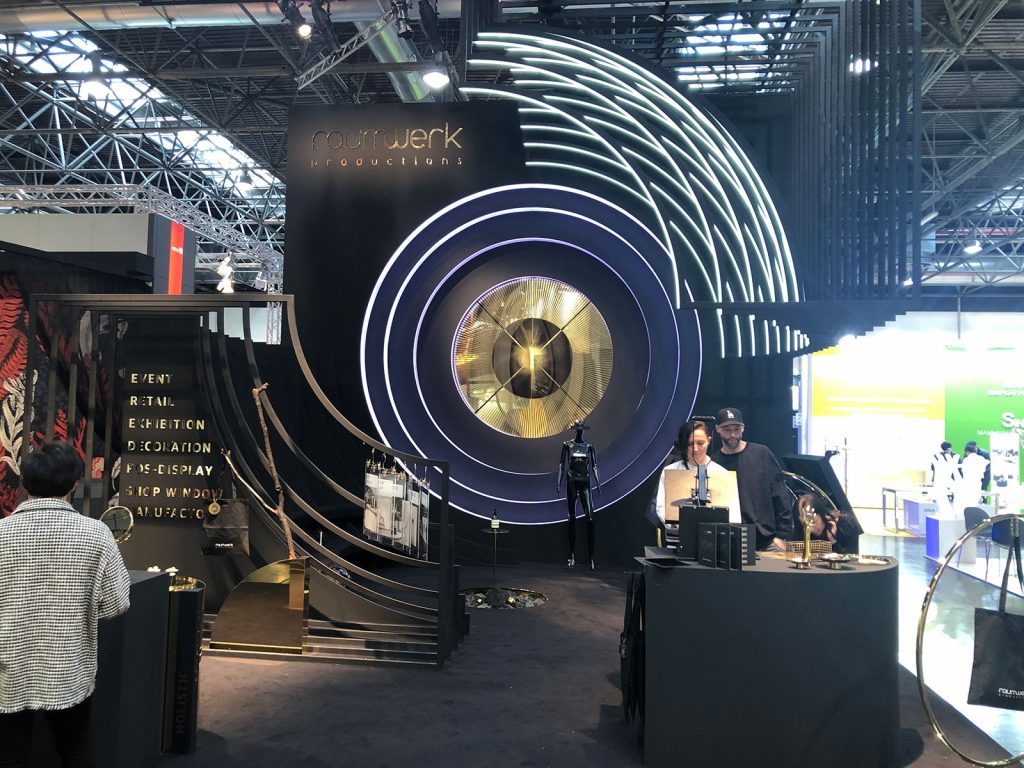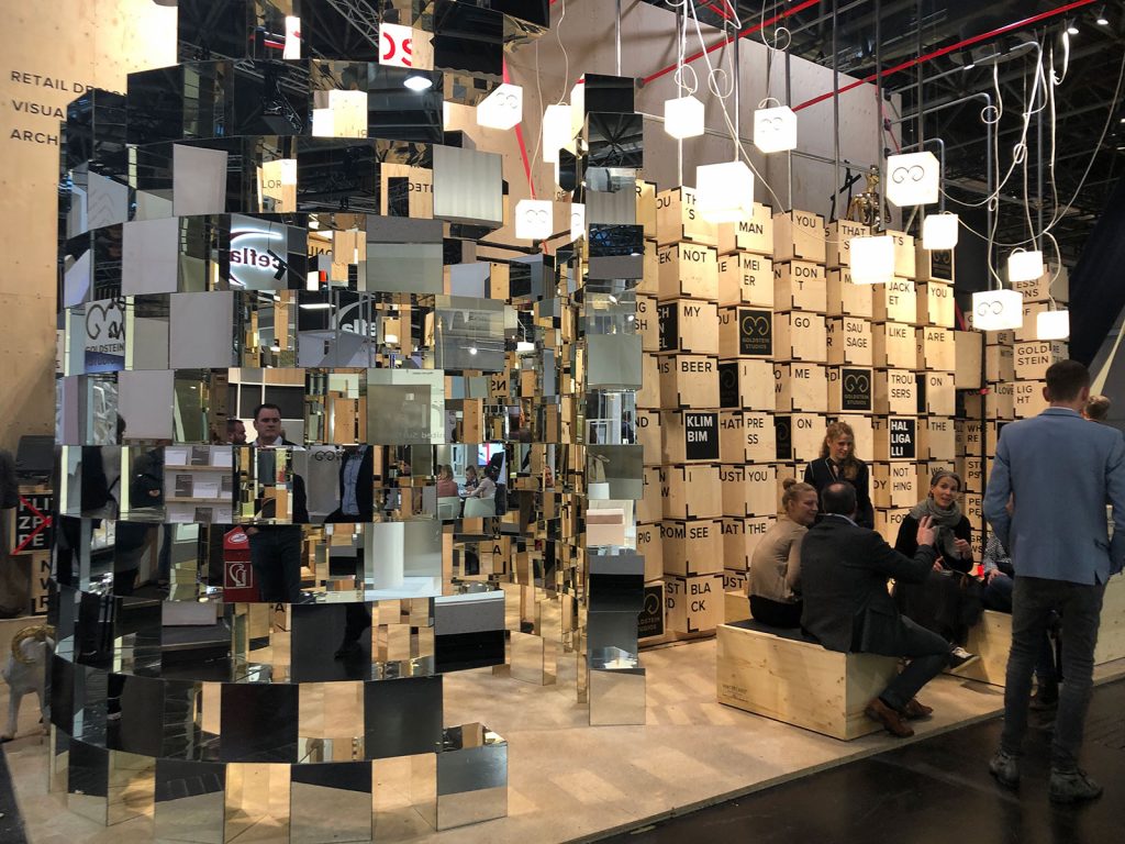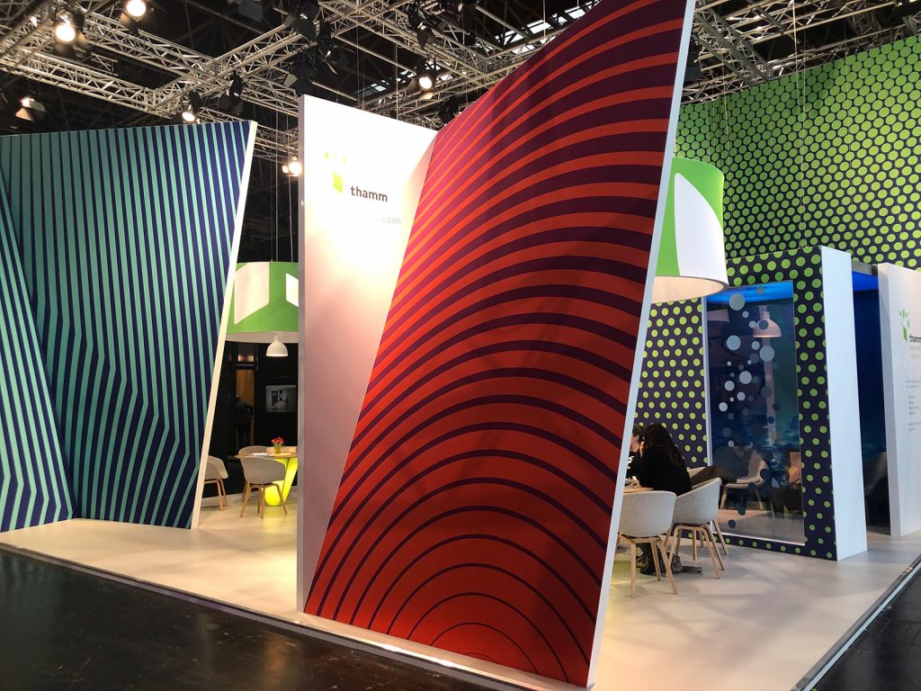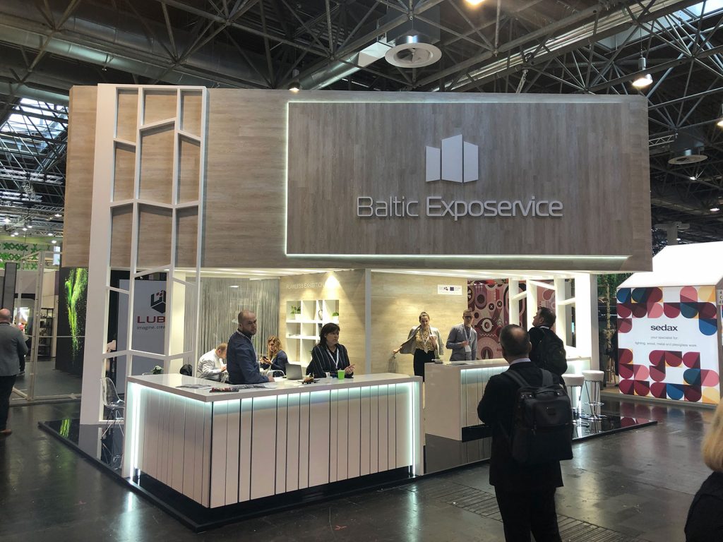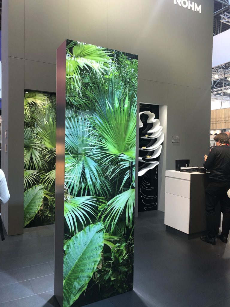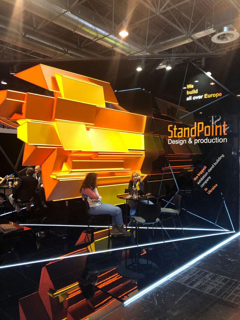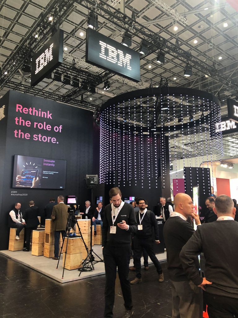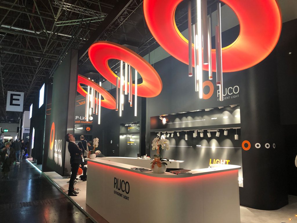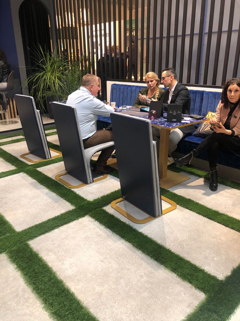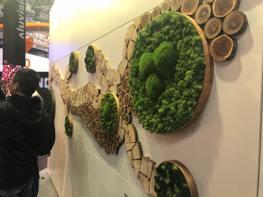
Held every three years, EuroShop is like a candy store for designers. While many of the trends on display at EuroShop 2020 were not new, they were reinvented in fresh ways. Also worth revisiting are the ways in which technology has become more sophisticated, incorporating movement and advanced LED lighting techniques into almost every exhibit.
Our Instagram contains many more examples and video’s of these trends: @classic_exhibits
Movement
- Short-throw projectors, touchscreens, 3-d Holograms
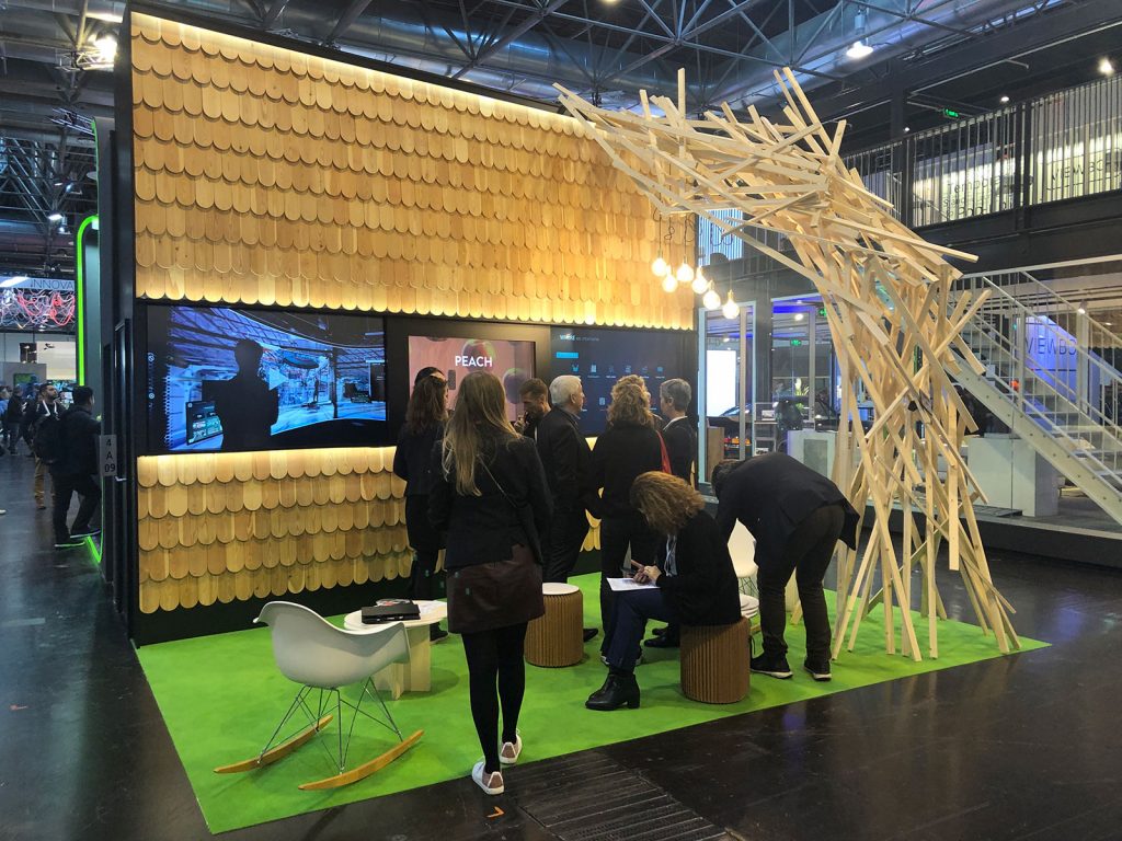
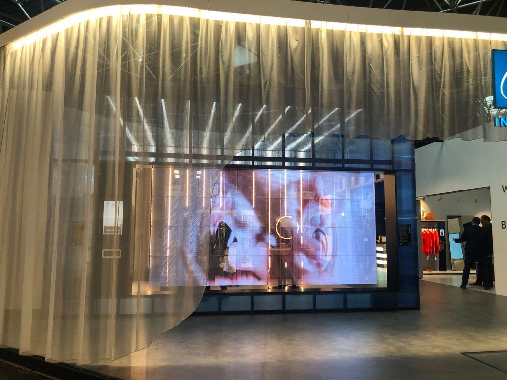
- Video walls both flat and curved and on every surface from ceiling/floor/wall/ hanging structures
- Programmable LED lights both as simple accents and behind lightbox graphics or on a raised floor
- Motion detecting interactive cameras tied to projectors/touchscreens/video walls
- Physical objects controlled by magnets or gravity, robotics
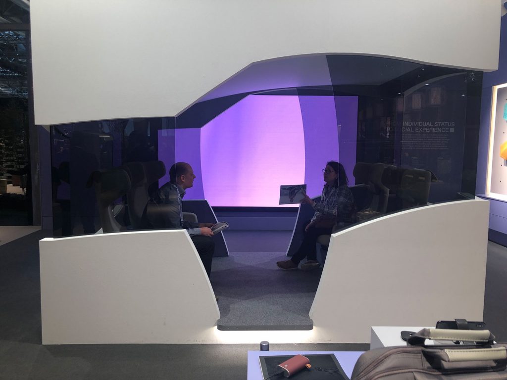
- Smart glass that has an image or mirror finish and can fade to transparent
- Polarized glass that we had to look through to interact with content
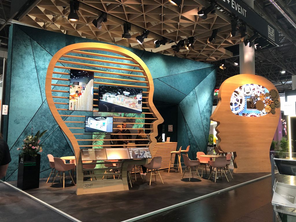
- VR interactive, AR interactive, mechanical movement like gears rotating.
- Programmed LED panels were mesmerizing, continuously changing patterns with quite long programs. It was hard to stay long enough in one space to see the entire program of movement.
Materials
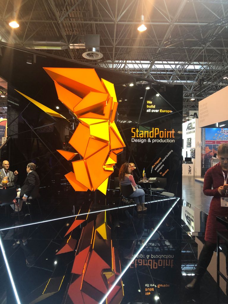
- Mirror-finish as an accent or to cover a wall and make the space feel twice as big
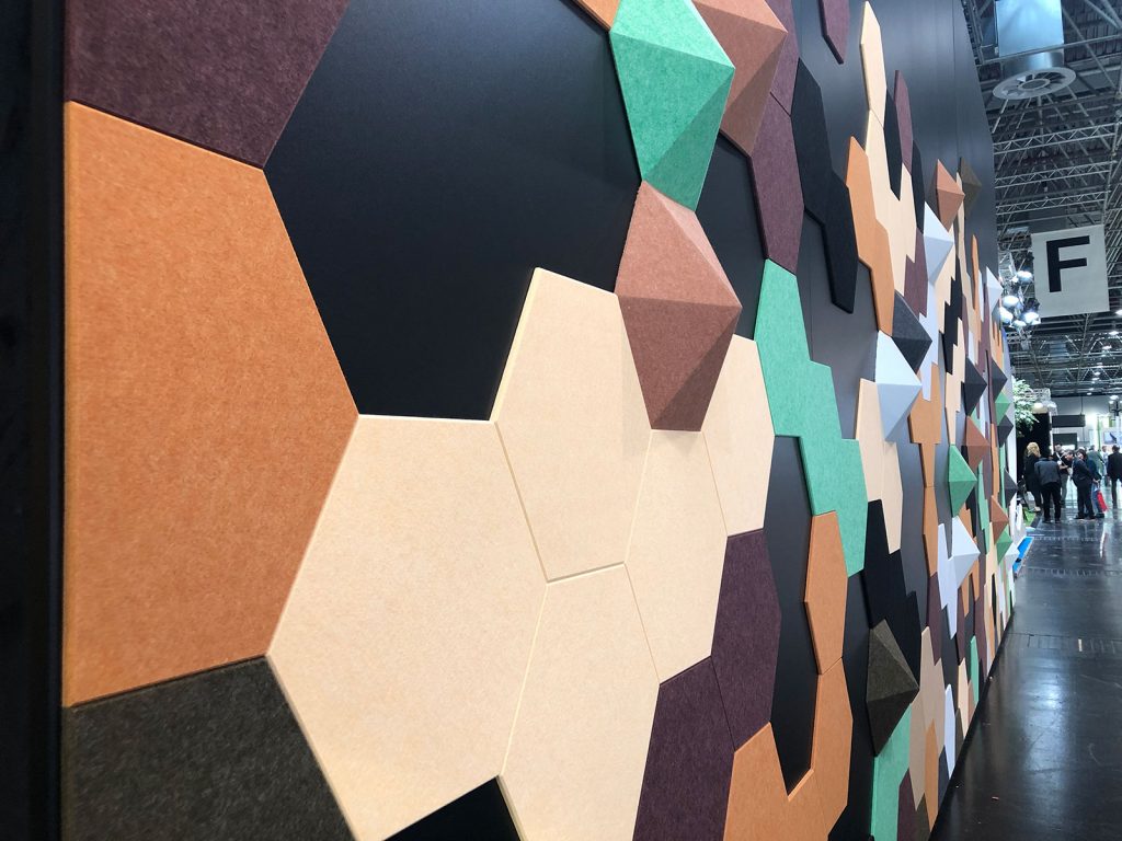
- Felt as an interesting shape texture and acoustic material
- Velvet, crocodile, unfinished wood, and pressboard with wash of color that still reveals the texture
- Marble, sheer fabric, high gloss paint, clear acrylic, draped fabric
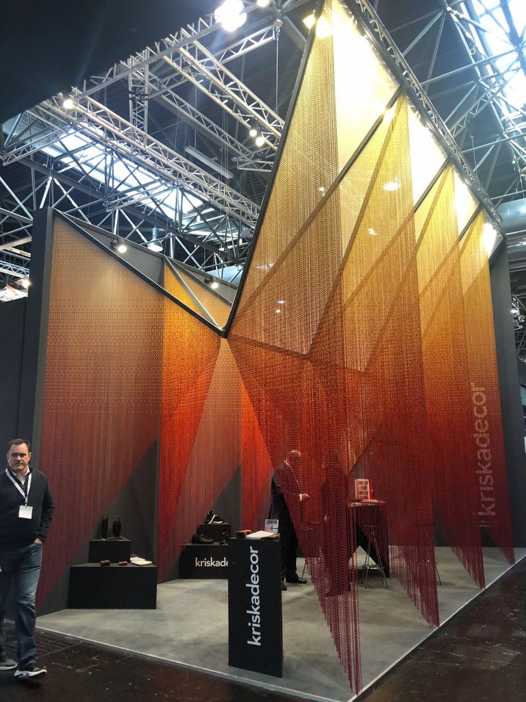
- Chains, corrugated plastic and cardboard — cardboard was even used as a structural material in numerous places
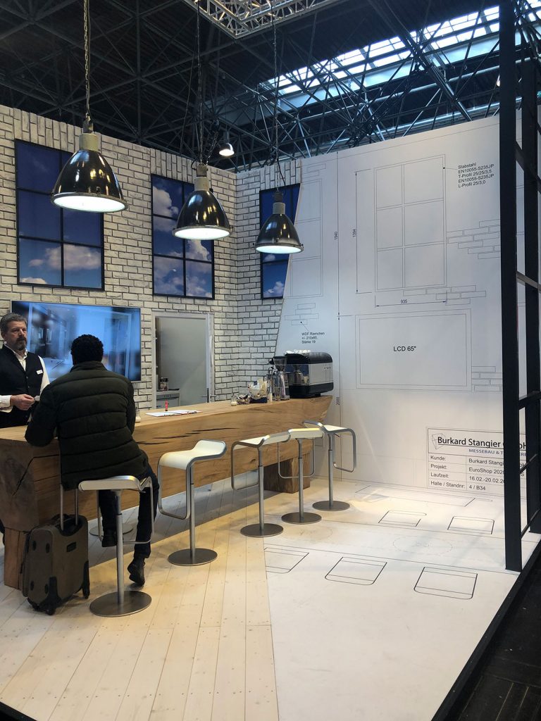
- Metal mesh, brick and wood were very prevalent textures sometimes printed on a flat surface and sometimes fully 3D
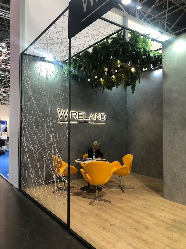
- Colored string stretched between surfaces to create a pattern and hanging fringe
- Almost all metal structures were covered in some way
Structural
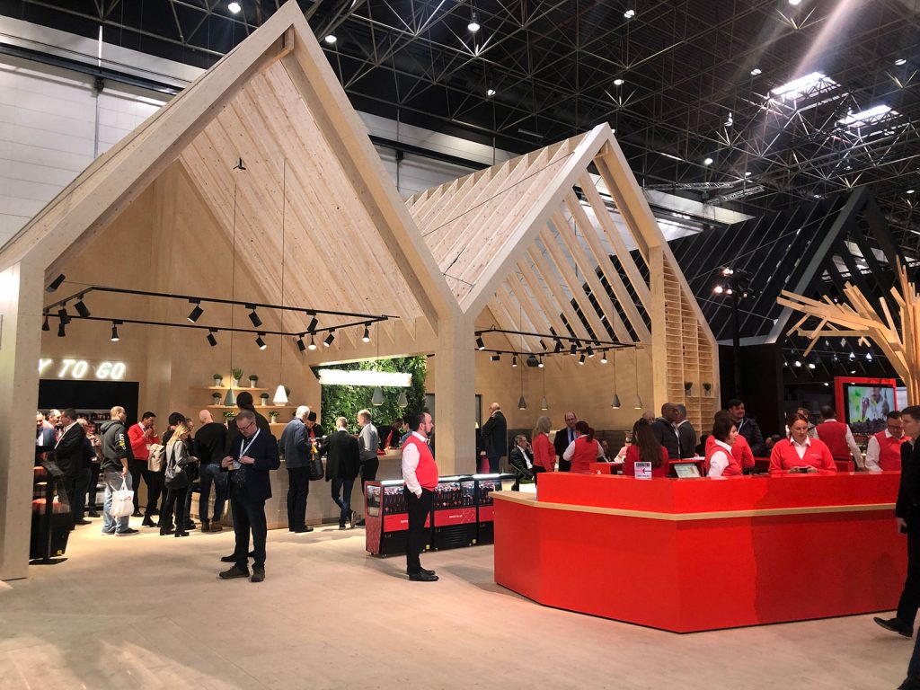
- Peaked roof frame – sometimes a simple 2D frame, sometimes built out as a 3D structure
- Elongated roman arches – tall and elegant with a perfect half-round curve at the top
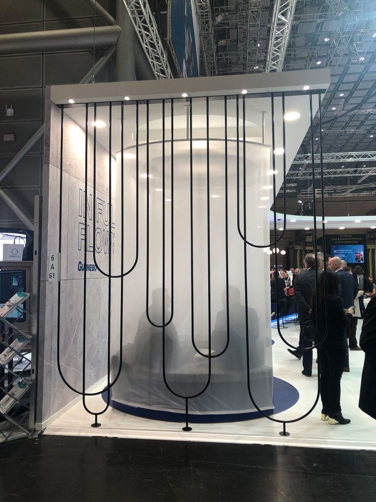
- Semiprivate meeting spaces
- See-through barriers around the edge of an exhibit space
- Cubes/boxes/squares, circles/spheres
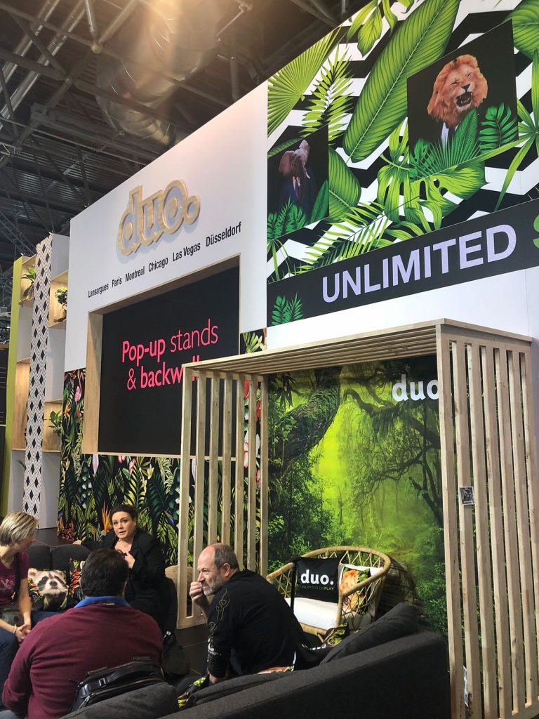
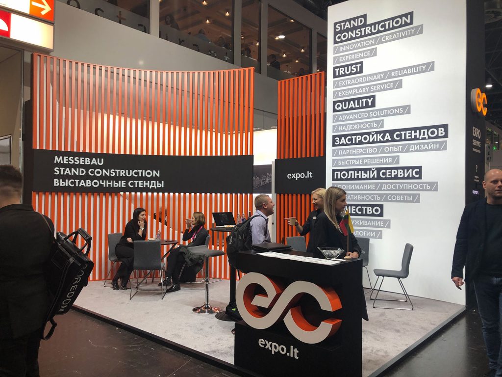
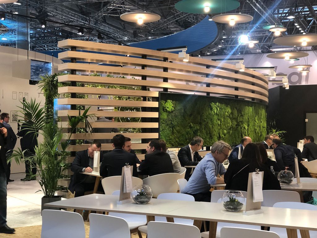
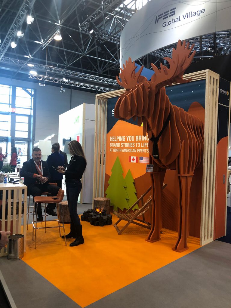
- Slats most often unfinished wood, vertical, straight, of the same width and at even intervals, but we saw them tweaked in numerous ways to make many unique and custom applications
Colors/Color Combos and Patterns
- Black and White
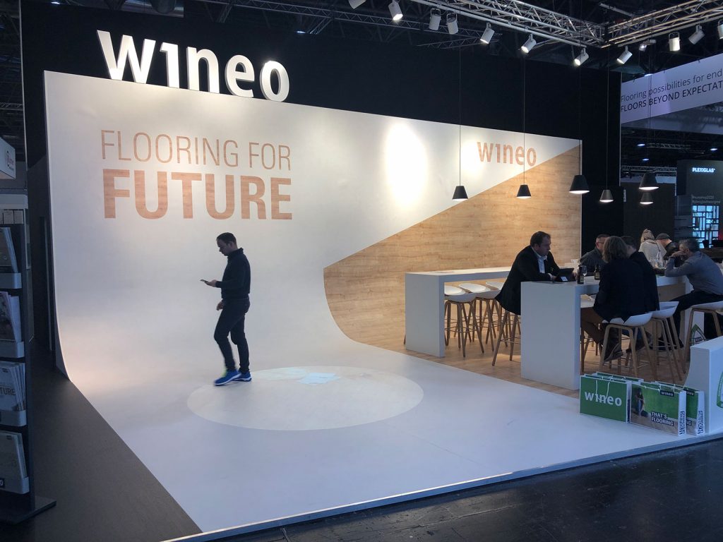
- Either Black or White or both with a Bold Accent Color
- Either Black or White or both with a Natural Wood Accent
- An all-white booth might consist of glossy white finish, flat white finish, white washed wood, white LED light accents. Solid shapes and relief patterns out of white materials. White fringe shielding the conference area. Clear acrylic furniture – lots of textures, but all in the same color story
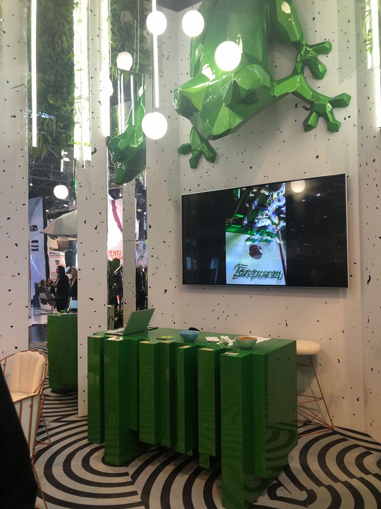
- Tropical print – palm leaves and flowers
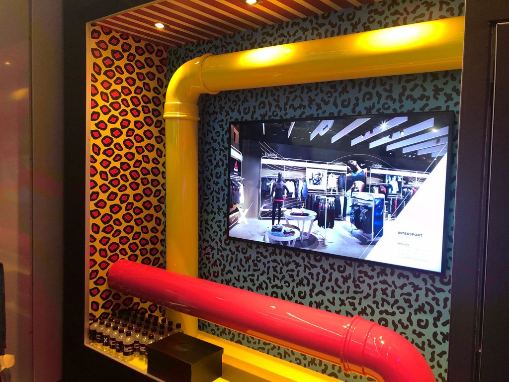
- 80’s inspired neon or brightly colored pop-art patterns
Lighting
- Throwback Neon signs (accomplished through LED technology)
- Edison bulbs of all shapes and sizes
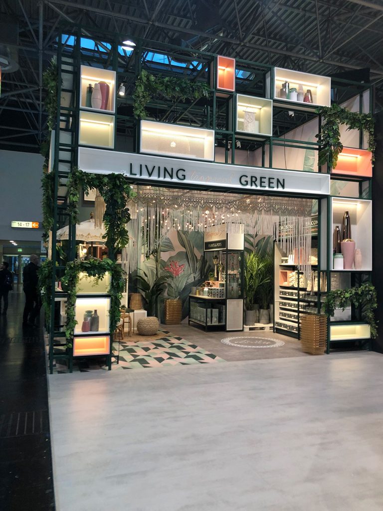
- Programmable LED Lights as edge light lightboxes
- Programmable LED tile floors
- Pendant lights
- LED lights are used more strategically in the edge-light capacity and are often dimmed down so they really enhance the structure of the design rather than blind us with their power
Plants
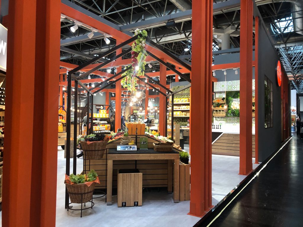
- Greenwalls with different heights and textures of foliage
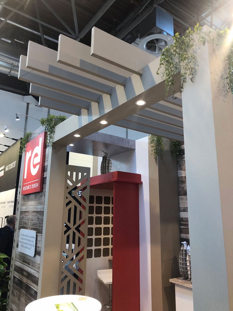
- Hanging plants
- “Tufts” inset, spotted on every surface from ceiling to floor, even light fixtures
Organic Design Elements
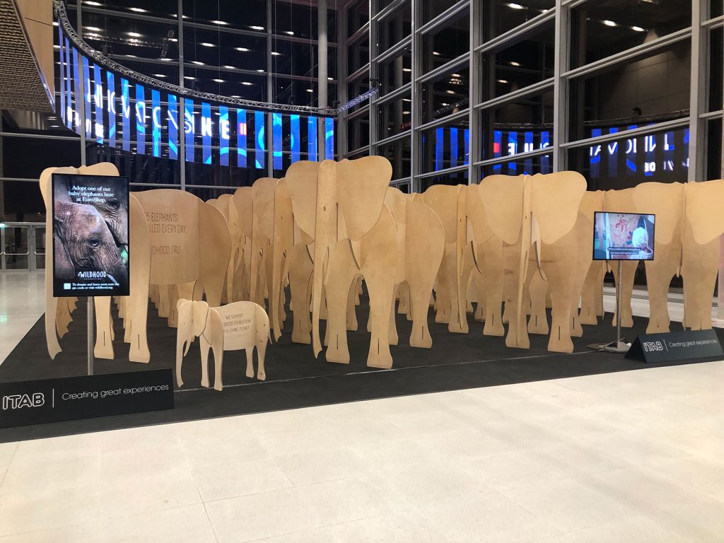
- Faces, hands, and animals were used as very effective shapes in the exhibit designs at EuroShop
- Booths made completely of organic cut curved slats felt like intricate caves
Tags: Classic Exhibits, EuroShop 2020


