Launching a new website/webpage should be anti-climactic. It’s 2016. Around the world, thousands of new websites are created every day. And yet… When we launched our new home page last week, I was giddy. That’s a rare sight. Just ask Jen or Reid.
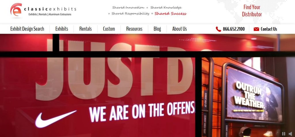
The new home page is beautiful, practical, and efficient. Our previous home page was focused on products and resources. The new site adds secondary layers showing our story, capabilities, and values. Anyone who visits Classic, whether for a tour, product preview, or Shared Knowledge University, realizes that the Classic Story is so much deeper than just our 1400 products. It’s special in a way that is hard to translate without being here. Which doesn’t mean it can’t be done on a website. But we knew it would be challenging.
Our Approach
We adopted the current website design of “banding” — i.e., horizontal layers stacked in a vertical scroll. There are seven bands, excluding the header and footer.
- Company Video w/ a Short and Long Version (click on the speaker)
- The Shared Success Formula (Values Statement)
- Key Menu Blocks
- Classic Rental Solutions
- Recent Work — Past Five Days (Scroll)
- Products Updates and News
- CE Website Links
This layered approach attempts to show website visitors “What We Do” and “Who We Are.” As a Classic Distributor, you may not delve into the “Who We Are” sections more than once or twice. However, our website traffic has increased significantly over the years. Search engines see us as a content-rich destination for anyone interested in trade show marketing, industry news, and designs. It’s those visitors who will see, hear, and feel the big picture message on the home page.
Additional Changes

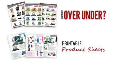
In addition, we’ve added a literature image link. Clicking on it will take you to a webpage where product sheets can be reviewed and downloaded. Second, we’ve reorganized the drop-down menu items so they’re easier to navigate.
More changes are coming, particularly in Exhibit Design Search (both Classic and the branded versions). You’ll see those in the next month or two.
As always, a huge thanks to Tony and Glenna, who did the real work, and to everyone at Classic who reviewed the beta site and offered their advice and suggestions. Shared Success… it’s how we continue to thrive.
We’d love to hear from you about the home page modifications. Your suggestions are always welcome and encouraged.
–Mel White
mel@classicexhibits.com
http://www.linkedin.com/in/melmwhite
https://twitter.com/melmwhite
**********************************************
Based in Portland, Oregon, Classic Exhibits Inc. designs and manufacturers portable, modular, and custom-hybrid exhibit solutions. Classic Exhibits products are represented by an extensive distributor network in North America and in select International markets. For more information, contact us at 866-652-2100 or www.classicexhibits.com.
[subscribe2]
Tags: Classic Exhibits, Exhibit Design Search, Home Page, Website


Fabulous changes to the website, Mel!! I recently went to the site expecting to see the usual and WOW!! Huge shift, love it, well done!!
Thanks Ruth. Appreciate the kind comments.
Another change is coming later today. There will be a rotating header and a link to download literature.