In my last blog post, “Exhibit Designs that Sell,” I offered some tips on how to achieve a nearly 100% success rate. This time, I want to delve into a design element that connects to a deep-rooted preference in many people — graceful, mesmerizing curves!
There are two reasons why your client may be drawn to curves. The first is biological. A recent scientific study tested how the brain responds to curved vs. linear designs. In the study, the part of the brain linked to emotion was more stimulated when participants were expressing a greater affinity for the curved designs they were viewing.
It appears many people have a positive emotional pull to curved spaces. In the insightful article Why Our Brains Love Curvy Architecture, Eric Jaffe explains why curved designs tug at our hearts. Curvature appears to affect our feelings and signal safety or a lack of threat.
When it comes to exhibit design, the second reason clients may be drawn to a booth with curves is the elevated status that is associated with it. Curves are more difficult to manufacture. They require more labor because the materials, whether metal, wood, or plastic, must be modified from straight to curves. Because of this, curved booths have historically been designed for clients who can afford curves and other custom features.
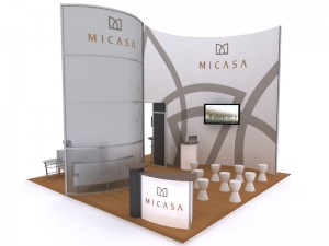
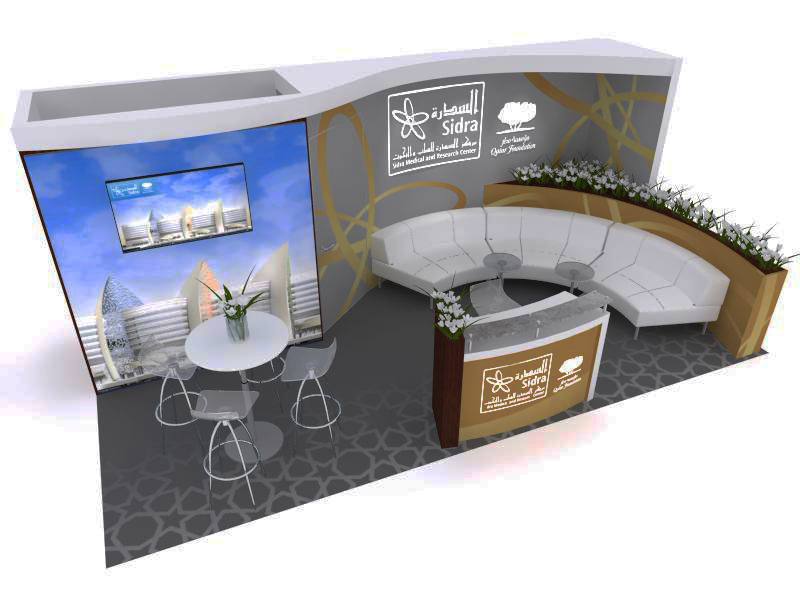
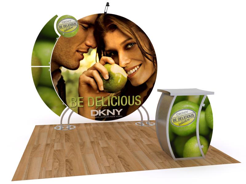
Our Design Department continues to receive custom design requests for curvy booths (and thankfully budgets that allow for them). But more notable is the huge increase in requests to re-brand our existing kits from Exhibit Design Search, such as VK-1320, TF-5202, and VK-5095. From 10×10’s to large islands, curved structures are selling because there is a recognition that branding on these structures offers bold and eye-catching surfaces for creative graphics. These designs attract attention and, as you know, attention is everything on the trade show floor.
The Classic Rental Department recently added many new curved island and inline designs. I spoke with Jim Shelman, GM of the Rental Dept., who is thrilled about these new rental options. As we all know, curves have typically not been an option in the past. To preserve small budgets, straight lines were predominant. According to Jim, clients are excited about getting a curved rental booth because these booths are both upscale and affordable.
 One of my resolutions for the Classic Design Department in 2014 is to continue producing designs that will “Wow!” your clients . . . and sell like hot cakes. Watch for creative new designs in Design Monday. I see twists and turns and lots of curves in our future!
When your client’s budget allows for curved elements, do they prefer a curvilinear booth or a linear design aesthetic? Let me know in the comments section below. I look forward to hearing from you!
Katina Rigall
katina@classicexhibits.com
Tags: Classic Exhibits, curves, display design, Exhibit Design, Rental Exhibits, trades shows





Oh how I pine for Frank Lloyd Wright and his occasional natural architectural curves.
Well said Mike, occasional being the key word there. While almost all of the Prairie Style was rectilinear, the curves, as sparingly used as they were, always stood out as a nice way of complimenting and contrasting. I would point out also that what FLW was a master at was crafting a structure to respect and take full advantage of the site it was being built on. With an exhibit we want to stand out and be noticed (hopefully in a professional and tactful way) and if everyone is using curves, the well done square edged exhibit will stand out and be more memorable.
Very nice, Mike!
FLW’s philosophical grounding was “in the ground”. His designs grow from a base line and expand metrically both vertically and horizontally. Strong lines are a hallmark, but to really see his genious, look at his wall covering pattern design and his art glass designs. These are almost Ruskin in their organic shape, especially his pre-1900 designs.
“The Decorative Designs of Frank Lloyd Wright” is next to my desk as I type this. Amazon, or Half.com!