Trade Show TalesBlog

Author Archive

Graphic Design for Trade Shows & Exhibit Graphics

September 13th, 2022 2 COMMENTS
Graphic Design Trade Shows

Congratulations! You are exhibiting at a trade show or exhibition. The next step is choosing a design. Actually, multiple designs. Whether you’re creating custom trade show exhibits or renting, the structure is just part of it. The bigger thing? Graphic design! 

Graphic design on trade show displays can be overwhelming to many graphic designers. Most designers are proficient at print or online projects, but when they shift into large format projects it can be unfamiliar, both in the scale and content. Trade show graphics are like billboards. They must attract attention quickly to be successful. But unlike billboards, they’re competing with hundreds of other designs in varying heights in a chaotic environment with loud noises, unpredictable movement, and bright colors. 

Graphic Design Trade Shows

Honestly, Graphic Design is TOO broad of a category. Let’s run a little scenario. You have a “marketing firm” that helps clients with websites, print campaigns, email marketing, social media, maybe even logo design, and other fun things… Then you decide it is time to design graphics for your trade show exhibit. Who do you turn to? Your marketing agency?

Here’s a secret. DESIGNING FOR TRADE SHOW DISPLAYS IS COMPLETELY DIFFERENT THAN ANYTHING ELSE! Hiring a graphic designer with trade show design experience is one of the most important decisions. Why? They’ve already made the mistakes that a novice at trade show design would make. 

A little warning… If your exhibit house or display supplier can’t assist you with either in-house graphic design or refer you to a professional 3D graphic designer then you might want to consider working with someone else. It’s that important.  A professional graphic designer will know how to source quality files, format them, design your graphics, and hit your deadline. If you don’t know what resolution, PMS color, vector art and bleed are, trust me, you don’t want to be responsible for file preparation. The graphics are as important as your physical display, if not more important, and they can make or break your trade show’s success.

trade show booth graphics

Trade Shows Graphic Design Tips

There’s an often cited rule regarding trade show design and graphics. You have 2.5 seconds to catch someone’s eye at a trade show or event. Here are some high-level things to consider.

  1. People are NOT going to read every bullet or every line of your copy. Your trade show exhibit is not a white paper or an instruction manual. It’s a 3D billboard meant to quickly communicate a problem and a solution.
  2. Did you put graphics behind a counter, a table, or a monitor? It’s a common but avoidable mistake. 
  3. Aligning images across structural seams is VERY difficult for fabric graphics. Consider how you can create visual continuity without a line or image spanning separate panels. 
  4. Is your tagline, URL, or contact information at the bottom of your display? No one will see it…
  5. Graphics with lots of images, color, and text can be tricky. Sometimes they’re amazing but more often they’re cluttered and busy.  
  6. Know your DPI. What works for a website or print media may not scale up for large print graphics. If you’ve ever seen a fuzzy or blurry graphic on a booth, that’s why. 
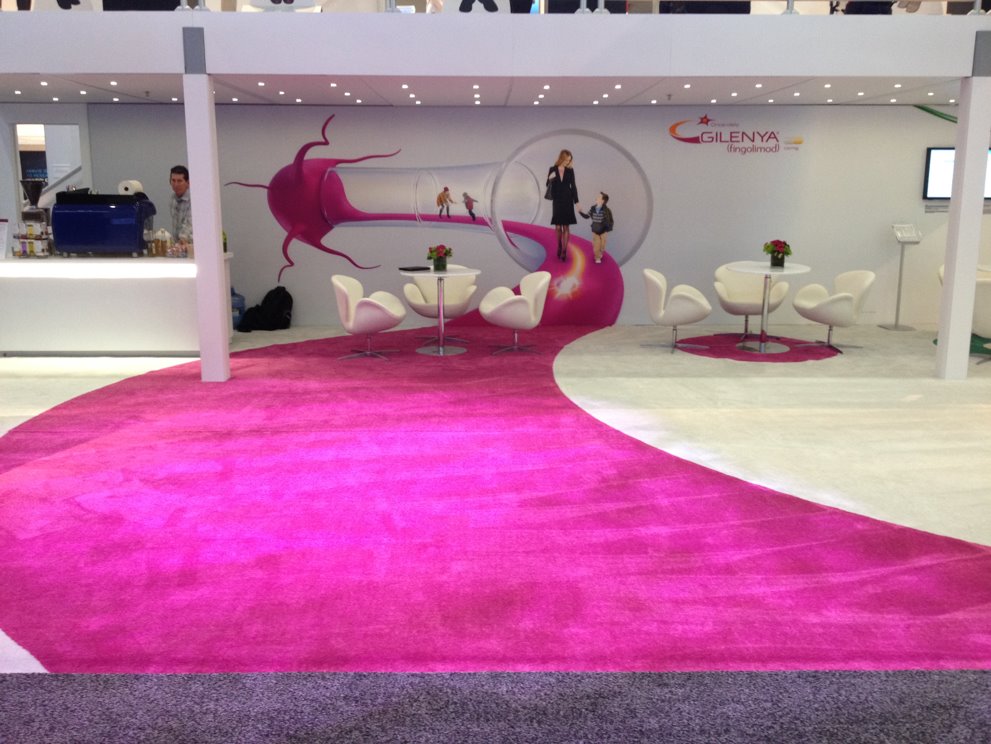
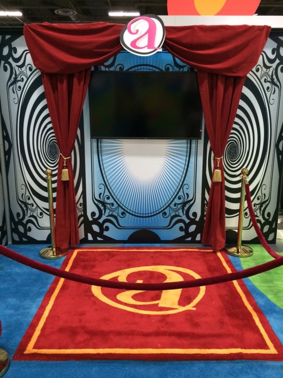
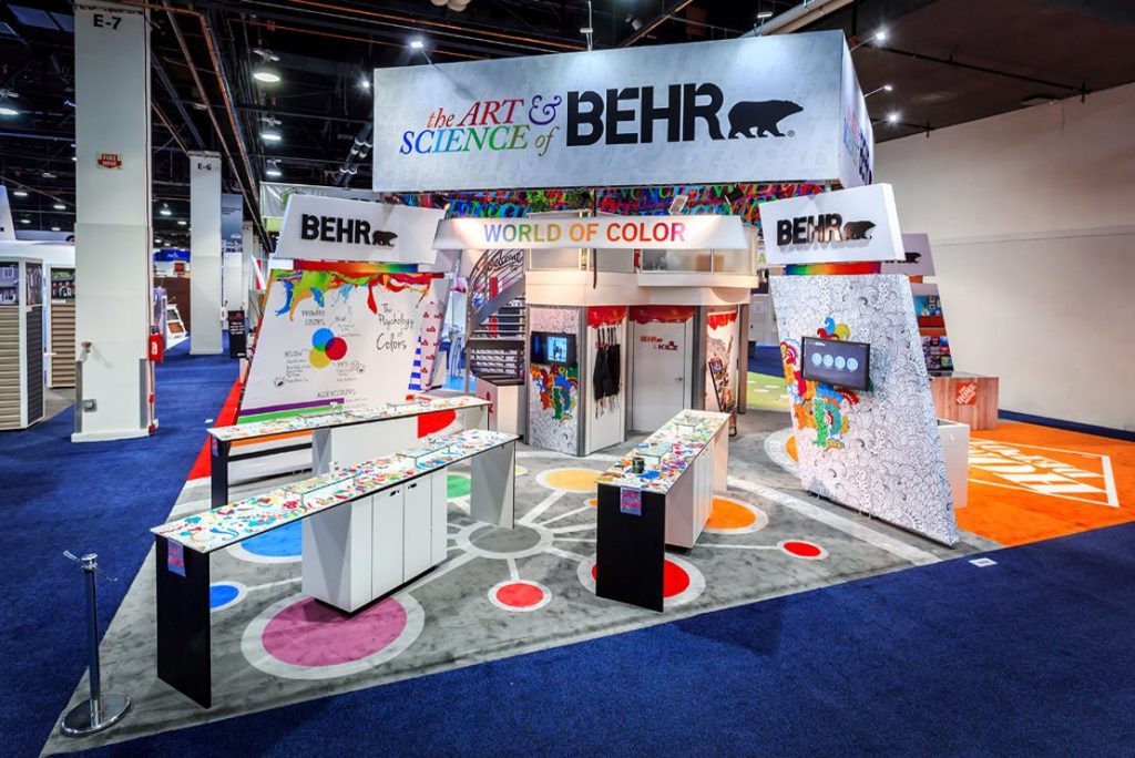
  7. Don’t forget the floor. Done well it can extend the graphic canvas available in a display. Often doubling it.   
trade show graphics

Tips for Hiring a Graphic Designer or Design Firm

If you are hiring a designer or design firm to create your trade show graphics, consider the following suggestions:

  • Ask for references from your agency of choice for large format, trade show exhibit design clients.
  • Check their website. A bullet item that says they do trade show booths or graphics, doesn’t mean they excel at trade show graphics. Ask them for examples of previous trade show work. 
  • Is most of their work is digital marketing, web design, and social media marketing? Find another designer. Your bank account will thank you. Your patience will thank you.
  • Create a library of your marketing assets, logo source files, high-resolution images, etc. 
  • If you don’t speak graphic design, then find someone who does. It’s a highly technical field and knowing the lingo will make everyone’s life easier, more efficient, and save you money.

exhibit graphics

Professional Tips for Exhibit Graphics

Here are some simple, tried and true suggestions for trade show graphic design:

  1. Viewed from a Distance. Trade show graphics are meant to be viewed from a distance. Think about what elements you want to be seen either 6 ft. away or across the show floor. Avoid putting important elements at floor level. Higher elements will draw your customer’s attention. Those should be the ones you emphasize. Don’t use strange fonts or fancy fonts.
  2. Up and Away. Put important messages or images, like your logo, up high for visibility. There’s a reason companies put their logo on hanging signs.
  3. White Space Rules. Use white or empty space. Don’t be afraid of white space, especially with backlit graphics. Backlighting colors, like blue or yellow for example, will make your canvas pop. 
  4. Pantone Color Match. Use PMS colors to be sure to stay true to your brand. Reference specific Pantone swatches when color matching is critical. This goes back to working with a professional when possible. No one wants to have graphics shipped directly to the show only to find out that the nice mustard yellow they were expecting printed peach or pea green.
  5. Don’t Font It Up. One or two fonts is enough. Any more and you’ve got an identity crisis on your hands. Legibility is key with any graphic design but especially graphics that are being viewed from a distance. Look for a clean, easy-to-read type, and then if you want a little flare, add an accent font that is more unique, but don’t overuse it. And please, don’t use a cursive or handwriting font in all caps. Just don’t. As a side note, avoid any fonts with names like Giddy-up…
  6. Have a Plan. If this is for a large exhibit, make sure your graphics have a plan and/or coherency, don’t just place random product images on a wall because the wall is there. Be purposeful with your graphics. You have the opportunity to create graphics of a larger-than-life magnitude. Seize the day! 

Graphic Design for Trade Shows with Classic Exhibits

If you need help with trade show graphic design, start with your trade show exhibit company. A good partner will either have internal resources or partners with extensive experience in large format, trade show exhibit design.

Classic Exhibits has been in the industry since 1993 and we have been honored as an Exhibitor Magazine Find-It Top 40 Exhibit Producer and an Event Marketer Fab 50 Exhibit Builder multiple times. Reach out to our team to get started on your next exhibit or graphic design project!

Interview with Jessica Sibila, The Exhibitor Advocate Association

August 29th, 2022 COMMENTS

Interview Introduction

Recently, I spoke with Jessica Sibila, who’s the owner of Jessica Sibila Consulting, and the Executive Director of The Exhibitor Advocate. If you are unfamiliar with The Exhibitor Advocate that’s understandable. It’s brand new. However, the professionals spearheading this association have been championing the rights of exhibitors for many years.

For anyone who’s worked in the exhibit industry or participated in trade shows, you know it can be complicated, confusing, and often opaque, especially to exhibitors. They don’t always know their rights or how to dispute charges or even propose changes to a show. Collectively, they have the largest financial commitment to the success of a trade show but often the least amount of influence on how it’s priced, managed, and marketed.

The Exhibitor Advocate Mission

The Exhibitor Advocate is a newly formed non-profit organization dedicated to supporting exhibitor needs in the exhibitions and events industry. The group provides expert advice, research, and tools to act on behalf of all exhibiting companies, focusing on addressing challenges and pain points so that exhibitions and events remain a valuable and irreplaceable marketing channel.

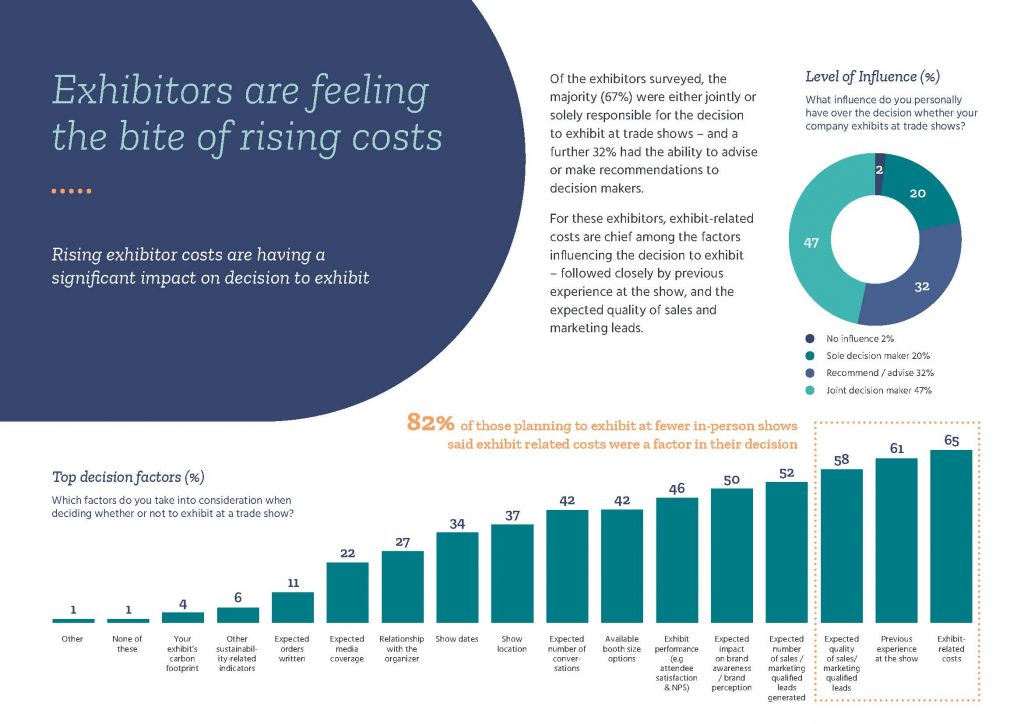
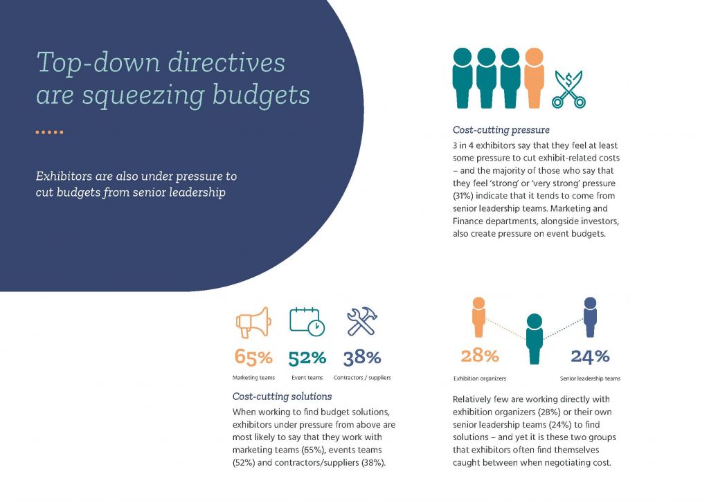
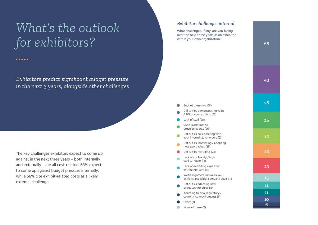
Exhibitors are an essential part of the industry ecosystem; without them, we don’t have a trade show. In this post-COVID world, exhibitors are being challenged by exponentially rising costs, lack of data availability, and limited metrics and ROI. It’s important the industry understands the needs of the exhibiting community and works towards addressing these issues in order to sustain the industry for the future. We can no longer rely solely on the attendee to drive the success of a trade show. The exhibitor is a strategic partner in creating an event that is beneficial for all parties.

The Exhibitor Advocate amplifies the voice of the exhibitor. We are a powerful community that finally has a platform for sharing best practices and addressing challenges we face. We invite all industry stakeholders to join the cause and support The Exhibitor Advocate. Become a member or donate funds at ExhibitorAdvocacy.com. Together, we can ensure the enduring success of the exhibitions and events industry.

The Exhibitor Advocate Association

New Symphony Portable Displays — Literature and Promotion

August 22nd, 2022 COMMENTS
Save on Symphony Portable Displays

Thanks to you, the Symphony Portable System has exceeded our sales projections… by a significant margin!

As a result, we’ve added more designs, a new shape, and a wider range of price points.

New and Updated Literature: 

  1. An updated Retail Price List. Same prices as before with additions and revised descriptions.
  2. An updated Accessories Sheet. You can find this sheet in the “additional images” on every Symphony Kit. 
  3. All NEW Symphony Accessories and Options Guide. Unlike other portable systems, Symphony encourages you to add, remove, and reconfigure — switch counters, add a lightbox, or order a literature tray or iPad clamshell. You’ll find the Accessories and Options Guide (PDF) within the bulleted Details tab on every Symphony kit in EDS. 

Save 50% on Shipping

BONUS! Order a Symphony Portable in August or September and Classic will pay 50% of the shipping.

Symphony Portable Trade Show Displays

Classic’s Annual BBQ and Watermelon Spittin’ Contest

August 22nd, 2022 1 COMMENT
Classic Exhibits 2022 BBQ

On Friday, August 19, the Classic Exhibits Family held our Annual Summer BBQ. The BBQ wouldn’t be complete without great food, conversation, drawings, and the Harold Mintz-inspired Watermelon Seed Spittin’ Contest.

To help wash away the “end of summer” blues, we remind ourselves that the waning days of August also brings the best fruit season of the year! Every weekend Farmers Markets all over the country are bursting with nature’s bounty – the juiciest berries, the sweetest plums, and succulent peaches.  

And then there’s the mother of all summertime fruits… the WATERMELON! When was the last time you spit a watermelon seed? Heck, when was the last time you ate a watermelon with seeds?

In Portland, we know a guy who knows a guy whose second cousin hooked us up with Hermiston, Oregon watermelons, the world’s best-tasting melons. And here’s the best part… he let us snag a few for Classic’s Annual Watermelon Seed Spittin’ Contest!  

You might be asking yourself how does one spit an award-winning watermelon seed. Simple…

  1. Select your favorite slice of red, ripe, juicy watermelon
  2. Find the most aerodynamically shaped seed 
  3. Step up to the line
  4. Place the seed on your tongue
  5. Visualize the seed arcing gracefully  
  6. Wait for any slight breeze to give way to still air
  7. Take a DEEP breath
  8. Curl your tongue like a taco
  9. And let ‘er rip!

2022 WATERMELON SEED SPITTIN’ MEDALISTS

  • Women’s Gold — Stefania Toscano – 12’-3 ½” 
  • Women’s Silver — Jessica Loss – 12’-3”
  • Women’s Bronze — Jennifer Carney – 12’-1 ½”
  • Men’s Gold — James Zuber – 35’-3”
  • Men’s Silver — Mel White – 29’-3”
  • Men’s Bronze — Jeff Garrett – 27’-9”

Exhibit Planning: The Key to a Successful Trade Show

August 19th, 2022 COMMENTS
exhibit planning

“Build it and they will come” – All too often, exhibitors embrace this phrase as the beginning, middle, and end of their trade show marketing program. Unfortunately, success at trade shows requires MUCH MUCH MORE. It requires planning – lots and lots of planning including setting goals and a budget. 

Everyone loves the custom exhibit design process. It’s the fun part. With a carefully designed trade show booth, you stand a much better chance of attracting potential clients, making sales, gathering contacts, and generally spreading the word about your company. If your booth represents a microcosm of your business, then it should also reflect not only your products and services, but also your culture, your customer service, and your marketing.

Exhibit Planning: Where to Begin?

It’s never too early to start planning. Begin by assigning one person to be in charge of timetables and schedules. Assign another person to draw up the budget and define the marketing goals. This person will have to account for the cost of renting or buying a booth, the cost of accessories such as literature racks, as well as travel expenses. Travel expenses will vary depending upon the location and duration of your stay. If you decide to rent, you should expect to budget:

  • 25% on renting your booth space
  • 20% on design and graphics 
  • 15% on electrical, cleaning, and drayage 
  • 10% on shipping materials to and from the trade show 
  • 10% on press kits and pre-show promotions
  • 20% on staffing, travel, and other miscellaneous expenses


Regardless of your decision to purchase or rent an exhibit, you would be wise to work with a professional graphic designer with trade show experience. Most exhibit distributors have a designer on staff or rely on their exhibit manufacturer to supply design and rendering services. You will need to follow the rules and regulations on booth design for your particular show as well as observe basics such as fire, electrical, and safety codes and provide wheelchair accessibility. Professional exhibit designers understand those requirements.

Exhibit Planning Guideline & Tips

When considering the dimensions of your booth, take into account booth staffing, as well as account for kiosks, counters, conference rooms, and the storage of materials. Be sure your design allows for the free flow of attendee traffic in and around your booth. Remove any obstacles at the designing stage. Keep your traffic objective in mind. For instance, if you’re there to demonstrate a new product, erect walls that force passers-by to cluster at the front of your booth. And while you want to be busy, design the flow so attendees are not confused or overwhelmed by your booth. As a rule of thumb, your exhibit space should resemble a well-organized party and not a crowded dance floor.

A 10 x 10 booth is sufficient for a small business. At 100 square feet, you can accommodate at least four people at once, two staffers, and two attendees. Consider a 10 x 20 for a medium business, and islands for a larger business. The size of the booth, however, depends on your goals and products. At a trade show, size matters, but it should complement, not dictate your exhibit marketing goals.

Exhibit Planning Process

Think of your booth as a 3D advertisement for your company. You should include your company’s colors wherever possible unless you are using a theme that necessitates certain colors. It is also a good idea to display the company logo as prominently as possible. You will want to coordinate the flooring with the rest of your booth, either by renting carpet from the show decorator or purchasing more upscale solutions such as hardwood flooring, raised flooring, or cushion flooring.

In order to both conserve space and add an exciting look to your booth, display your literature in a literature rack. Audio/Video presentations have become commonplace and affordable for any size exhibit. These allow show attendees to participate in the booth experience and learn more about your company. Large screen monitors are perfect for product demos, interactive videos, or entertaining promotions. Like a moth to a light bulb, show attendees are instantly drawn to professionally produced videos.

For more information, be sure to consult with an exhibit designer or trade show professional. Participating in trade shows can be expensive, but it’s not difficult to maximize your Return on Investment (ROI) with the right planning and expertise.

Exhibit Planning: 7 Mistakes to Avoid

  1. A weak or non-existent exhibit marketing plan without stated goals and objectives.
  2. A casual attitude toward pre-show marketing. Well-designed traditional and social marketing campaigns give attendees a reason to visit your booth.
  3. A fuzzy or ill-conceived exhibit identity and message.
  4. An exhibit marketing message that doesn’t differentiate you from your competitors.
  5. An exhibit design that hinders effective client interaction (too noisy, too cluttered, too casual, or too formal)
  6. Poor booth staff etiquette that sends the wrong message to attendees and customers. Inappropriate etiquette is a common (and avoidable) mistake.
  7. Slow, ineffective, or nonexistent post-show follow-up with potential sales leads. There’s a reason they are called “sales leads” and not “sales.” 

Convention Exhibit Event Planning

Successful Exhibit Event Planning requires time, energy, creativity, and money. Far too often, companies think “showing up” is the same as “showing off.” To reach your trade show goals, consider these critical exhibit design and marketing tips.

Traffic Flow
In what direction do attendees enter the show hall? Is there a natural traffic flow? Position your exhibit to take advantage of the traffic flow.

The Three-Second Look
Does your exhibit communicate your key message(s) within three seconds? After three seconds, an attendee will move on to the next exhibit if your message does not capture his or her attention. Consider simple, declarative text and bold, relevant graphics. And PLEASE do not put your website address at floor level.

Continuity/Branding
Does the exhibit match your marketing materials? Too many mixed messages or images, no matter how creative, creates confusion.

Safety
Is your exhibit structurally stable when filled with attendees? One small disaster can ruin a well-planned and potentially successful show. 

Storage
Do you have adequate storage for literature, electronics, promotional incentives, briefcases, and portable shipping cases? Do you require secure storage for valuables during and throughout the show? You don’t want purses, briefcases, or tablet cases cluttering the booth.

Finish
Is your exhibit worn or dated from one too many shows? Plan ahead before you purchase your next exhibit. Light colors show seams and damage more easily than dark colors or patterns. Glosses scratch easier than matte laminates.

Budget
Does the exhibit fit your short and long-term budget? If you spend too little, you may not reach all your marketing/sales goals. If you spend too much, you may be forced to curtail your trade show program just when it is making a difference.

Exhibit Planning Support from Classic Exhibits

Classic Exhibits has been designing and building trade show solutions since 1993. We’ve worked hard to win many design awards and love to challenge our team with new and innovative designs. We take great pride in our planning processes, client interactions, and the products we deliver. We look forward to working with you to plan, design, and execute a trade show experience that exceeds all your goals.