I entered the exhibit industry back in 1980 when I took a job with the Electronic Industry Association’s Consumer Electronics Shows. To put that in perspective, the big thing at the first CES I attended was the launch of RCA’s Videodisc. For those unfamiliar with a videodisc, picture a DVD the size of a record. For those of you unfamiliar with records, see your grandfather.
I am in my first year with Classic Exhibits but with 30 years of industry experience. I took nine years off (2010-2018) to play in Hollywood with a childhood friend. And while that turned out to be a fun-packed excursion for me, the pull of the exhibition industry lured me back. And so here I am.
Recently, my friend Jason Cornatzer from 2020 Exhibits invited me to attend this year’s Produce Marketing Association’s Fresh Summit 2019 at the Anaheim Convention Center. I accomplished two things by attending the show. First, I saw what is happening on the front lines of the exhibit industry. Second, that inspired me to share my thoughts with you about what worked and didn’t work. So here goes. I hope you enjoy.
#1. Parking Fees at Convention Centers Should Be a Budget Line Item
“Please take your ticket with you for validation.” Translation. Feel free to overpay us inside the convention center before returning to your car or we’ll make you wait for 20 minutes to overpay us in an exhaust-filled deck structure where your satellite radio doesn’t work.
#2. I Was Never a Fan of Homework
As I was preparing to attend PMA, I needed some direction. How was I going to spend a full day on the show floor? What was I looking to accomplish? What trends were worth tracking?
When I mentioned to Mel White at Classic that I was attending PMA, he asked me to look for charging stations in the booths. Is this still a hot trend, not only in islands but also inlines? And are charging stations specific to some shows and not others. Mel was also curious if any 10 x 10 portable/modular exhibitors along the floor perimeter were finding cool new ways to attract attention.
At Mel’s suggestion, I contacted Katina Rigall Zipay, Classic’s Creative Director, to get a designer’s take on my homework assignment. Katina suggested checking on the use of lightboxes, cool rental designs and if graphic wings are still a thing?
With my car securely parked and my homework assignment in hand, I was ready to hit the floor.
#3. Bright Colors and Creative Illumination Reign Supreme
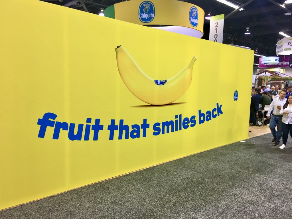
Let me start by stating something obvious… If it grabs your attention from an overcrowded aisle, it’s probably a good thing. Every time I found myself stopping to notice a particular booth it was bright yellow (thank you, Chiquita), a backlit booth (yes, Katina, lightboxes are still a thing), or a graphic that made use of high contrast graphics (colorful fruits and vegetables against a white background was quite the popular look).

“Bright and colorful veggies against a sheer white backdrop. Beautiful.” 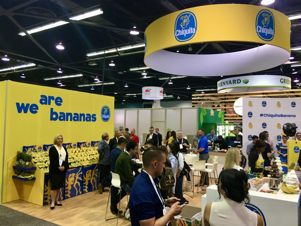
“When you’re Chiquita, go bananas with your yellow!” 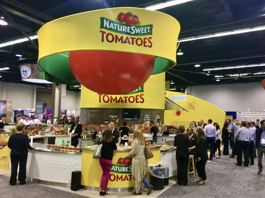
Red and Yellow. Perhaps the two most dynamic colors on the trade show floor. 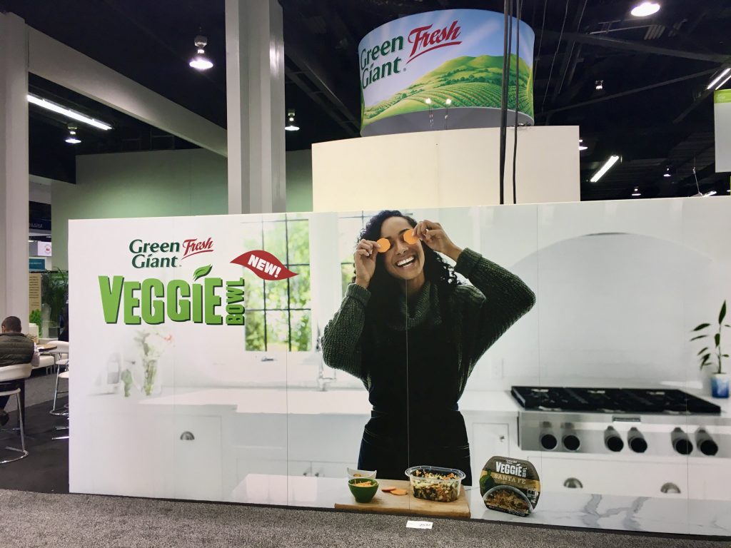
“A white background with high contrast graphics always grabs my attention.” 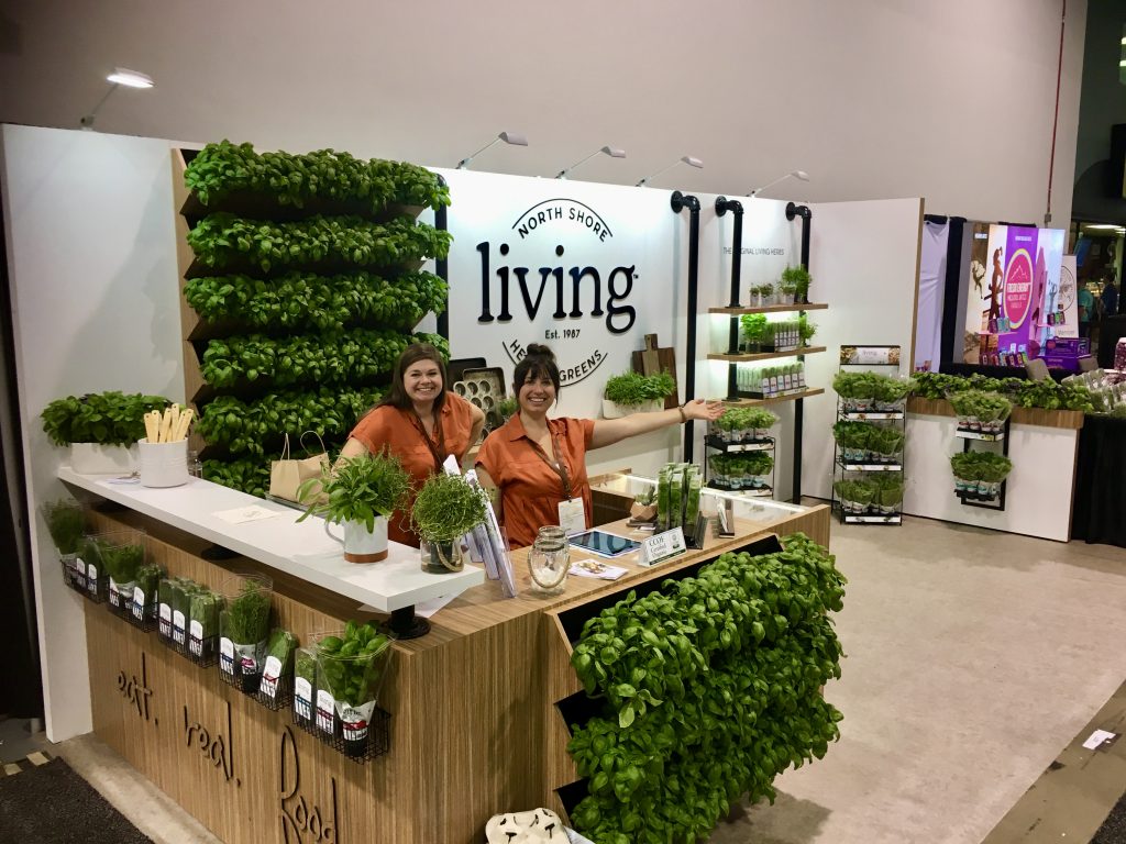
“White backdrop with black type and your product as a colorful contrast.” 
“I shouldn’t like this booth. Too much copy and a roadblock stopping any client interaction. Must be that burlap background – a perfect pairing with potatoes!” 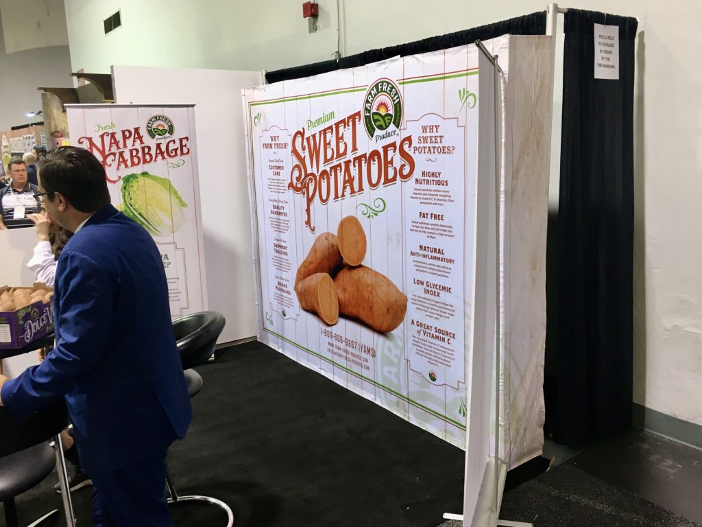
“I’m torn. While I feel there is WAY too much copy, the layout here still grabs me. Maybe it’s the headline telling us exactly who they are.” 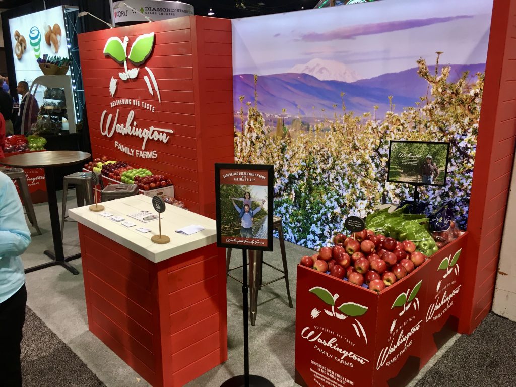
“Red and Delicious! Red apples, red display. Dimensional logo and wood slats. Product there but not overstated. Only issue is the small monitor gets lost.” 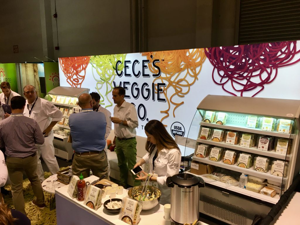
“One of my faves… Backlit, colorful and high contrast against a white background. My photo skills do not do this booth justice. Busy every time I walked past.” 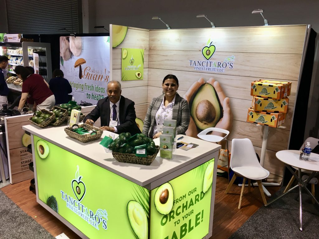
“Hard NOT to look and notice this booth with its extremely bright and backlit counter.” 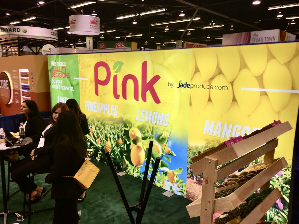
“I dare you not to stare at this brightly backlit booth as you approach it. Go ahead… I dare you!” 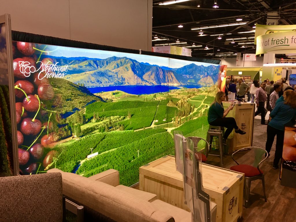
“Another beautiful brightly backlit booth. The B4’s!” 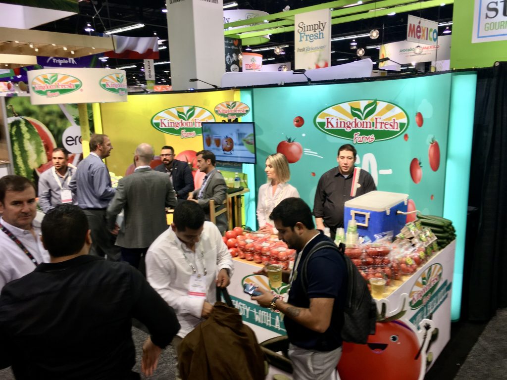
“What do you get when you combine brightly backlit yellow and turquoise? Attention!”
#4. Trade Show Rules Were Meant to Be Broken
The best salespeople don’t always make the best booth staffers, and the show floor has its own set of unique rules and regulations. First, all staffers should fully understand what the goals of attending this particular show are. Are you demoing your latest widget? Are you trying to book future appointments? When the show is over and you’re back home, how will the boss measure the success of this particular show?
Seems simple enough, but it’s still one of the rules ignored by many companies at every show. How do I know this? It’s obvious when you see soooo many booth staffers sitting behind a toll booth (any table that stops me from entering the booth), on their smart phones with their heads down, or the biggest sin… booths left unattended with no sign of life.
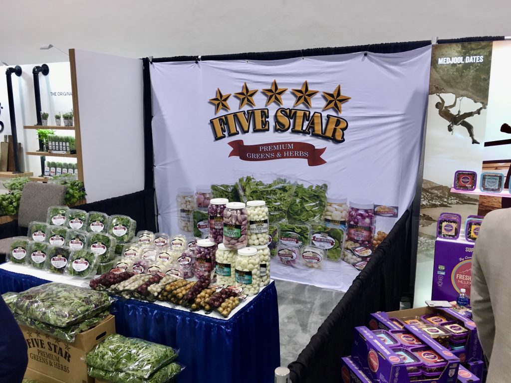
“Love the product displays. If only the graphic was as fresh.” 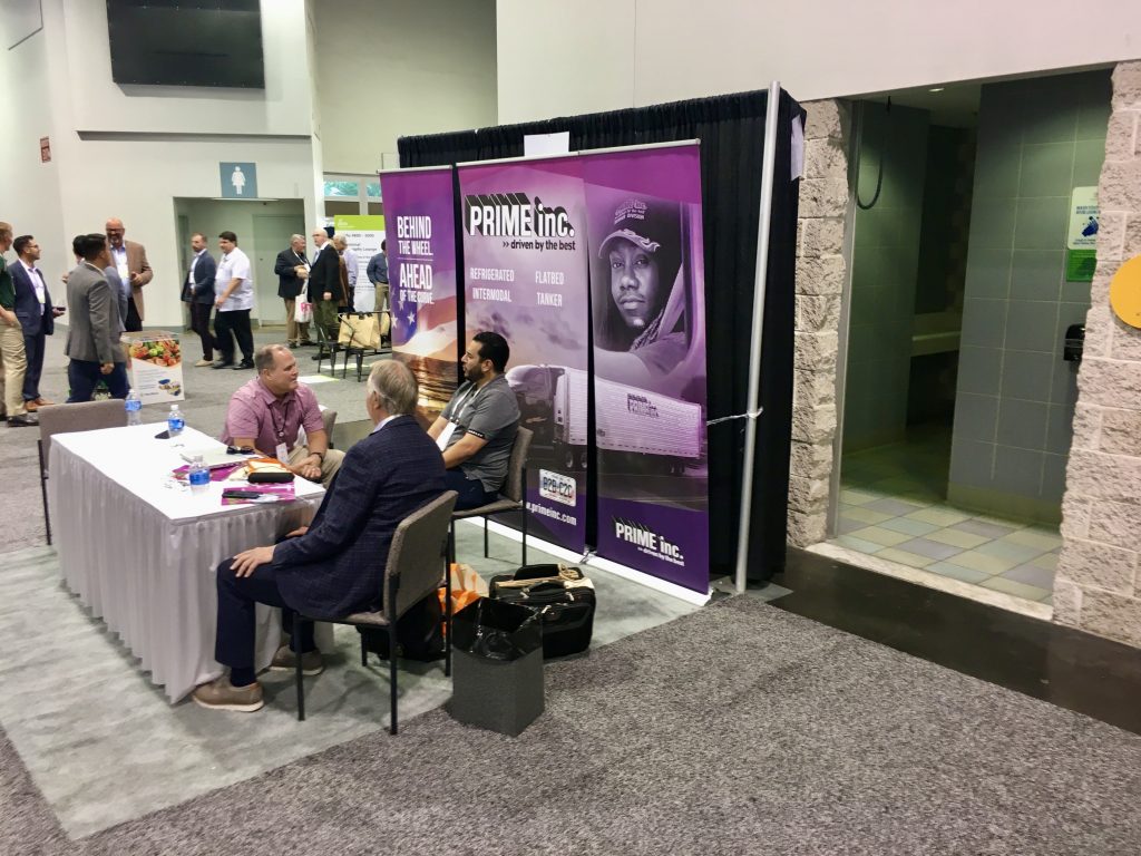
“Three banner stands. One bland show table. Three bottles of water. And a garbage can.” 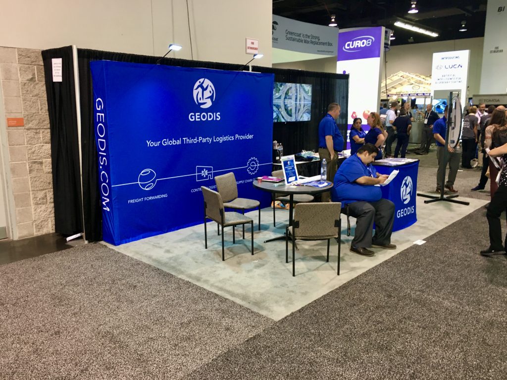
“Chairs and a table are fine, but how about more of a casual lounge feel with comfortable rental furniture?” 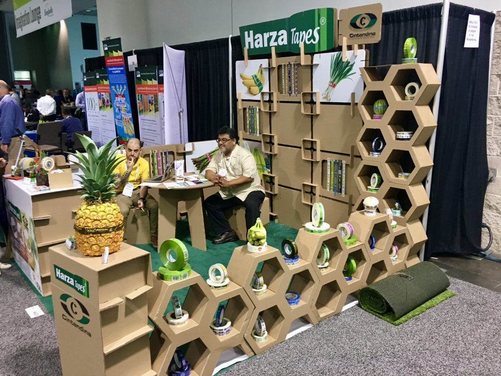
“Clever use of walls to show the products, but maybe too much of a fortress?” 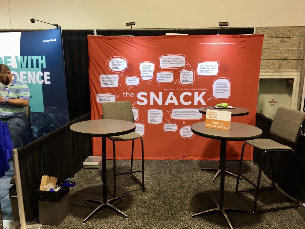
“Really? Anyone? Anyone?”
#5. Look! Up in the Sky! It’s a Bird! It’s a Plane….
Some booths take full advantage of the third dimension. While most get it right, some are still a work in progress. And when it’s “right,” the results can soar!

“One of my favorite hanging signs. Brightly backlit and custom cut logo commands your attention. Identifiable from all around.” 
“Is it cheating if you use 10 ft. tall pears above your booth? Nope! Use em’ if you got em’!” 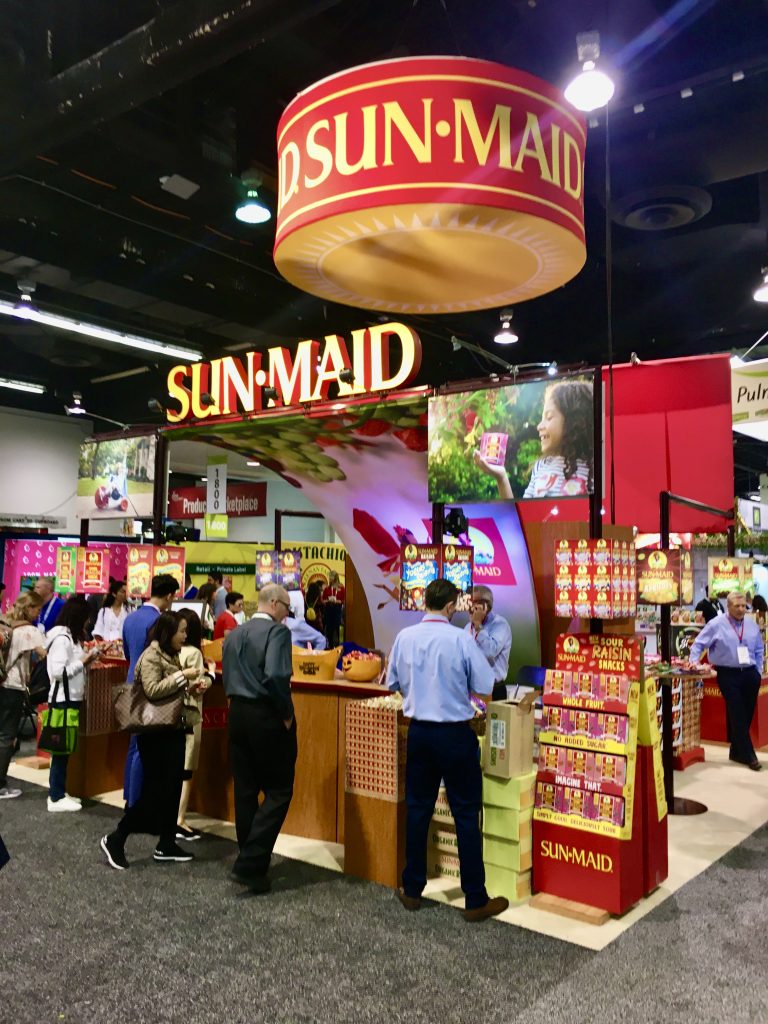
“Take advantage of highly recognizable highly placed logos. And while you’re at it, give away bunches of free raisins!” 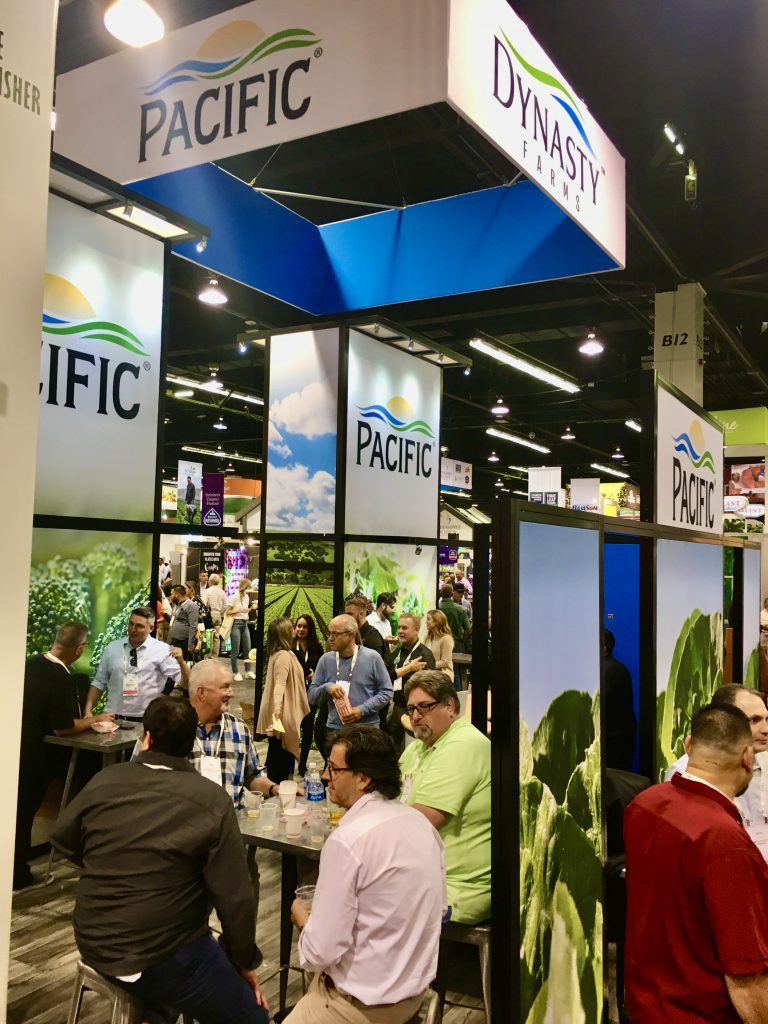
“I think it’s the combo of black extrusion against the colorful graphics that draw me in. The hanging sign blends beautifully with the exhibit below.” 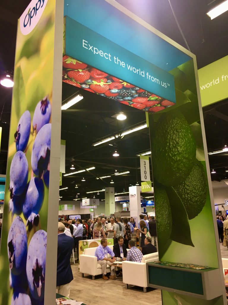
“Blueberries to the left, avocados to the right and backlit strawberries overhead. I’m getting hungry!” 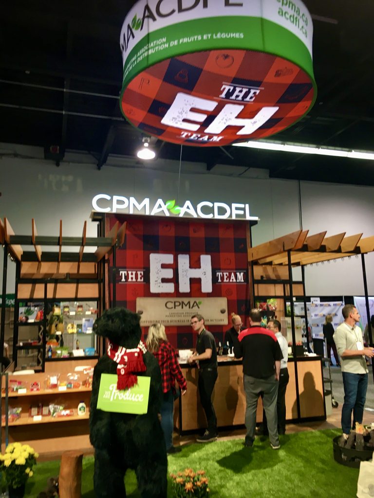
“No way I’d miss this red/black plaid from across the floor. And unlike some other highflyers that get lost once you’re in the booth, this one stays easily visible.” 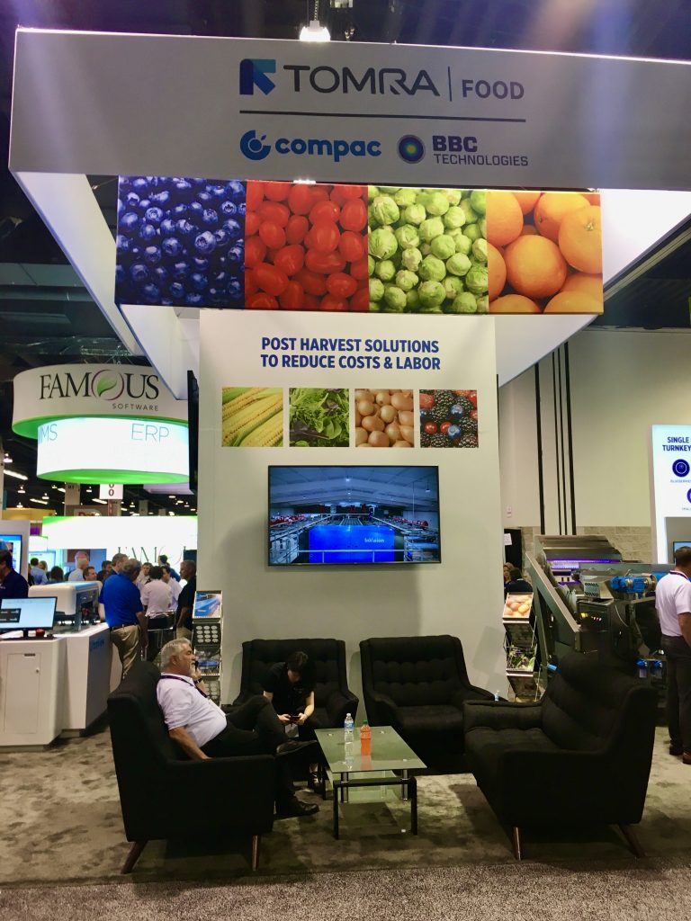
“Double Whammy! This colorful, layered hanger demands attention while drawing your eyes to the booth below. Nice work.” 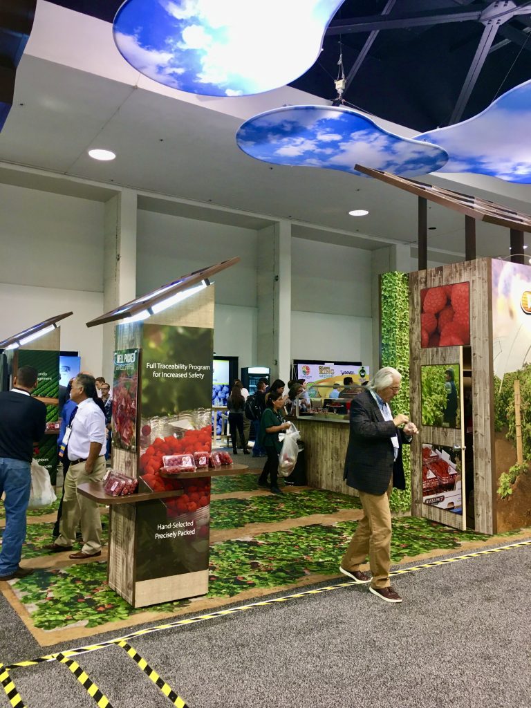
“This booth takes advantage of all planes – Floor, walls and ceilings. Colorful and inviting.” 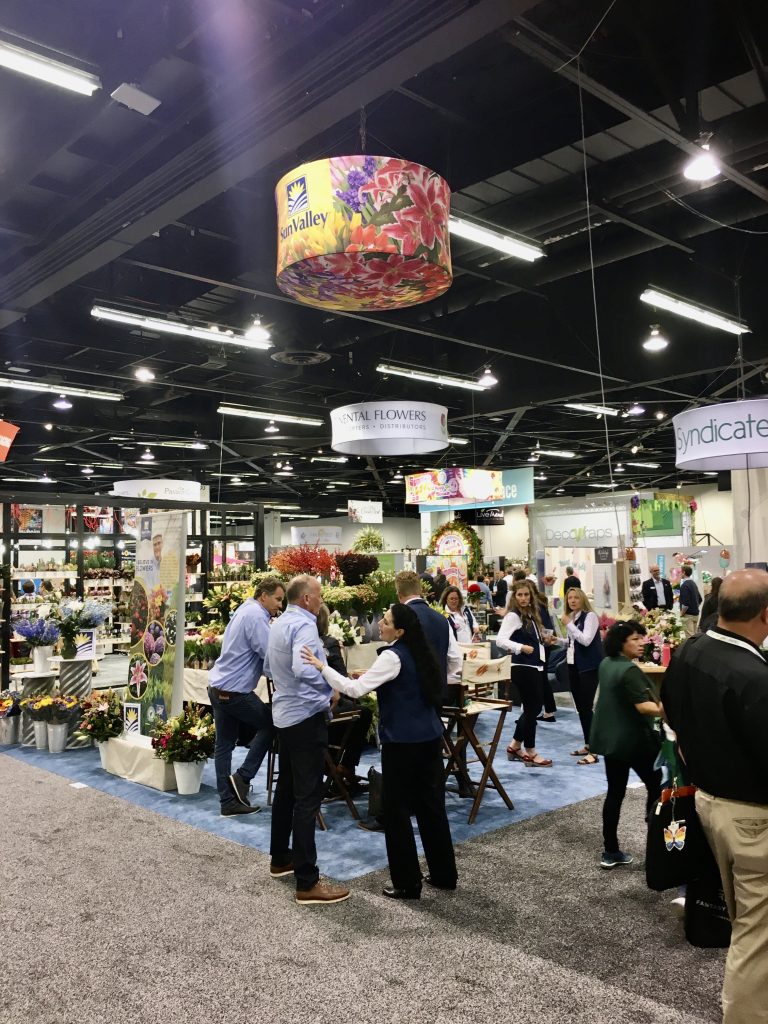
“This reminds me of high-water pants. The hanging sign is either too small for this booth or too high for this configuration. Probably both.”
#6. Engagement? That’s Got a Nice Ring to It.
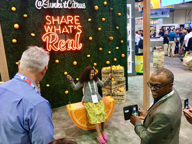
If you can engage your attendees with something that makes them stop, notice, and hang around for a bit, it gives staffers the time to capture appropriate information. And in this case, a nice show souvenir.
#7. Think A/V is Expensive? Sometimes It’s More Expensive NOT Using It.
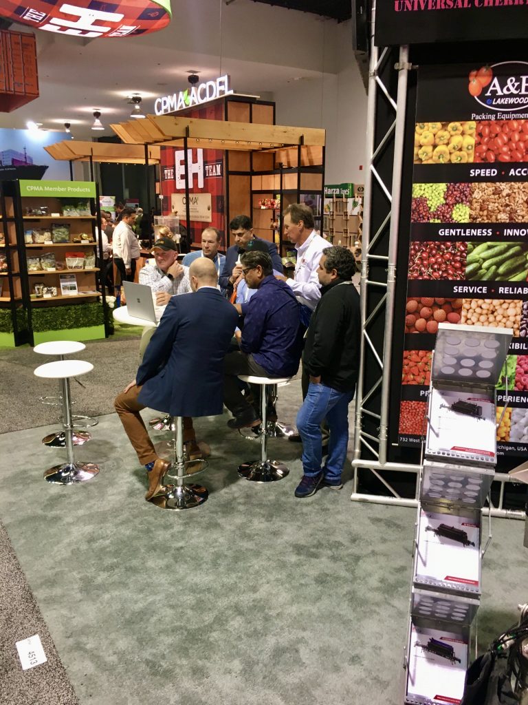
How many fully grown men can we pack around a 13” computer screen? Maybe the real question is how many more you could have harnessed had you listened to your exhibit house and splurged on the 50” monitor?
#8. Use It or Lose It.
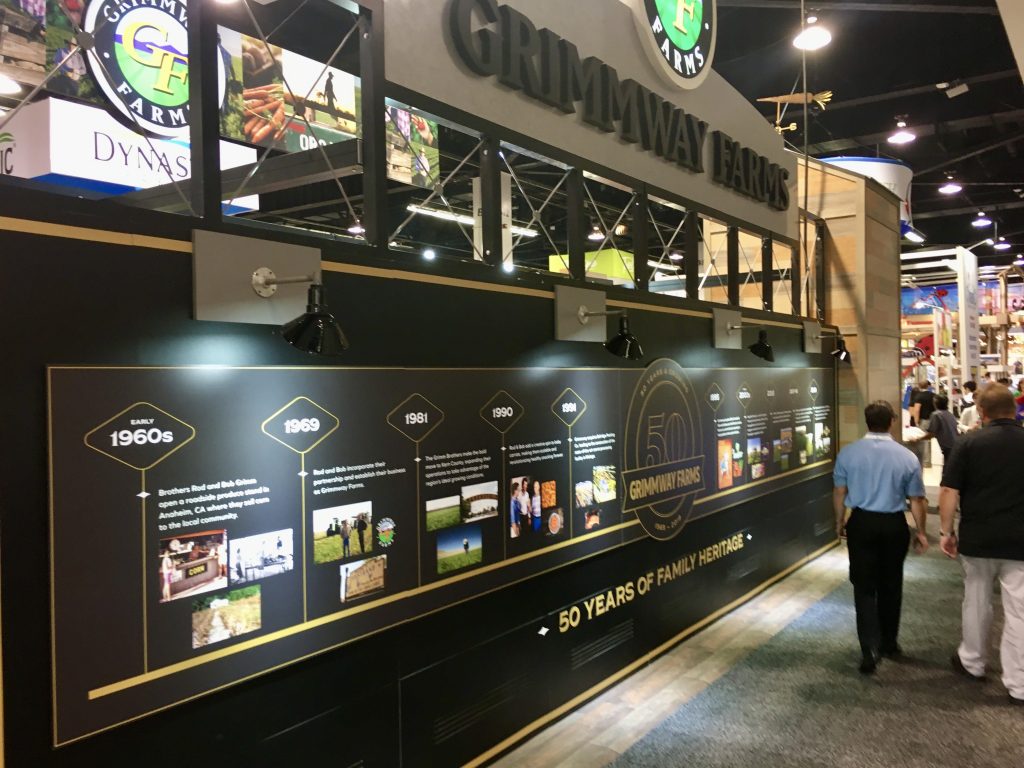
Look at what these two companies did to utilize the backside of their booths. One transformed it into a company timeline while the other said, “We can never have TOO much yellow in our booth.”
#9. Honorable (and a Few Dishonorable) Mentions
All these booths have something notable to share.
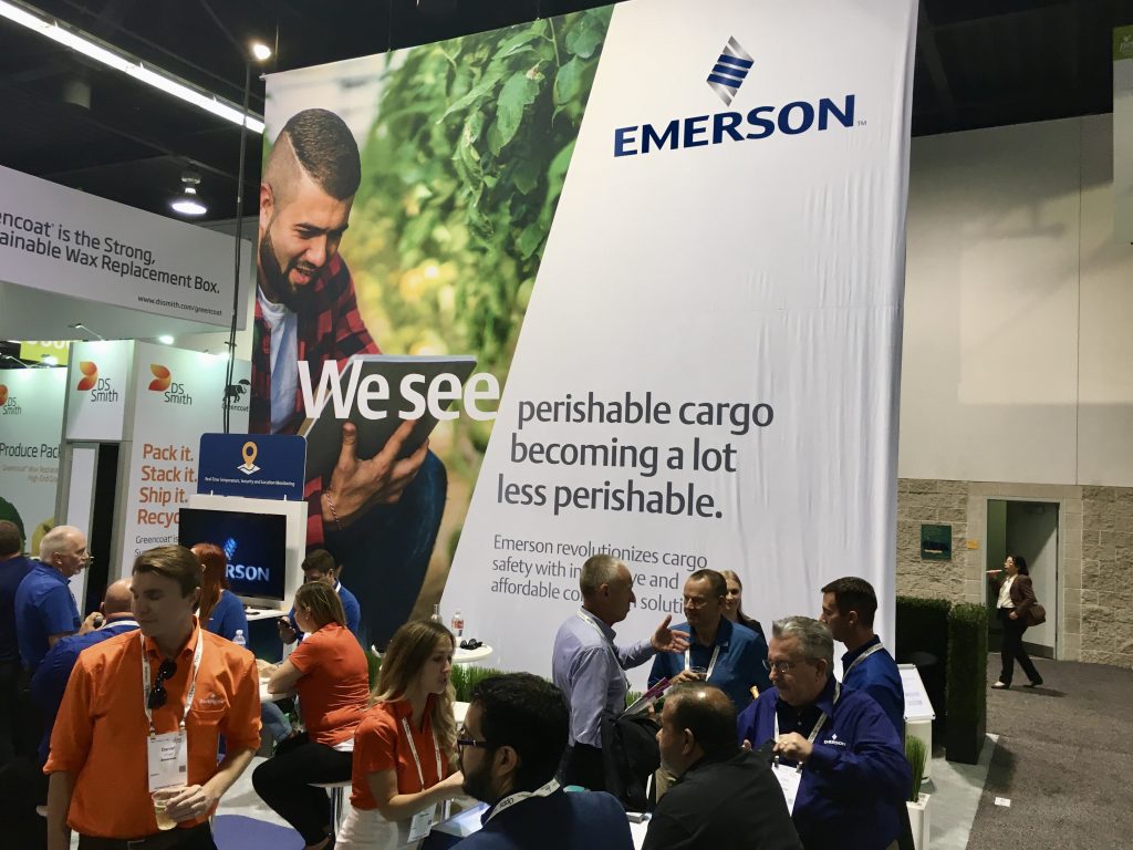
“So close! They got away with minimal hardware and are generating a nice crowd. But those wrinkles are killing me.” 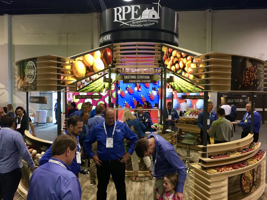
“Congrats to the designer! Nice use of height, backlighting and clean linear design. This team had a crowd all show long.” 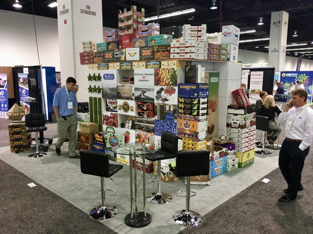
“The booth without a booth. Their product (cardboard packaging) was their booth. Nice work… if you can get it.” 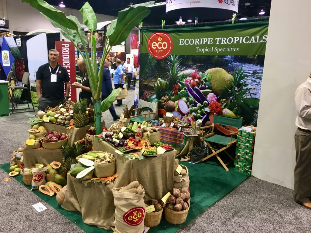
“Question… How much stuff can one company fit in a 10 x 10 booth? Answer: Not this much.” 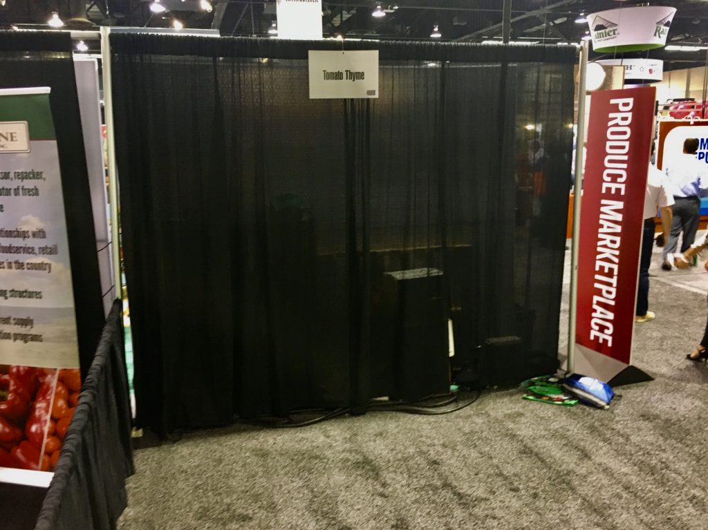
“I thought you said YOU were going to bring the booth! DOH!”
Finally, My Homework Assignments
After spending the entire day walking up and down the aisles of this year’s PMA at the Anaheim Convention Center, I was able to answer my homework assignments. And realized I’m a little outta practice walking show floors (very sore feet).
Charging Stations. I saw very few charging stations inside the show hall. Hardly any, actually. I did, however, find about 80 charging outlets outside the show hall provided by the Anaheim Convention Center. Interestingly, I had a hard time finding an open spot where I could recharge my phone after snapping all these pics. With so many people utilizing all those charging ports outside the hall, you’d think that some exhibitors would’ve been able to take advantage of bringing a few inside their own booth for attendees in need of a fresh charge. Good ideas don’t fade away. They just get forgotten about.
Portable/Modulars Along the Perimeter. Yes, Mel, some of the perimeter booths certainly grabbed my attention. But not always for the right reason. Remind your clients that they’re at the show for a reason. Best to share those reasons before the show and every morning before the show opens. Maybe even offer a Starbucks gift card to the Boother who “wins” the day’s goal count.
Attention Grabbers. Same as it ever was (thanks, David Byrne). Backlighting. Colorful Graphics. Engaged Attendees. Accessible Booth Space. Graphics Up Top. And Good Exhibit Design. The basics are the basics for a good reason. They work.
So while I’d been out of the industry for almost 10 years, some things haven’t changed. The only way to keep your eye on trends is to walk a show floor every now and then. Make it one of your annual goals. Spend a few days during the year walking show floors and observe what catches your attention. Because if it captures YOUR attention, chances are it’ll capture THEIR attention.
Harold Mintz is the Regional Sales Manager at Classic Exhibits. You can contact Harold at harold@classicexhibits.com.


