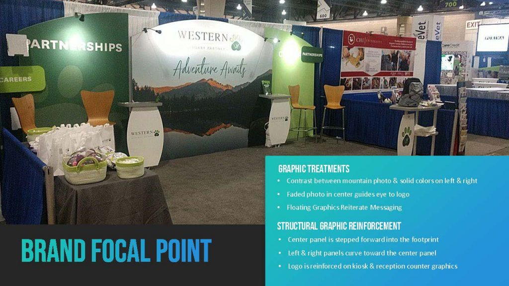
Trade show graphic design can be challenging for designers without extensive 3D graphic experience. Add in structural modularity, unusual shapes, and vertical and horizontal layering and the task becomes MUCH MUCH harder. However, most graphic designers love this creative challenge.
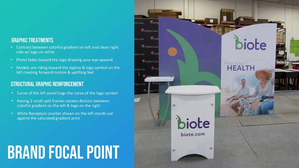
Below are examples of graphic designs on the Symphony Portable System. The Symphony’s mix and match architecture gives exhibitors the flexibility to select from 8 frame shapes and 17 counters and accessories. In addition, the frames vary in height and can be layered front-to-back. That’s a lot to consider as a graphic designer… and yet, as the examples illustrate, the shapes, layering, and accessories serve as perfect canvases for beautiful, clever, and effective graphic treatments.
10 x 10 Trade Show Displays
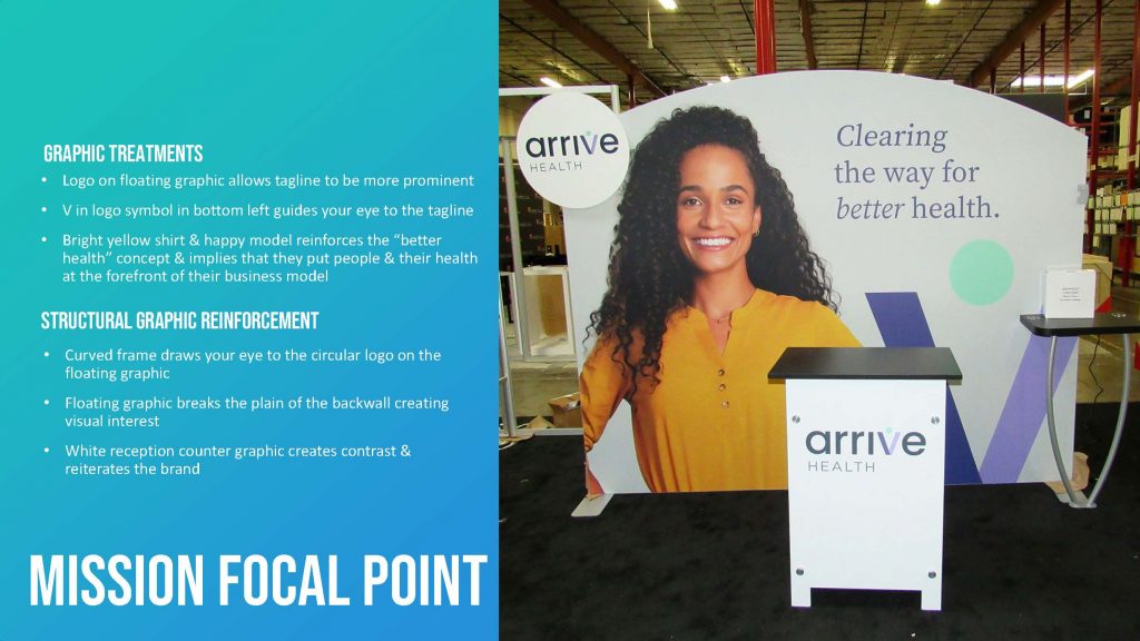
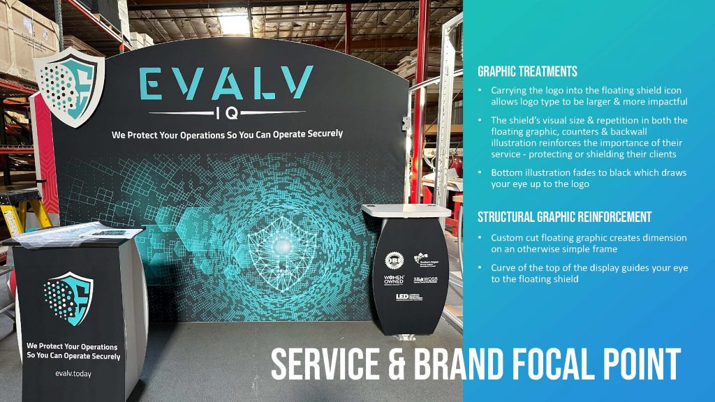
10 x 20 Trade Show Displays
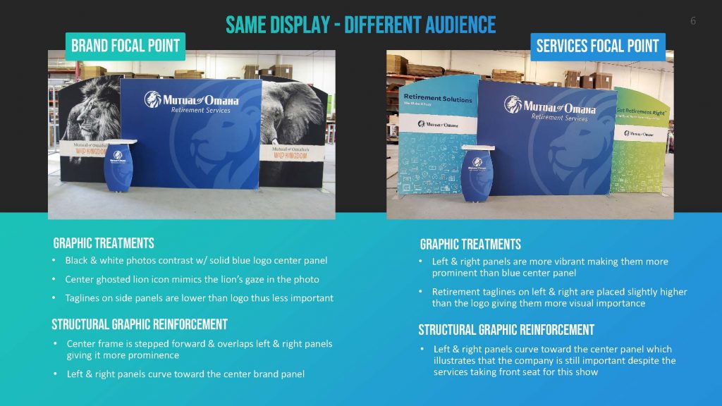
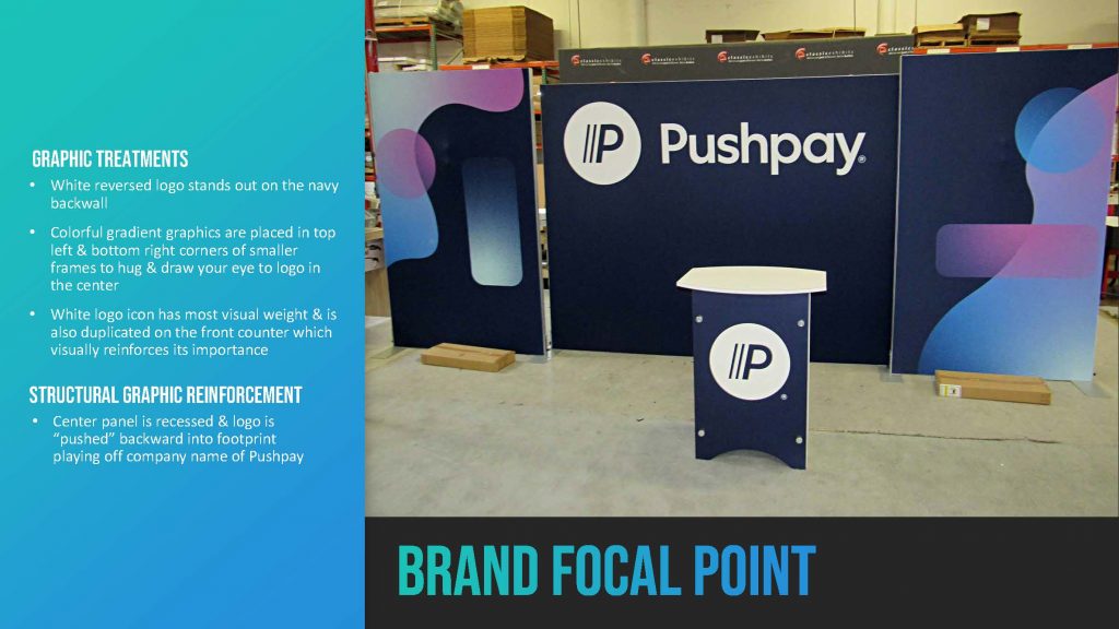
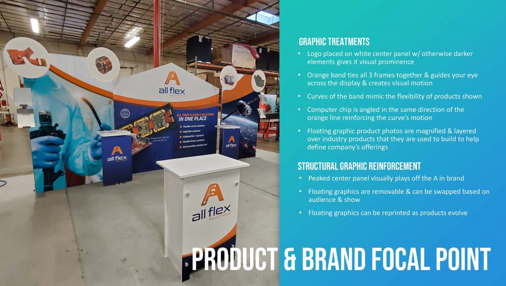
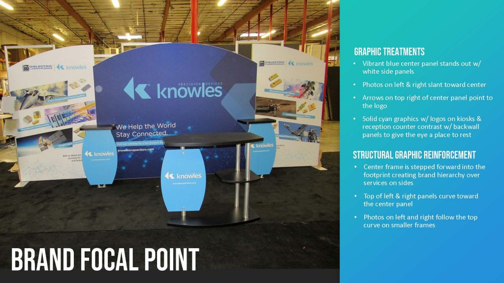
With Symphony, you can create the perfect 10, 20 or 30 ft. display by selecting from stylish backwall shapes and distinctive counters and workstations. The mix and match flexibility encourages unlimited design possibilities. Need a different look for your next show? Symphony’s modular SEG frames are double-sided and re-configurable.
Personalize your Symphony Display with attractive counters, workstations, floating graphics, iPad clamshells, and monitor mounts. The lightweight aluminum frames are engineered for SEG dye-sublimated fabric graphics for a seamless, wrinkle-free look. Add floating graphics for additional visual layering and branding.


