
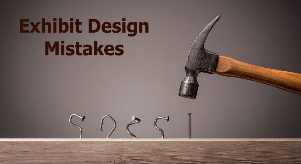
Mistake is a Subjective Term
What one exhibitor views as an exhibit design mistake another may view as a brilliant strategy. For example, some companies contend that a hanging sign should only include the company’s name and logo. Others would insist that it include what the company does or the problem they solve. To be fair to both… It depends.
That’s not to say there aren’t any exhibit design mistakes. There are plenty. If you ever have the opportunity to stroll the floor with an exhibition designer, ask them to be brutally honest about what they see. Frankly, you may find yourself blushing at the language. Exhibit Designers have very strong opinions about design regardless of the size, budget, industry, or type of trade show.
Most exhibit design mistakes aren’t intentional. No one wants to have a dud display or an icky exhibit at a trade show. We all want attendees to swarm to our booth. And we want them to praise the graphics, the layout, the accessories, and the interactive elements.
Exhibit Design Mistakes Most Companies Don’t Realize They’re Making
There are obvious design mistakes, like blocking the entrance to the booth or using low resolution graphics. But most exhibit design mistakes are subtle rather than obvious. An attendee may not notice these issues, but if attendees are not stopping or entering your booth, there’s likely a reason. Booth layout and messaging will influence attendee engagement and your trade show results. In this article we’ll review the most common mistakes, like an overcrowded layout, confusing traffic flow, poor messaging, and inconsistent lighting.

Low vs. Medium vs. High Resolution Graphics
Trade Show Booth Errors That Reduce Visitor Engagement
At a trade show, a booth is much more than a physical space—it is a silent salesperson and a three-dimensional brand story. How a booth is designed directly influences how long a visitor stays, how they interact with your team, and whether they remember your brand after the show closes.
Poor booth design acts as a series of physical and psychological roadblocks. It doesn’t just fail to attract people — it actively repels them, cuts conversations short, and can leave a negative lasting impression of your brand.
Overcrowded Booth Layouts
An overcrowded trade show booth design is one of the most common pitfalls on the exhibition floor. It often stems from a well-intentioned desire to maximize every square inch of rented space—trying to showcase every product, display every graphic, and cram in as much furniture as possible.
However, in spatial design, less is almost always more. An overcrowded booth triggers immediate psychological and physiological barriers that actively drive qualified traffic away.
The trade show floor is already a high-sensory, high-stress environment. Attendees are bombarded with bright lights, loud noises, and hundreds of competing messages. In a cluttered booth, there is no focal point. If every product, banner, and screen is screaming for attention, nothing stands out. Because the eye doesn’t know where to land, it simply glides past the booth without registering the brand’s core message.Faced with cognitive overload, an attendee’s natural psychological response is to avoid the space entirely.
Lack of Clear Entry Points
One of the most common design mistakes is placing a long, solid counter or desk right at the very front of the booth, cutting off the aisle from the exhibit space.
- The Defensive Barrier: A massive front counter acts as a physical and psychological wall. It forces staff to stand behind it like gatekeepers, which can feel confrontational to attendees.
- The “Do Not Enter” Vibe: When the threshold is blocked or overly narrow, visitors feel that crossing into the booth requires a formal commitment. Rather than stepping inside to explore, they will simply keep walking.
- Congestion Chokepoints: If a popular demo or display is placed right next to a narrow entrance, it creates a bottleneck. When the entrance is congested, passing attendees will bypass the booth entirely rather than fight through the crowd.
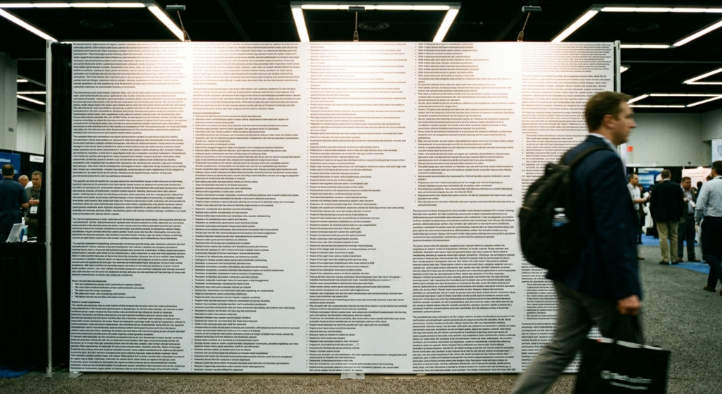
Exhibit Layout Problems That Confuse Visitors
Think of an exhibit like a home or an office. Each space is divided into defined areas like a kitchen, conference room, foyer, or living room. Exhibits, especially larger islands, can be divided into demo, meeting, and reception spaces for example
Poor Traffic Flow Within the Booth
A booth that is entirely open with nowhere to sit or stand comfortably forces all interactions to happen in a high-traffic, noisy environment. If a prospect becomes genuinely interested but has to stand in a loud aisle bumping elbows with passersby, they will cut the conversation short. And without a semi-private area, lounge, or dedicated meeting nook, there is no physical transition from a casual “hello” to a deep, qualified sales discussion.
The same is true for graphics and text. Is it one coherent message or a series of disconnected messages?
No Clear Product or Message Hierarchy
Attendees walking a crowded show floor make split-second decisions about where to stop. A successful design uses a clear visual hierarchy to communicate who you are and what you do almost instantly.
- Long-Range (Header & High Signage): Suspended fabric structures, towering signs, or high-set LED video walls act as beacons, drawing visitors from across the hall.
- Mid-Range (Backwalls & Imagery): As attendees get closer, bold graphics and clear messaging tell them exactly what problem your business solves.
- Short-Range (Details & Demos): Up close, interactive screens, product displays, and literature engage the visitor’s focus and initiate conversations.
Without a clear hook, passing attendees will subconsciously categorize your booth as irrelevant and keep walking. Here is how a lack of clear messaging actively damages visitor engagement, brand perception, and overall ROI. The average trade show attendee walks the floor at a steady pace, scanning dozens of booths a minute. They allocate approximately three seconds to look at an exhibit and answer three fundamental questions:
- Who are you?
- What do you do/make?
- Why should I care (what problem do you solve for me)?
Visual Design Mistake: Messaging That Is Too Wordy
At some trade shows, like scientific symposiums and medical conferences, attendees expect text-heavy messaging. The product details are not just important, they’re essential. However, at most trade shows, booth graphics with lengthy paragraphs or a laundry list of bullets repels attendees.
In addition, no clear messaging usually results in a booth that tries to say everything at once. Without a single, unifying core message, different sections of the booth will compete for attention.
- Conflicting Stories: The left wall talks about your history, the back wall lists twenty bullet points of product features, and the right wall promotes a contest. To a visitor, this looks like visual static.
- Lack of Post-Show Recall: Even if a visitor did stop by and chat, their visual memory of your booth will be a blur. Without a clean, memorable typographic anchor or visual headline to pair with the conversation, they are highly unlikely to remember your brand name when they look at their stack of business cards next week.
The ideal messaging communicates who and what you do succinctly and clearly while creating curiosity about your product or service. Curiosity is often the missing link. Without it, attendees will rarely cross the threshold from the aisle carpet into your booth space.
Finally, companies fall into the trap of using clever, highly abstract, or jargon-heavy slogans that mean a lot to their internal marketing team but nothing to a passing prospect.If an attendee has to physically walk into your booth and ask your staff, “So, what is it that you guys actually do?” your design has failed. While it might occasionally start a conversation, more often than not, people avoid asking because they don’t want to get trapped in a high-pressure sales pitch just to satisfy their curiosity.
Weak Lighting or Poor Display Placement
Not so many years ago, lighting in a trade show booth could be both challenging and expensive. Not anymore. LED lights were a godsend to the exhibit industry, allowing for consistent, creative, and inexpensive lighting options for any budget and any size exhibit.
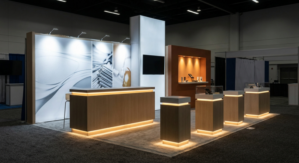
Lighting is the ultimate unsung hero of booth design. While graphics, technology, and architecture determine what visitors see, lighting dictates how they feel about what they see. Many exhibitors spend tens of thousands of dollars on high-end materials and custom graphics, only to rely on the flat, clinical overhead lighting of the convention center. This is a critical mistake. Strategic lighting design isn’t just about visibility; it is a powerful tool of psychological persuasion, spatial definition, and brand perception.
A Quick Reference: Lighting Types & Their Impact
| Lighting Technique | How It’s Used | Impact on Visitor Engagement |
| Arm/Stem Lights | Mounted to the top of backwalls to illuminate graphics. | Makes key messaging legible from a distance; prevents shadows. |
| Pendant/Hanging Lights | Suspended overhead to light lounges or meeting tables. | Creates a cozy, boutique atmosphere; anchors a conversation zone. |
| Gobo/Pattern Projectors | Projecting logos or textured light onto the floor or walls. | Adds motion and visual texture; reinforces branding. |
| LED Under-lighting | Placed beneath counters, bars, or display shelves. | Elevates product premiumness; makes heavy furniture look sleek and modern. |
| Track/Spotlighting | High-intensity directional beams aimed at specific items. | Commands immediate visual attention; highlights product details. |
In trade show design, shadows are wasted space. When you invest in professional, intentional lighting, you aren’t just making your booth brighter—you are designing the emotional atmosphere, guiding the visitor’s journey, and dramatically elevating the perceived value of your brand.
Booth Design Improvement Tips That Fix Common Problems
By now, you know an exhibit design is much more than creating an attractive structure. Exhibit designers can create beautiful exhibits, even with limited input from the client. But they can’t create a marketing masterpiece with a thorough understanding of the client’s goals and strategy. Knowledge is king. The more you share, the more likely the exhibit designer hits the bullseye on the first or second attempt.
Even then, you must guard against these 5 engagement killers which can slowly creep into the final exhibit design.
The Checkpoint:
By blocking the entrance(s), visitors are hesitant to step inside. Placing a long reception counter directly on the front aisle looks like a border checkpoint to an attendee. It communicates to them to expect an immediate, high-pressure interaction.
Word Wall:
We get it. You have a lot of information to share with attendees. However, trying to fit your entire corporate brochure, history, and bulleted feature lists onto a fabric backwall is visually overwhelming. Passing attendees cannot read it, and those who try quickly experience cognitive fatigue.
Interrogation Chamber:
It may seem counter-intuitive to expect privacy on a hectic trade show floor. And yet, many discussions quickly shift from general inquiries into highly technical, sensitive, or budget specific conversations. Even in an inline where space is limited, try to create an area that functions as a meeting zone. Something as simple as well-placed greenery can block sightlines and dampen sound.
Cave Lighting:
All convention centers are bright, well-lit venues. But relying on that lighting washes out colors and can cause the booth to blend into the background. Instead, consider cool arm lights or spotlights to highlight graphics, accent lights on counters and pedestals, and backlit fabric graphics to draw attendees into your booth.
BoringTown:
Design is more than just the exhibit. Static graphics and looping videos are easy to ignore on modern exhibits. Instead, consider touchscreen demos, games, active sound and movement, and engaging large video tiles. Finally, don’t forget your staff. A positive, energized booth staff will always be the star attractive in any booth. It can fix a multitude of marketing sins if your team understands their mission and makes every guest in the booth feel heard and valued.
Improving Your Exhibit Design Strategy for Future Shows
You don’t know what you don’t know. That’s the starting point for any company new to trade show marketing. Working with an exhibit design professional ensures you skip the awkward unknown phase. Their goal is to create a structure and graphics that maximizes your trade show success while pushing you to hone your strategy and goals before and after each event.
Classic Exhibits has been designing and building trade show exhibit solutions since 1993. We’ve been honored as an Exhibitor Magazine Find-It Top 40 Exhibit Producers and an Event Marketer Fab 50 Exhibit Builders multiple times. Along with numerous Portable Modular Awards. With over 250 Distributor Partners throughout North America, there’s a Classic representative closer by.
Contact us today whether you need an inline modular display built to last, a rental display guaranteed to attract trade show attendees, or a custom 30 x 40 exhibit with all the bells and whistles. At Classic… We’re not just different. We’re better.