
Glenna Martin, Graphic Design Manager
Graphic Inspiration Galleries
Many trade show clients and graphic designers are unfamiliar with how to design for 3D structures. If you have a client that fits that description, then our new Graphic Inspiration Galleries will be useful. We’ve dug through the Past Five Days (P5D) photo archives and identified outstanding examples of graphics. Each image has notes about why the graphics are successful (in our humble opinion). Our hope is that these notes will help you start an informed conversation with your client about their next project.
We love using P5D as inspiration space when designing graphics — there is tons of great stuff in there. Keep checking back as we add more images and create new categories.
In addition to the Inspiration Galleries, we’ll post a few of our favorites in the blog each month. Here are a few favorites from March:
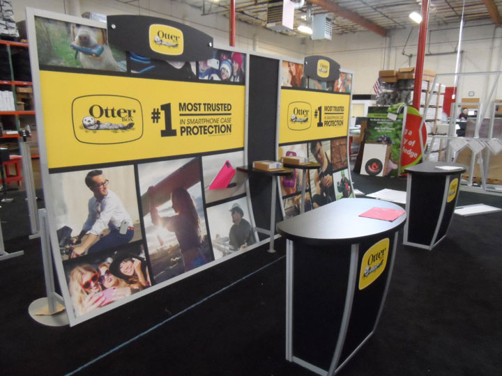 |
Otterbox:
Wonderful combination of lifestyle photos in these graphics and bright yellow band as the focal point for copy. This display also has a unique header shape that mimics of the logo shape. |
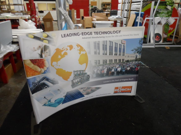 |
Busch:
It’s very unique how the images flow down the left side of this table top and land flat on the visual plane in the graphic. This does a great job of guiding your eye to their logo and copy points. |
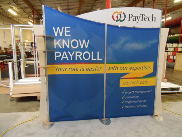 |
PayTech:
Excellent use of contrast between header and backwall graphic. The curves compliment the contrast and the ribbon’s “z” shape emphasizes their URL and copy points. |
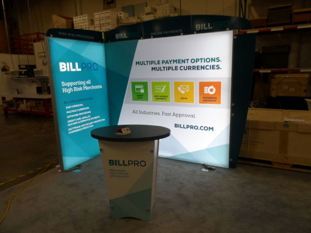 |
BillPro
Very vibrant shade of blue in these graphics. The backlighting makes all of the colors pop and look amazing. The angles in the graphics stretching around the corner creates a nice flow in a small space. This is a great example of what SuperNova lights can do for artwork. |
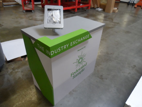 |
Federated Sample:
This counter is a spectacular example of a customized counter. The 3D graphic elements and contrasting colors are streamlined, but amazing. |
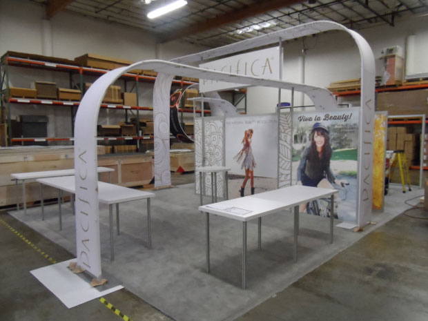 |
Pacifica:
These graphics are so simple and elegant, yet they work fantastically. The illustrated pattern and logo placement in combination with the lifestyle photos are perfect. Nice how the front curved piece extends into the space making the merchandise part of the display. |
Stay tuned for next month when we highlight examples from April.
Glenna Martin
Graphic Design Manager
http://www.linkedin.com/in/glennamartin
glenna@classicexhibits.com
**********************************************
Based in Portland, Oregon, Classic Exhibits Inc. designs and manufacturers portable, modular, and custom-hybrid exhibit solutions. Classic Exhibits products are represented by an extensive distributor network in North America and in select International markets. For more information, contact us at 866-652-2100 or www.classicexhibits.com.
[subscribe2]
Tags: Classic Exhibits, Graphic Design, graphic inspiration, Past Five Days
This entry was posted
on Thursday, April 17th, 2014 at 12:09 pm and is filed under Glenna Martin, Graphic Inspiration Galleries.
You can follow any responses to this entry through the RSS 2.0 feed.
You can leave a response, or trackback from your own site.




Nice post, Glenna. If we sent you a photo of our booth at Exhibitor, would you critique it for us and suggest some ways it could have been improved?
That would be very insightful, and generous of you, too.
Just let me know and I will send a couple of photos.
Thanks much,
Gary Jesch
CHOPS & Assoc. Live Animation
Hi Gary,
I’m so glad it is useful to you! We’re going to make these monthly installments to keep distributors up to date on all of the cool stuff that we see every day in our shop. I’ll be in touch about the critique 🙂 Thanks for the comment! –glenna
I love this feature, you guys!
I think it’s a great idea to take time to share with clients what good graphic design looks like, and how our build can compliment and accentuate a good Designer’s work. Keep these coming!
-Tyler
ps: I also love the way this section works, Tony. Very cool stuff.
Thanks, Tyler! We appreciate the feedback. Mel is definitely the mastermind behind the idea. Hopefully it will continue to be well received 🙂
I love getting a chance to point out some of our favorites, because I can’t help but notice how massive a difference a client gets from the overall investment when they let talented designers work together. I can’t tell you how many times I’ve sent out templates for an awesome display and been super let down by the results of the designer that the client entrusted with the execution of the messaging. Grrr!
Mostly, I think it’s genius how you guys have created this platform for showing off custom build elements like curves, wings, canopies, and counters. Yes, it’s a study in graphic design execution but it was clearly planned as a great way to point out what Classic is doing better every day. More people need to understand that the overall outcome is not simply how much you spent on the display or how good the designer is: you really need to find a way to marry the 3D design with a confident, compelling Brand message. I like the idea of us being a positive, influential part of that equation.
Nice Post Glenna.I really like your post and i appriciate your work it’s helpful for me.